2017 F1 Constructor technical info/developmentFormula 1 

  • Thread starter Thread starter LMSCorvetteGT2
  • 2,124 comments
  • 177,580 views
Is it just me, or does the rear wing on the VF-17 look almost as narrow as the 2016 spec wing?

 
The Red Bull nose is terrible, and the rest of the car is...underwhelming? Maybe it'll be better when not in a dark room with neon signs. :P
 
It looks like the 2016 car with a vacuum cleaner nozzle attached. They are definitely hiding some things.
 
Haas has made it look like a milling machine yet again :rolleyes: the sharkfin looks nice though, very Caddilac racing.

As for the Red Bull where has the Bull's tail gone? :lol:
 
With the bull's tail, the sharkfin might have been a late addition after seeing what everyone else was doing, so they didn't have the decal ready.
 
People being amazed over the incredibly dull Sauber, proceed to express their disappointment in the much more interesting looking HAAS.

Logic.
 
People being amazed over the incredibly dull Sauber, proceed to express their disappointment in the much more interesting looking HAAS.

Logic.
The livery dulls the aerodynamic intricacies of the Haas. If the Haas had the livery of the Sauber it'd be a different story.
 
I don't think anyone is commenting on the technical savvy of Sauber, just that the colours/livery are about 764.3 times more attractive than the industrial paint used by HAAS.
 
The Macca looks a lot better in real life than those press shots.
 
12c573d4-a747-44a4-ae43-f17ac407610c_800.jpg

C5m1YeyXEAEvY05.jpg:large
 
They've ruined my 2nd favorite Livery

C5m1M3hWQAA9Hhz.jpg


Edit: could be the picture was taken with a crap phone, looks gorgeous in that studio shot.
 
Toro Rosso STR12:


I'll probably be banned now for breaking the AUP by posting porn, but that car is hot (livery not as good but the actual car)!
 
I don't think anyone is commenting on the technical savvy of Sauber, just that the colours/livery are about 764.3 times more attractive than the industrial paint used by HAAS.
Lack of sponsorship does give them freedom to design the car to look pretty.;)
 
Well, that's umm... different. And the bull has a tail!
 
Did they notice that their um... RED Bull is now silver?:odd:
 
Toro Rosso STR12:


I'll probably be banned now for breaking the AUP by posting porn, but that car is hot (livery not as good but the actual car)!

THAT'S BEAUTIFUL! :drool: :D :drool: THANK YOU TORO ROSSO! :D That is definitely, THE best looking car on the grid this year, I hope they can do well with it. :D
 
They've ruined my 2nd favorite Livery

C5m1M3hWQAA9Hhz.jpg


Edit: could be the picture was taken with a crap phone, looks gorgeous in that studio shot.
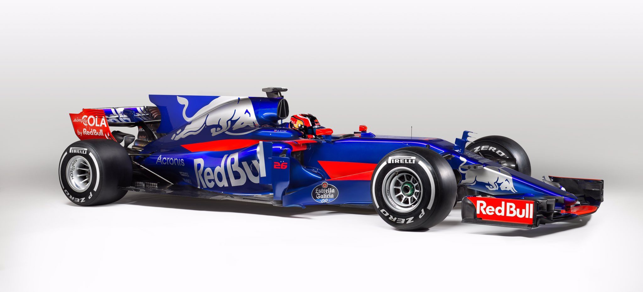
Also great car and livery. But where is the Rosso in the Torro?

My favs cars: obviously the RBR13, Renault and Haas
 
You know what? The more I look at it, the more I like the new livery (Yes I am a weird person, I can change my opinions very quickly). The shade of blue is awesome.

My overall ratings for all the cars:
  1. Renault
  2. Sauber
  3. Haas / Toro Rosso
  4. Red Bull (despite the weird nose)
  5. McLaren
  6. Williams
  7. Ferrari
  8. Mercedes
  9. Force India
 
Finally Torro Rosso have gotten rid of that comic book Bull and have gone more for the sleek drinks can look.

upload_2017-2-26_17-20-11.png
 
Toro rosso win best livery 2017
 
GODDAMN THATS ONE NICE LOOKER! :drool::drool:

My 3 Favorites:

-Sauber
-Red Bull
-Toro Roso
 
I think we have some of the best looking liveries and cars for a long time .

I love most of the cars except the Force India and not keen on the Renault livery but really looking forward to testing this week to see what they do.

The Toro Rosso looks stunning and has a Mercedes style nosecone.
 
Back