2017 F1 Constructor technical info/developmentFormula 1 

TAG Heuer remains prominent on the side (as you can see, obviously) and the provisional 2017 entry list also names them as the engine supplier. That's not final, of course.


The design is meant to highlight their sugar-free brand, I read. I quite like it, I definitely prefer it to the same-old-same-old "parent" team livery.
View attachment 630426

I think it is about the Cola brand.. "Red Bull Simply Cola" (see back wing) the colors are the same
Red-Bull-Simply-Cola-e1480624480714.jpg
 
The TR livery does absolutely nothing for me. I find it quite boring, if I'm honest.

Well, regardless of what we all think looks good or bad (which obviously is quite subjective), I'm sure we all share the same commonality.. In respect of wanting the F1 season to start already! :)
 
Last edited:
Fair enough, I'd answered the engine question about the wrong team and identified the wrong RB brand for the STR livery.

Apart from that... oh I give up :D
 
Correction: You thought it was more interesting...I've found both teams liveries to be piss-poor boring for the past 5-6 years. ;)

How is this more interesting, it's the same thing as the sister team, in a different color scheme...they're both boring visuals that inform the world "hey we're red bull and while we spend as much as a manufacture with none of the returns, we want you all to buy our drinks, either original or sugar-free edition (or blue edition)!"

I mean that's very interesting.


Now that would have been nice.

I think it is about the Cola brand.. "Red Bull Simply Cola" (see back wing) the colors are the same
Red-Bull-Simply-Cola-e1480624480714.jpg

They've been promoting the Cola brand of Red Bull since TR was STR, so it's surprising they now go to the corporate colors of it. Good catch by the way, I've never seen the Cola version of Red Bull.
 
Ok so here are my lists. First is order of beauty

1: Toro Ross
2: Renault
3: Sauber
4: Ferrari
5: Mercedes
6: Haas
7: McLaren
8: Red Bull(probably just a mule car though)
9: Williams
10: Force India

Meanwhile here are my guesses for the pecking order come Melbourne

1: Mercedes(unfortunately)
2: Red Bull(unless their actual car is crazy)

3: Ferrari
4: McLaren

5: Toro Rosso
6: Renault
7: Force India

8: Williams
9: Haas
10: Sauber

*spaces indicate gaps in pace
 
That Toro Rosso really is a banger. Best look F1 car in years. But I need more pics of the Red Bull... The lighting in the video hides the form goddammit.
 
Gary Anderson on the T-wing:

Williams has added two curved sections, offset by maybe 150mm, underneath its t-wing to support it. Even with that addition, it's not stable and it's moving around a lot and so is the shark fin. Williams isn't the only team with that kind of movement, Haas has it as well and, although I haven't seen it up close, perhaps Ferrari. This could be a problem for both the shark fin and the t-wings because if they move around so much, they are not a stable aerodynamic device, which you could argue is illegal. Not only that, but it won't be doing the aero job expected.
 
Both the MCL32 and the RB13 have suffered technical failures already. The McLaren apparently suffered an oil leak, and Red Bull has a sensor issue.
 
I know it's cliche to say "am I the only one who doesn't like this" but am I the only one who doesn't much care for the new Toro Rosso livery? Probably not actually, seeing as people here have said it too. Nothing wrong with the shades of colour they've used but I don't think the blue and red go together well. The nose doesn't look too bad, mind. I also think the Red Bull and Haas look fairly unremarkable.

So I still think the Sauber is the best looking car. I nominate that for the non-existent beauty pageant nobody forms when all the new cars are out. Hopefully it would win such a thing, although the Toro Rosso would probably be given the win by accident.
 
Last edited:
Complement of the above pictures.

Shark Fin with a hole in it :
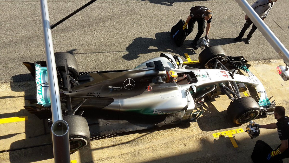
C5rRDqaWUAAYPLm.jpg


Gary Anderson (autosport)
There is a certain width you can have the shark fin and Mercedes has taken advantage of that to have an opening. It will be an exit duct for hot air that comes around the airbox area.

Whether that airflow is ducted from anywhere or just from the engine bay is not possible to stay. This will also make the shark fin stronger and move around less.
 
Explanation on T-Bar :

F1 fanatics
During the car’s second runs at Silverstone, while Valtteri Bottas was at the wheel, the W08 sprouted an additional narrow black wing between the rear wheels. This is within the box region of the shark fin so it would be legal. One possible use for this would be to control the wing tip vortices shed behind to reduce drag/back pressure.
More following that links : http://www.f1fanatic.co.uk/2017/02/23/w08-technical-analysis-of-mercedes-new-car-for-2017/
 
The Merc looks so much better with a shark-fin, still not the best looking imo.

Fascinated by whole T-bar debacle. i reckon that whole area around the shark-fin will be the key talking point with regards to aero this year. I'd imagine many teams will slowly start to exploit various loopholes and what not, such as it appears Williams might be trying with those little winglets.
 
Back