- 48,719

- Australia
Seriously, I'm really not biased. It's not great, but looks better than with the camo livery.
Doesn't look bad at that angle.
If anything, the Ford logo looks huge. Maybe on purpose, because as long as the wings are black, it looks fine. Gotta see it on tv and in the metal.
Edit:
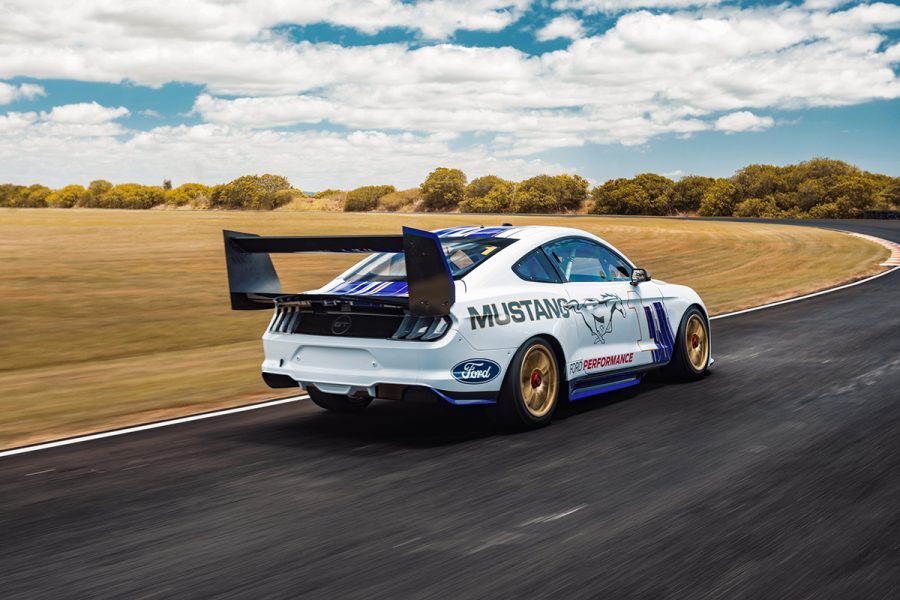
JIMINI CRICKET! That WING!


Such a bad angle. Probably the #6 Monster Energy car will look best, in matte black.
Doesn't look bad at that angle.
If anything, the Ford logo looks huge. Maybe on purpose, because as long as the wings are black, it looks fine. Gotta see it on tv and in the metal.
Edit:
JIMINI CRICKET! That WING!
Such a bad angle. Probably the #6 Monster Energy car will look best, in matte black.
Last edited:


 Car 15 top 3 quarter
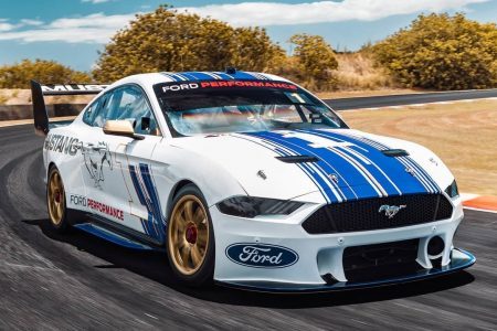

") .
. 7AP_7932
 car 15 Frt 3 quarter tight high