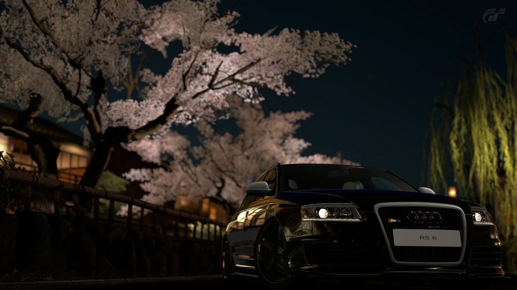
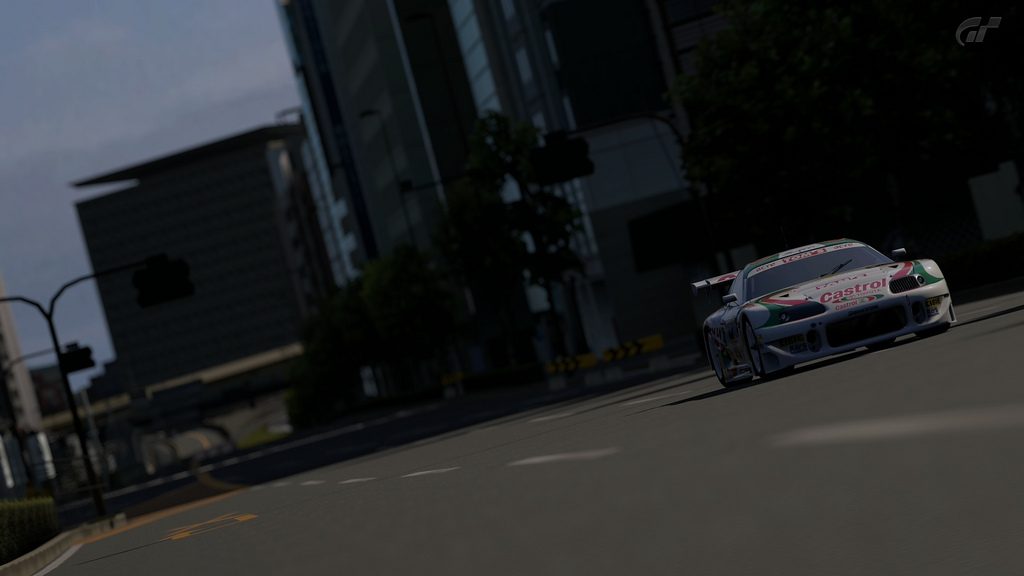
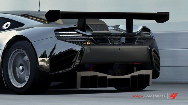
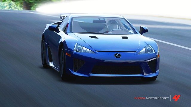
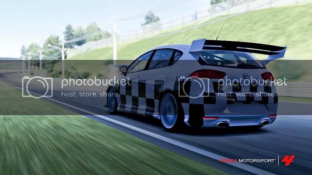
The shot is good indeed. However, I think it's better for the fact that it finally shows me what I don't like about the FM4 graphics engine. I think it's mostly on tracks built for previous games (the new tracks made for FM4 are much better) but the white balance (aka color temperature) of the environments are waaaay too yellow! Add to this the lack of deep blacks and low contrast, and it just isn't pretty.
So. I've fixed it in photoshop. Maybe nobody will agree with me, but here is the result:
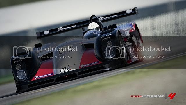
All I did was increase the black level and contrast, and took the color temperature down some. Then added a bit more exposure to compensate, and voila! I think it looks so much more real and sexier. Hope the original poster doesn't mind!
edit:
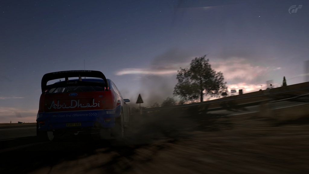
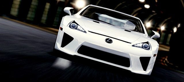
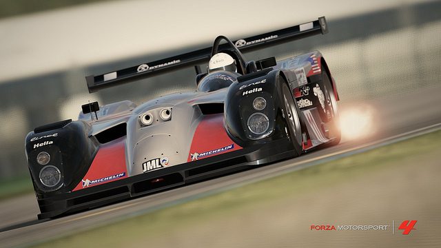
Another one that I thought had fantastic potential if the light/colors were better:
After going under the knife (same modifications as above)
It's never going to make up for the vastly superior rendering and lighting engine that GT5 has (I swear it's just as good as a ray-trace from 3DS max sometimes) but it certainly helps.

")