Collection of photos from GT5 and Forza 4.

  • Thread starter RedSuinit
  • 130 comments
  • 16,699 views
Oh, well I suppose this belongs here as much as any other thread:


(click on image for full-size)
_______________________​

Ideally, I will be mixing both games images together on the same pages, so this will definitely be a new challenge...

I got rickrolled...:lol:
 
I still keep checking this to see if its a real pic with forza watermark and i'll look like a right turnip...but its defo from forza.....got to admit. its stunning...


6724037061_ca3c11f9e9_z.jpg

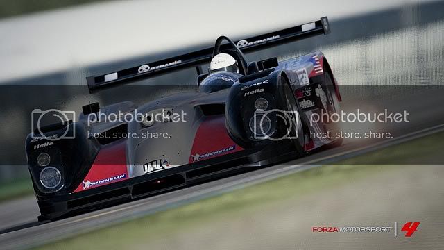
The shot is good indeed. However, I think it's better for the fact that it finally shows me what I don't like about the FM4 graphics engine. I think it's mostly on tracks built for previous games (the new tracks made for FM4 are much better) but the white balance (aka color temperature) of the environments are waaaay too yellow! Add to this the lack of deep blacks and low contrast, and it just isn't pretty.

So. I've fixed it in photoshop. Maybe nobody will agree with me, but here is the result:

panoz02.jpg


All I did was increase the black level and contrast, and took the color temperature down some. Then added a bit more exposure to compensate, and voila! I think it looks so much more real and sexier. Hope the original poster doesn't mind!

edit:

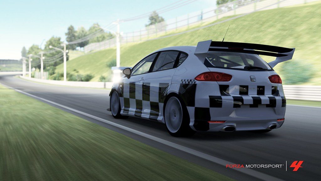
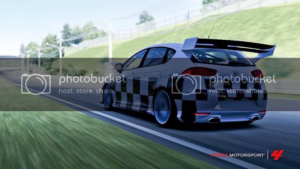
Another one that I thought had fantastic potential if the light/colors were better:

6753622837_ea91c9b9ae_b.jpg


After going under the knife (same modifications as above)
seat01.jpg


It's never going to make up for the vastly superior rendering and lighting engine that GT5 has (I swear it's just as good as a ray-trace from 3DS max sometimes) but it certainly helps.

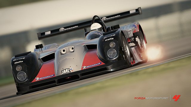
Everything you changed in both those pictures could be done 100% better while using the in game photomode and no editing. It all depends on the photographer really.

The reason those photos look like that is because it is the settings, not because of the game. The pic has a sepia tint to it thats why it looks a bit discolored.
 
Back