That Toyota looks great! I wonder if the brakes work on it...


Heh thanks a lot man. I liked this one a lot too. I really like the two before it but they didnt have the same depth of field but unlike the 3rd, they show more driver action. Then again i really like the way the driver leans into the turn in the 3rd caterham shot.The third Super Seven pic gets my vote. Good composition, good DOF, good shutter speed and the model could pass for real, especially at thumbnail sizes.
Dankereally cool photos 👍
")
lol i did mean competition. I guess both were on the brain (some really good work in it so far too (the tournament)). Thanks! Yeah, the 6th one i was really just playing around at first. I like to go for half saturated images sometimes but I think i flubbed and left the bg with a little color. Thought it looked interesting and brought out those colors a little more.You meant 2.0 competition not tournament, right?
I like the rear shot (4th) of the drifting Caterham. 6th is interesting too, because the car has been desatuated, but the wall has been satuated.

Heh. Thank you man! I too for some reason am very attracted to that one. I think you may have given me the inspiration to clean it up a bit more.I just love this shot. The execution is terrific.
Just and OLD shot that I did briefly today might work on it a little more later. I think im going to go back into the vault and post a few old shots soon:idea:.
*Picture*
")
New update in line with the latest unedited competition
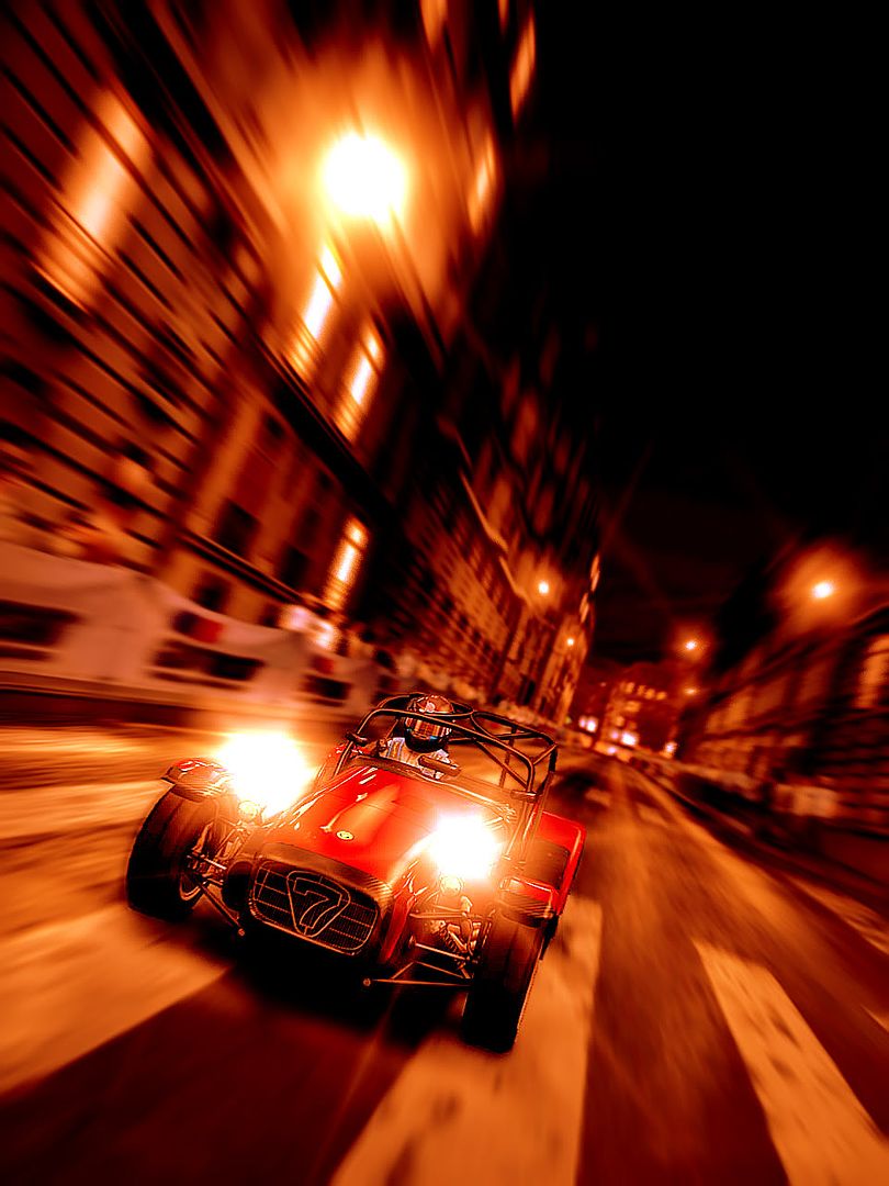
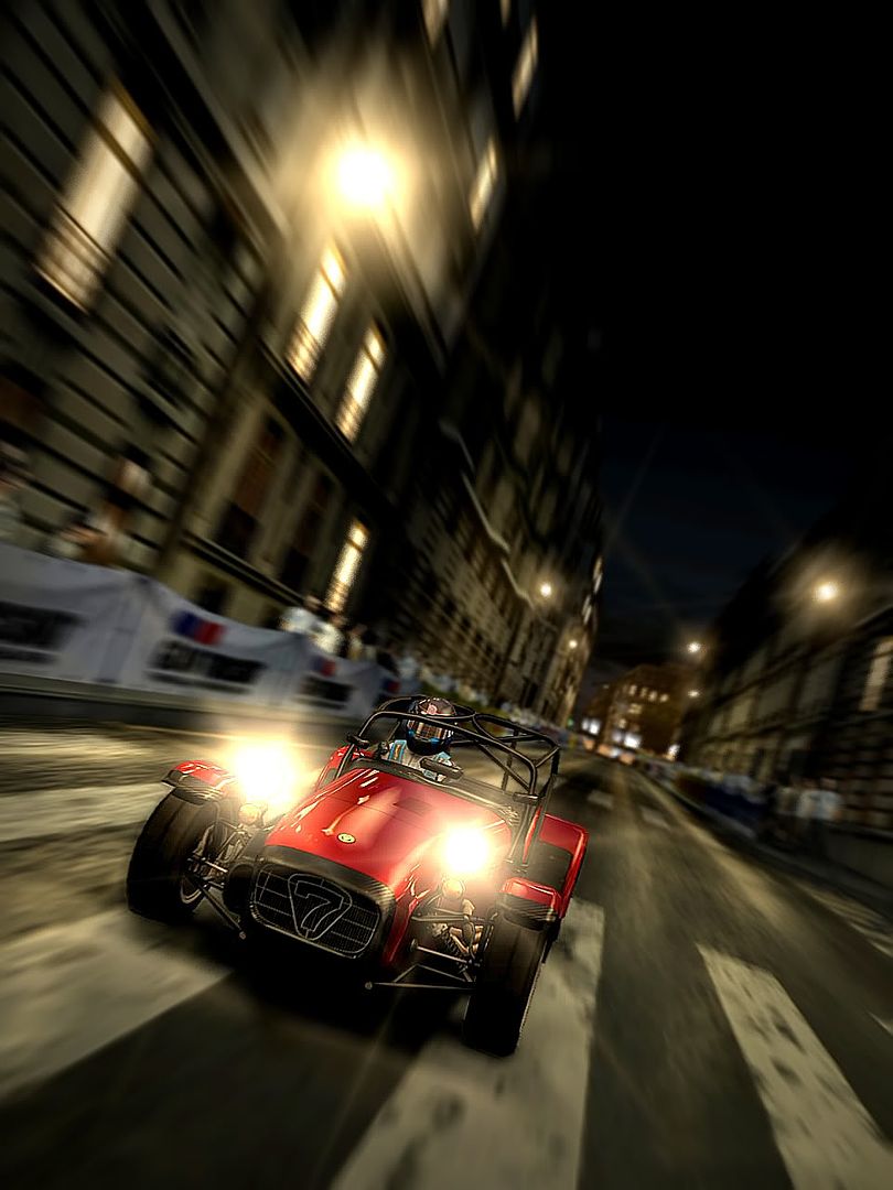
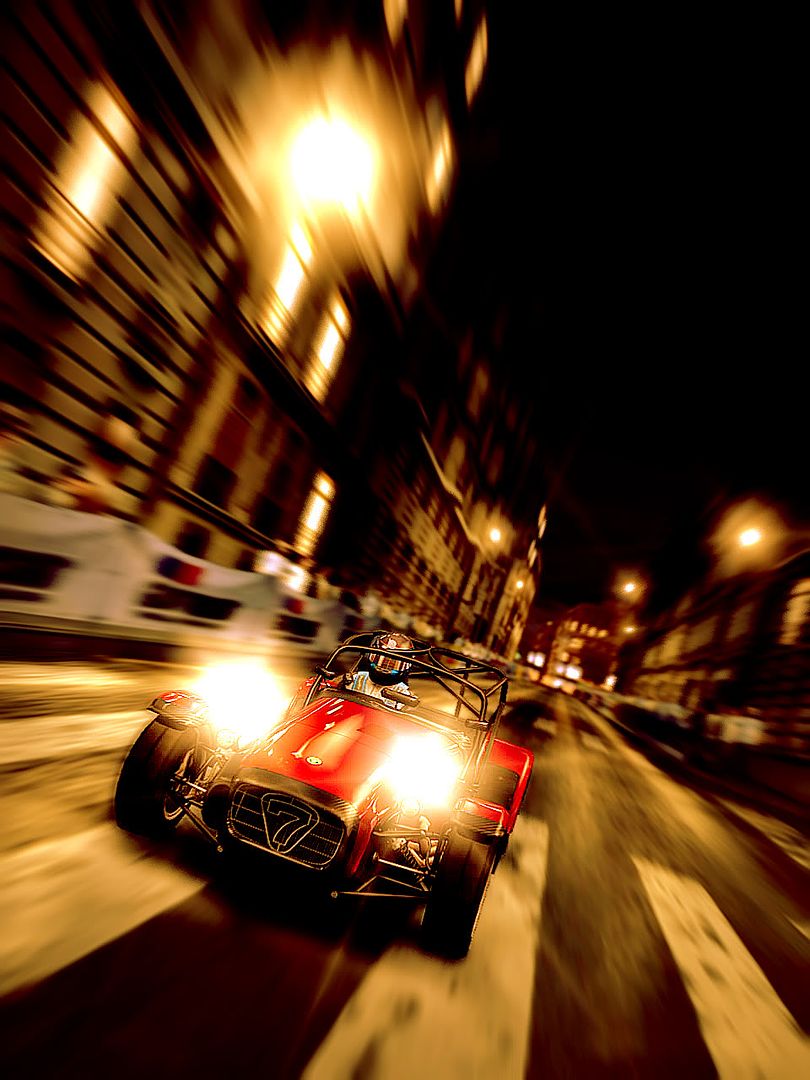
A 7 In Paris
Click on each panel to see different versions
*Pictures*
New update in line with the latest unedited competition
A 7 In Paris
Click on each panel to see different versions
Thanks. This one was a pretty quick/rough edit of an old picture i really liked. Believe it or not but the background (railing/track) is actually blurred slightly. I didnt want to make it like the car was going into hyper space but i can see how a little more would help. Ive already finished the re finish of it but it just needs a few final touches.This one looks good. Cleaning up the car is a good idea, but you may also want to blur the background, because it looks a bit weird having the car in motion, whereas the background shows no motion at all.
Nice presentation. I like all three versions, but if I had to choose I'd go for the first one (left), because of the warm colours and nice contrast (It is given in the other two pictures aswell, but it's more present in the first one). 👍
Great picture man, good sense of motion and it's also really nice that the picture has three different colours in each position, left, middle and right. those three colours are working as if they depict three diverse worlds/things of France in constituting one whole picture. Thus it's like the front cover of GT2,(It had a few different colors if I my memory serves me correctly) Excellent job
That "7 in Paris" pic is real nice. I like the motion and the 3-in-one picture.
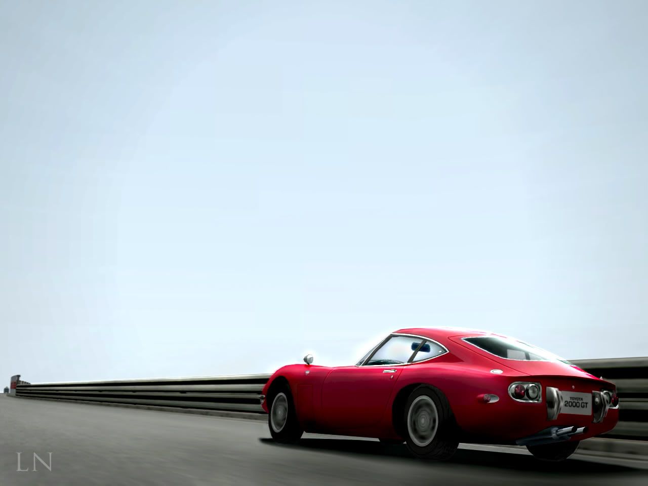
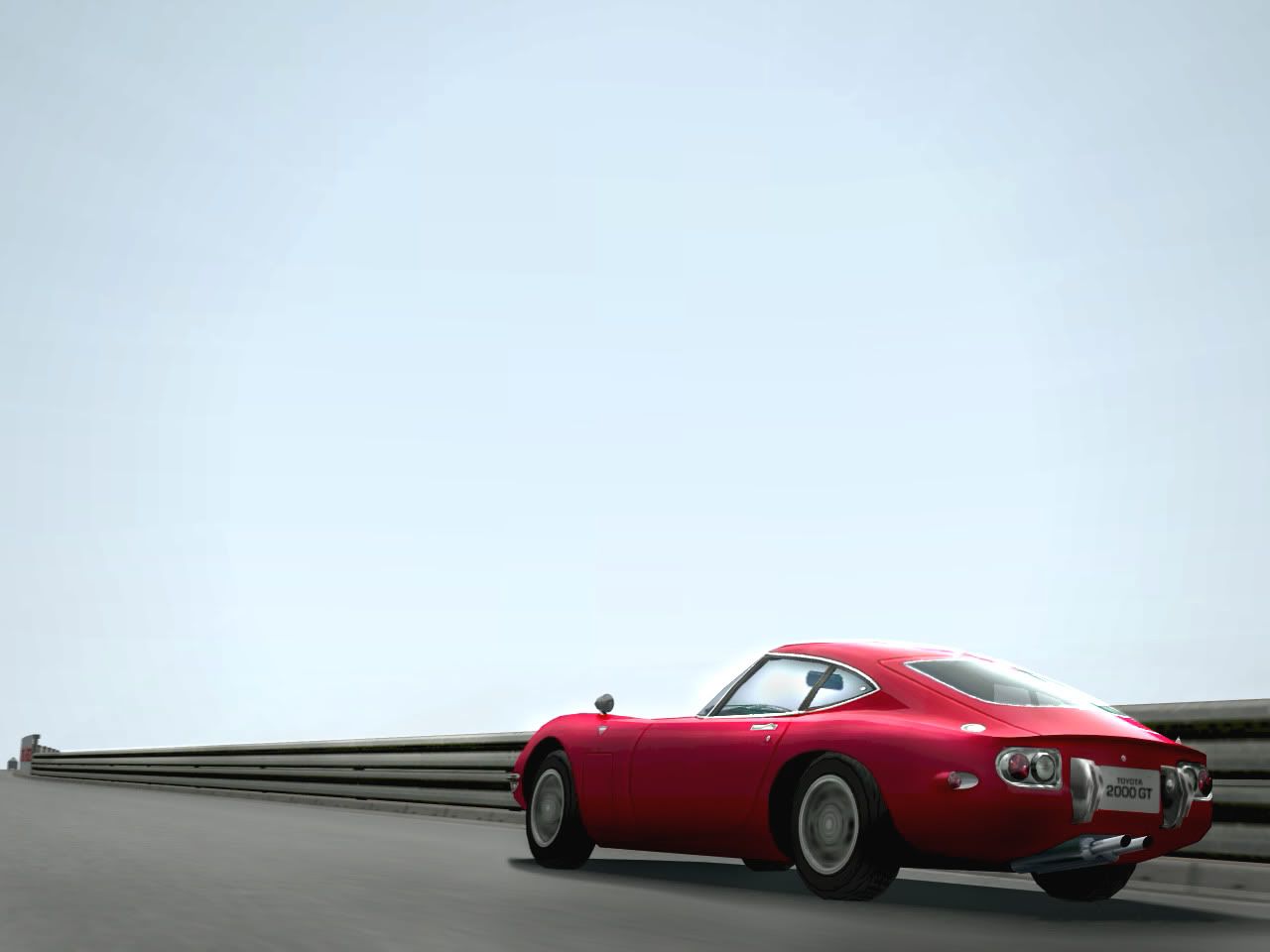
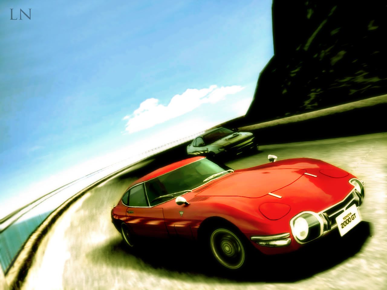
Beautiful work with the 2000GT
Beautiful! lol thank youBeautiful work with the 2000GT
Thanks Phantom. Im glad a couple people had something to say about it because it would have taken a lot longer to do itI agree. Good editing work. 👍
Heh, thanks YB! So you like the composite picture more than the individuals (if you click on each you get to see each of the three versions)? I actually forgot about a cool tone version. That would be perfect since i already have the red and "white" panel. I could definitely make one where the last panel is blue to represent the flag as well. Brilliant idea.
Merci
Holy crap, these are awesome pics. 👍
Yeah, I like the composite version of the picture that has three different colors better than just an individual picture composed of only one. It can make a peculiar mood like the individual doesn't have.
And, as always, nice work with your 2 pictures of the 2000 GT you updated after my last post I made in this thread. 👍
 . I decided to mod her up and take her for a spin and got a little creative along the way.
 great pic Mr. Nicon
Just and OLD shot that I did briefly today might work on it a little more later. I think im going to go back into the vault and post a few old shots soon:idea:.
AWESOME! Great blur.
You know, I know it's photomode and all, but GT4 still had some pretty awesome vehicle models.
This is awesome shot man! Great done 👍
Here's a little bonus
pardon the double post
That is what most people refer to as art. 👍