- 12,486

- CCS
- GTP_Diego
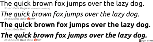
I use Arial for most things, think I need to broaden my font knowledge!
As long as you can stay away from Papyrus, it's all good
I use Arial for most things, think I need to broaden my font knowledge!
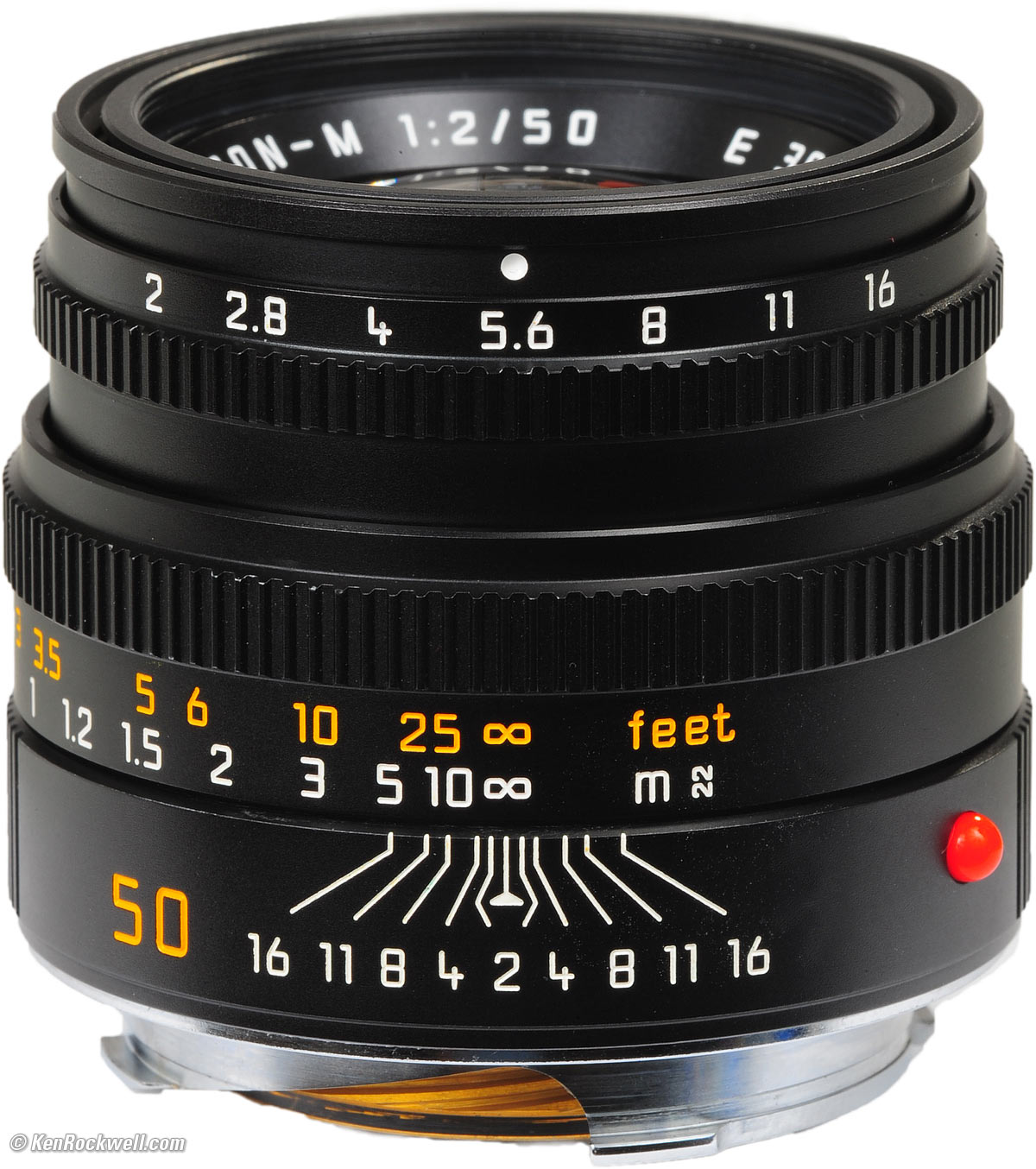
I was going through some of my camera stuff and noticed a Leica brochure in my stack of manuals. Leica's font is pretty sweet - especially the '8'. Anyone have an idea what it is? Googling didn't reveal much.. (image links to larger version)
I actually dug this thread up to post that very comic, as Hipster Hitler is hilarious. But I'll revive it because there needs to be more discussion on typography.


www.CaniBeat.com uses it, too.
IIf anyone's employer demands that they use a kiddie typeface and want something more bouncy and comic-like, check out HVD Comic Serif Pro. It's free (although may be CC non-com) and is a great substitute for MS Comic Sans.
I still need to watch Objectified!


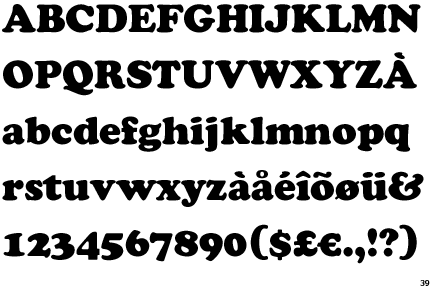
The slab serifs for all the applicable letters make the naked 'M' and 'W' stand out to me but I understand the reason for the omission. Other than that, I give it a 20/20.So... now that you're all here? Comments?


")