Get your pics rated by a Professional

  • Thread starter Thread starter MuFF
  • 178 comments
  • 7,047 views
GT4_Rule
The thumbnail not working!!

Anyways

One of my earliest shots:


i would like to see more from the side of the car.

el flexo
hi, could you tell me how good or bad this is please?


cheers

not a bad pic, could look better if the height of the camera is a little higher.

MK2golflover


Check my topic for more if you like:sly:

Not Bad! I love the 2nd one! 👍

Dorifto~Dan

you need more motion on the 1st pic, turn the shutter speed to a slower speed

show the whole car for the 2nd pic

3rd pic is fine. 👍
 
Speed Racer 12
I got another one for ya.


It'll look best with sharper colors like red and orange.


sejtur
I wont ask you to look for a fav through my whole gallery ( :p ), so please rate this:


my favorite pic up to date! 👍 👍 👍 👍 👍

Neoman15M
hi!!Are these photos.............??(I can't find the right word)
Photos!!!All drifting coz i like the screams of the tyres......
Mitsubishi i
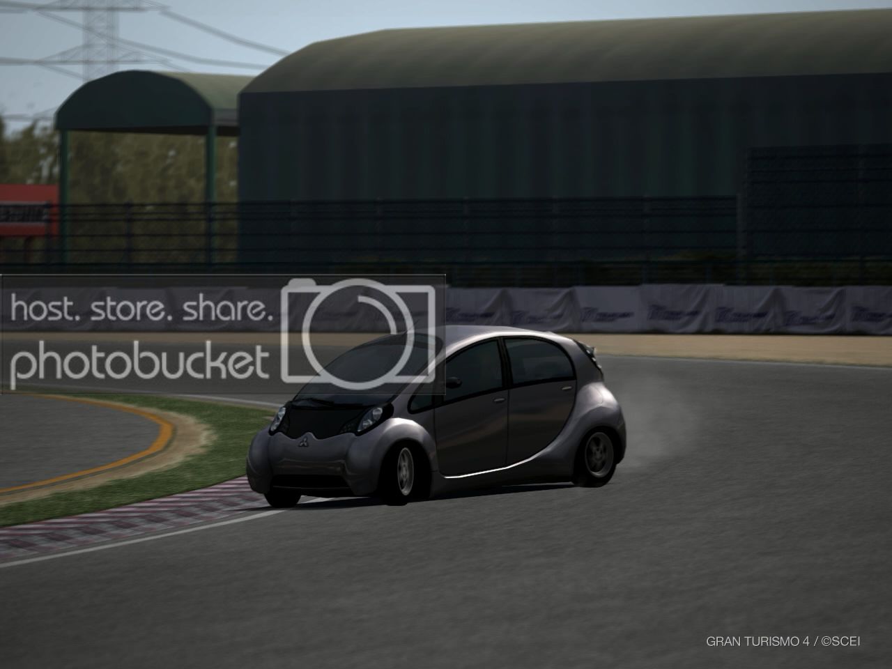
IMG0003.jpg

Opera 350Z
IMG0007.jpg

There are more photos of mine in my thread.......drop by if you have time......
https://www.gtplanet.net/forum/showthread.php?t=78620

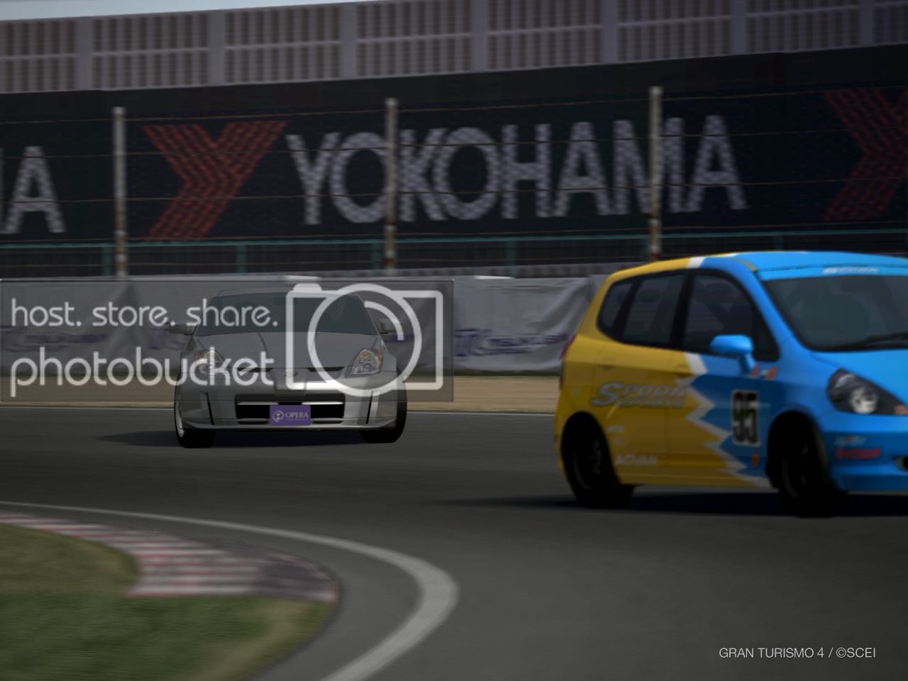
the car in the 1st pic don't stand out as much, otherwize you'll have a good pic!

2nd, should only focus on the 350z. Especially when the 350z is silver and the fit is blue and yellow. The attention goes to the fit even when it's blured.

FPS_nOOb

Last 3 pics are great. The first one though need more shadows in the front.
3rd pic is really nice!
 
kipo12
sxol7m.jpg


what do you think of my TRIAL celcia SS-II?

what's with the wheels? you need BIG BLING BLINGS :D
Other than the white balance, i think it's fine. It's a good pic! 👍
 
Div is back
You have not rated my 2 pics.

Sorry, i've posted one and it didn't go though. I love your pics. The cars are too shiny imo. Might be cool, but it doesn't look real :P

throttlehappy
our told me why the rx shot is your favorite

Damnit! I wrote a long paragraph on the camera, and now it's gone. However, i'm still going rewrite ONE part for you hahaha. You owe me :sly:

Composition is the main reason i like this pic. Especially when you use the white car in front and a less attractive black at the back. Makes the main object stands out. The way you placed the pictures are really good. No exaggerated angles. etc etc.

FPS_nOOb
One more for the hell of it... diff. rims.


a little blown out, but otherwize it's 👍

X Man
here's mine
][/URL]

on the first pic, you might want to move the viewfinder a little higher. The floor isn't that interesting :P A good area to place your car though.

The 2nd was supposed to be a boring pic, but the backfire made it stand out. 👍 a little camera height would be good!
 

I really appreciate your thoughts on it mainly because, I wanted it to be a pretty shot in the first place.
 
FPS_nOOb
:odd: Blown out?
I think he means focusing towards the ground to much. He wants' to see more of the buildings and sky. And not the ground (that's where the car belongs :lol: )
 
hey man..care to rate my pics again? :)

these are from my old updates.. :)


thanx for the info rikaro
i still dont think its my best though

gt4 rule - i rate that ss lovely :)
 
Could become interesting to post 2 pics of my gallery up here:tup:


2 of my best pictures, but I wonder if they're as good in a professional point of view too.
Could look WAAYY too dark if you have an old monitor though.
 
your doing a great job rating with the amount of pictures you get
 
Here's a few of mine, please tell me what you think.


By the way, have you got any tips when it comes to finding different/new compositions, so that you don't get stuck with the same angles etc?

Best regards,
Ajrik
 
R32mania
hey man..care to rate my pics again? :)

these are from my old updates.. :)


both pics are hot! Love the first one. Might want to move to the left a bit. Good work!

GT4_Rule
My old pic:


the background on the 1st pic is not smooth. In photography terms it's called a bad bokeh, because it's not smooth (lense flaws) Otherwize 1st 2 pics are good. Last one you would want to bring out the main object.

throttlehappy
thanx for the info rikaro
i still dont think its my best though

gt4 rule - i rate that ss lovely :)

haha you won't even like my pics. My pics are boring ;)

FPS_nOOb
Ok thanks Rikaro... One more.


good shot! What you need now is turn the shutter speed a little faster to make it a little sharper. 👍 👍

that's all for now, i'm buzy :(
 
Thatman

I really appreciate your thoughts on it mainly because, I wanted it to be a pretty shot in the first place.

a little higher shutter speed on this would help. In real life you will not be able to turn up the shutter speed in this situation.

Niels
Could become interesting to post 2 pics of my gallery up here:tup:


2 of my best pictures, but I wonder if they're as good in a professional point of view too.
Could look WAAYY too dark if you have an old monitor though.

I use a LCD, and it's color calibrated. You might want to get yours calibrated also to get an accurate color and contrast.

I think this is the 4th time i've mentioned this. Black cars in the dark is the hardest thing to shoot lol. Both are pretty good, but you should make the less contrast on the first one IMO.

X Man
your doing a great job rating with the amount of pictures you get

I think you guys should donate me a DFP, or sponsor me a new camera :P
I used to get paid doing this you know hehe :D

Ajrik
Here's a few of mine, please tell me what you think.


By the way, have you got any tips when it comes to finding different/new compositions, so that you don't get stuck with the same angles etc?

Best regards,
Ajrik

Most pics are fine. You might want to check the 110kb one though. The white is actually captures more attention than the s2k. You could add more saturation on the s2k to make a brighter orange or if it was me i would just focus on the white bimmer instead.
 
Hi Rikaro,

I've never really used photomode at all until last week's WRS race when I needed to get some pictures to justify my strange choice of car!
I'd appreciate your comments on my very amateurish efforts, and bear in mind in most pictures I was trying to showcase the car, not the scenery.

You can find them in this post.

If you'd like to repost any of them here with your comments, please feel free to, so that everyone else can see what you're talking about without having to open up the link.

:cheers:

Smallhorses
 
Rikaro
I think you guys should donate me a DFP, or sponsor me a new camera :P
I used to get paid doing this you know hehe :D

That was a smooth way to put it, you just want to get the allmighty DFP:lol::p
Nah really, thanks for the comment. I delibiratly chose a black car in the dark, in order to erase the car's shape, and focus more on the reflections and tiny details , making it more interesting. Hoped it would look more like "wow whats that for a car?!", like you sometimes have in real life. Just pure guessing work though, I know 0,000nothing about composition rules in real life, so I could be very very wrong there;) The contrast is increased to make my gradient trick work. If you add a little bit of gradient, everything looks like that color and the very white and very dark areas are gone, so I increase contrast with 30 more then again to make the light blue turn into proper WHITE again;)

Edit: Here's an example of different tones of blue gradient, achieved by increasing contrast and messing with levels after applying the gradient.
vette9preview5gd.jpg


No picture came out as well as this example for me so far (had some better pictures before although this one still looks nice IMO, but I'm talking about the technique:))
 
Back