You are using an out of date browser. It may not display this or other websites correctly.
You should upgrade or use an alternative browser.
You should upgrade or use an alternative browser.
GT Sport - Trailers, Videos and Screenshots
- Thread starter sk8er913
- 17,667 comments
- 2,013,159 views
- 2,236

- Lima
- gohan_girabyt3
- gohan_girabyt3
I don't think they will. I mean, it's not that all PD crew will go to LA, I think only Kaz, Translator-San, and the snapchat guy (for the social media) will go to do the conference, same for Gamescom if PD decides to goIf PD will skip E3 I would say they are really serious about the release date and that's a good thing. They have lots to do...
- 2,789

- mount doom
- coilerdh
- no.no.
I think Soony has a megaton and thats why they are pushing things aside. Pushing Horizon for early next year its just making room for something bigger.I don't think they will. I mean, it's not that all PD crew will go to LA, I think only Kaz, Translator-San, and the snapchat guy (for the social media) will go to do the conference, same for Gamescom if PD decides to go
- 3,278

- France
Please add more flags, heat haze and Feeder. I think it's the first time we can see the evolution of a GT game.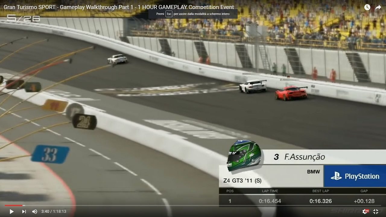
E3 build
Finally, they got rid of that grayish palette. Now it feels like GT3
Castrol96
(Banned)
- 2,899

- Southampton, UK
Please add more flags, heat haze and Feeder. I think it's the first time we can see the evolution of a GT game.
Now it feels like a continuation from GT3, in graphical terms not that the 4 and onward were bad.
- 3,278
- France
GTsport is beautiful but it looks too clean IMO, too sterile when GT3 had "warm" graphics.Now it feels like a continuation from GT3, in graphical terms not that the 4 and onward were bad.
And why the IQ seems so bad?
Castrol96
(Banned)
- 2,899
- Southampton, UK
GTsport is beautiful but it looks too clean IMO, too sterile when GT3 had "warm" graphics.
And why the IQ seems so bad?
What is IQ?
TRAILER 2 BUILD
E3 BUILD
- 13,740

- Adelaide
- Neomone
E3 build
Finally, they got rid of that grayish palette. Now it feels like GT3
All they did with the colours was fiddle with the contrast. You could do that on your TV.
- 11,332

- The 51st state of america
- sparkytooth50001
Just realized the car used to drive itselfWhat is IQ?
TRAILER 2 BUILD
E3 BUILD
- 6,967

- South Africa
What is IQ?
...I'm wondering about that as well. Some kind of graphical tricks used by devs? Frankly, half the time I've no idea what these acronyms stand for...
- 11,332
- The 51st state of america
- sparkytooth50001
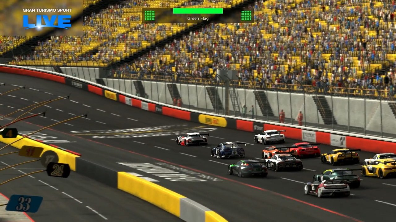
That's some work they added over 2 weeks, defined lanes, coloured lines, red barriers, pit lane barriers are coloured now, larger crowd. Nice.
E3 build
Finally, they got rid of that grayish palette. Now it feels like GT3
Castrol96
(Banned)
- 2,899
- Southampton, UK
All they did with the colours was fiddle with the contrast. You could do that on your TV.
The texturing is different and TV contrast does 🤬 all.
")
- 13,740
- Adelaide
- Neomone
The texturing is different and TV contrast does 🤬 all.
I said colours, not texturing. They changed the road and barrier textures, but you can also see the difference in things that they didn't change, like the colour of the stands or the signs in pit lane.
If your TV contrast does 🤬 all your TV is broken.
- 1,089
All they did with the colours was fiddle with the contrast. You could do that on your TV.
It is the texture, texture filtering that makes the new one stand out. 3 weeks one looks blurry in comparison. Someone posted a gif in other thread. It is easily noticeable in it
Last edited:
Castrol96
(Banned)
- 2,899
- Southampton, UK
I said colours, not texturing. They changed the road and barrier textures, but you can also see the difference in things that they didn't change, like the colour of the stands or the signs in pit lane.
If your TV contrast does 🤬 all your TV is broken.
Nah mate, I have a 4K TV and again it just does 🤬 all.
- 165

- Zagreb, Croatia
- Filip_JDM
...I'm wondering about that as well. Some kind of graphical tricks used by devs? Frankly, half the time I've no idea what these acronyms stand for...
I think IQ just stands for image quality xD
IQ means image quality, it specific how sharp it isWhat is IQ?
TRAILER 2 BUILD
E3 BUILD
Often we tell it by looking at AA (anti aliasing)
But talk about IQ, it s not so bad, some games have more aliasing than GTS
- 13,740
- Adelaide
- Neomone
It is the texture, texture filtering that makes the new one stand out. 3 weeks one looks blurry in comparison. Someone posted a gif in other thread. It is easily noticeable in it
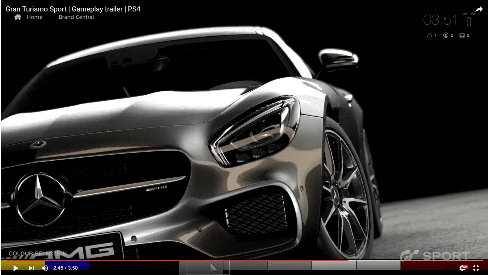
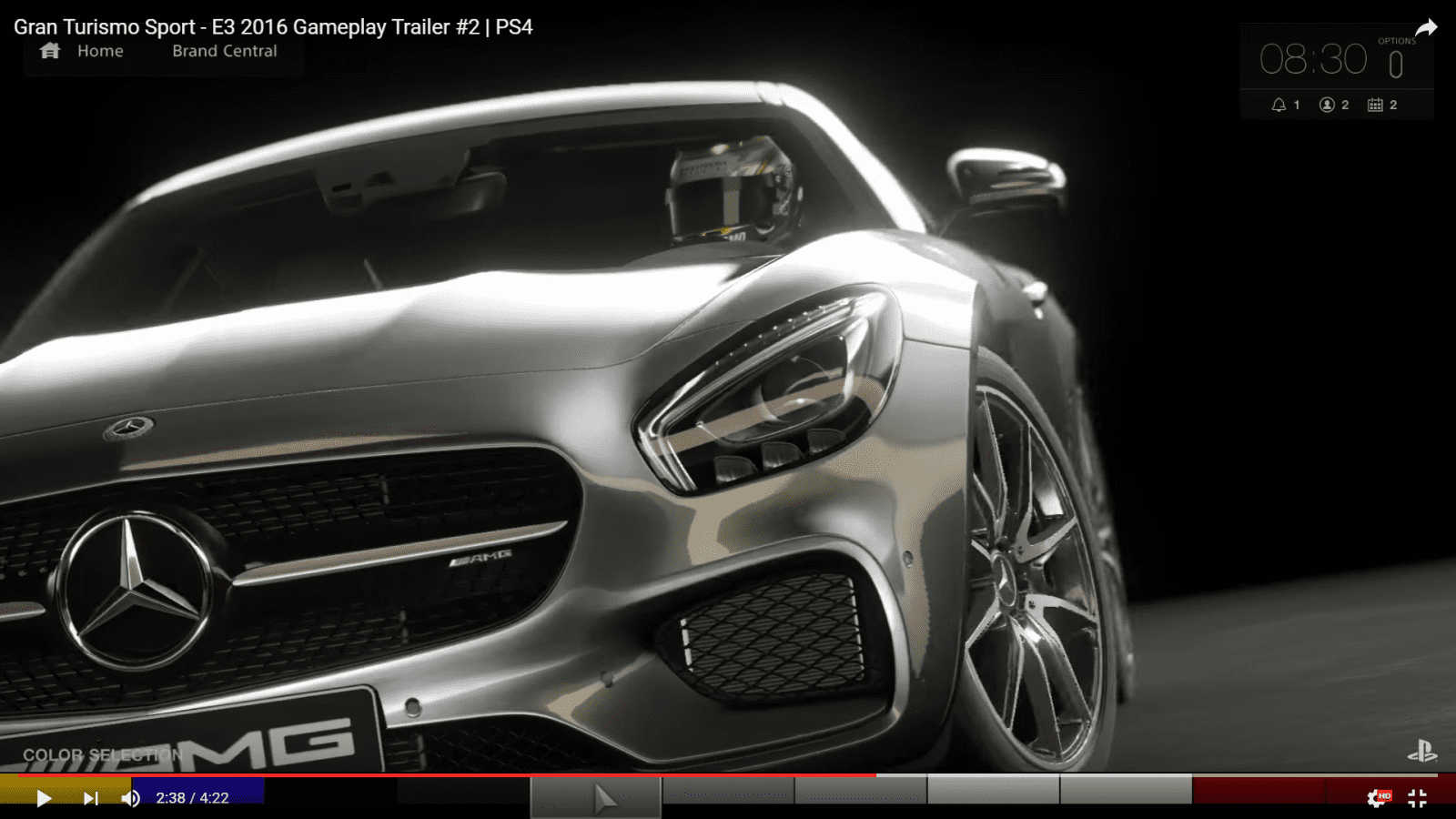
Can you seriously not see the difference in the colour of, say, the 33 sign in the foreground? That's not filtering, that's a different colour. And since the whole scene has similar colour differences, I say it's a contrast adjustment rather than an actual colour change of every single surface.
- 1,537
- GTP_Soundtrack
Hue is pretty similar, saturation and brightness changed. Pics from the second trailer show black point and white point clipping too. This could be the result of different capture settings, or even file export options. There appears to be some tuning in the gamma too (AMG shot), could be a potential hint of Neo version working in extended dynamic range. Not a big fan of the blooming highlights, hope they don’t fill the whole game with it.
- 319

- Co. Down.
All they did with the colours was fiddle with the contrast. You could do that on your TV.
No offence, but I find that comment ridiculous. They have improved the visuals greatly.
Unless it was humour, if so then Good One, ha ha.
- 13,740
- Adelaide
- Neomone
No offence, but I find that comment ridiculous. They have improved the visuals greatly.
The colours. All they did with the colours. I didn't mention any of the texture updates or remodelling which are lovely and needed, I was simply replying to a comment that it didn't look as greyish any more.
Yeesh, you'd think people would read instead of just jumping in with both feet. I find that ridiculous.
- 15,126
- Melbourne
- ScottPuss20
- CheetahsMeow
It's pretty clear to me that PD still have a lot more to offer us and what are seeing right now is not indicative of the final product. I like the way that they are showing their progress, it only makes more excited for the full game.What is IQ?
TRAILER 2 BUILD
E3 BUILD
- 319
- Co. Down.
The colours. All they did with the colours. I didn't mention any of the texture updates or remodelling which are lovely and needed, I was simply replying to a comment that it didn't look as greyish any more.
Yeesh, you'd think people would read instead of just jumping in with both feet. I find that ridiculous.
My mistake, it wasn't humour, ok.
While many of us were impressed by the visuals and atmosphere of most recently shown videos and images from GTS you suggested nothing was worth applauding and stated that we all could achieve it via our Television sets own contrast settings. To think that PD are wasting millions of Pounds in development costs when all they need to do is implement the core of the game and instead of polishing it give us a manual on how to adjust contrast settings.
My mistake. Sorry to jump in with both feet.
Now I'm going to boot up Skrym on PS3 and adjust my TV contrast and image settings to see if it compares to the PC modded versions.
- 616
It is confirmed, Kazunori is going to be present this week in Los Angeles and they'll show new gameplay videos during the Live Cast.
Can't wait for this E3, even if PD fails with the game, there is going to be a lot of content from Sony, as always")
http://blog.us.playstation.com/2016...of-motorsport-gran-turismo-sports-e3-trailer/
Can't wait for this E3, even if PD fails with the game, there is going to be a lot of content from Sony, as always
http://blog.us.playstation.com/2016...of-motorsport-gran-turismo-sports-e3-trailer/
- 4,992
- Nowhere special
- SweetLilPoppet
- SweetLilPoppet
Please show rain.