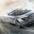
JFM presents +Carbon Skyline, umm..a Mazda, Skyline+ 5/29/07

  • Thread starter Thread starter JFM92_GTRacer
  • 548 comments
  • 25,568 views
Thanks. I really need some help with PS. OBVIOUSLY, i added blur to the 3rd shot but it's too noticable and i dont like it. Do i sharpen the shot a bit more?
 
Try getting rid of the water mark.

I like the Silvias, great angles.
 
wow, you got some really nice work there jfm, get a good feelin lookin at that, i like the skyline pic too, great job!
 
Very good update of the silvias 👍. I like the 2nd. Impatient for the next update, there will be impresionant :)
 
Bit too blurry for my tastes, but if I look past that, the shots are cool.
 
^Thanks for checking PB. Should i sharpen them??? What should i do to get that "clean" shot? Contrast?
 
I really don't know, I thought you blurred them in ps. If they were like that from the game, then i dont know what to do. I thought focusing on the car would be enough. Works for me.

I don't think sharpening would work unless it was sharp from the game.
 
well, i can look right through the shots with my keen eye for ps, and i see a good start, but bad choice of editing. Too soft, too blurry, not crisp, and some of the shots showed the worst of PD's graphics, that car really has potential at that great course, i believe sejtur did an update with the very color, and he kept the BG blurry, and left the car nice and crisp, actually, i asked him for a shot to use for wallpaper, here it is, courtesy of sej, take a look at how the BG is super blurry, car crisp, and he wasnt even moving fast, just gotta get the aperature down!

 
^That shot looks untouched.
Thanks for the help PB and Cuda. 👍 So never soften the car? Contrast? I can tell that i should never oversaturate the shots. AND one more thing how do you like that first shot? No blur and my best adjusting...
 
In the first shot the car looks long for some reason, but the colors are the best out of the whole update IMO.
 
^Thanks. I'll get back and retouch these shots.
BTW im fina get me a Skyline GT-R Nur edition.
 
about the first one, it is a very generic angle, and it also puts too much perspective in the pic. Its easy to be fooled by shots that look like they are making the car look nice by including a lot of BG, but sometimes they make terrible godforsaken pieces of mortified devil feces and such.
 
The first one is clean and crisp, but it looks awkward.

The rest of them look blurry. And remove the wing.

On parts that look pixelized and "dirty", get out your selection tool, set the feather at 3 or 4, and blur the dirty parts away, and now it looks clean in that area. Do the same with other dirty areas, but don't overdo it. And don't blur any defining areas, like the edges of the door or the hood. And after that, use the sharpen filter to make them nice and crisp.
 
Nice gallery JMF 👍

I just browsed though it all, your pics get better and better. Keep up hte good work man!

I really like the Zonda pics, and the Ford GT at El Captain
 
Good gallery man but there are some pics what don't have much brightnelles. Nice work 👍
 
Thanks Cuda, Duck, Fletch, and chocobo. 👍
I'll definitely use those tips. Dont worry. :) < OH ****! SANTA HATS!!! :dopey: < ANOTHER ONE!!! OH ****!

Here goes something i'm working on right now. I need to blur the hood, or just start from scratch again. ****. WHy'd i oversaturate it???:
 
are you trying to copy me? :grumpy: haha jk but nice pics man keep it up!
 
^Hehe i see. I found what the **** i should be doing now, thanks to tutorials. :) <SANTA HAT!!!

Skyline update


^in need for clicky-clicky. :crazy:


Put :crazy: For awesome
Put :dopey: Good
Put :) For WTF?
 
Damn, really nice pics, I like the first five. Oh and, :crazy:
 
:crazy:

I love shot #1 and #2 with its green tint. 👍 👍 👍

But I think the shot from post #228 looks better than that of post #229. The second one has too much contrast, IMO.

Prost! :cheers:
 
#1 - I haven't seen that angle before in that setting, but it suprisingly looks good.

#2 - The classic angle for wherever that is. Although you should've pushed the car closer to you, so you can get some really cool reflections, but you kinda missed it. :indiff:

#3 - It looks really good, with the trees making it feel invincible, but you should've softened the fences. They're too "jagged", and is an eyesore.

#4 - Select the fender, and blur it. It ruins the pic. Try using the smudge or push brush to thin out the upper-left part of the border of the headlight. If you did that stuff, it would look clean, but it only gets an :indiff:


Also remove the watermark using the clone brush or just cropping it out. I find that the watermark takes away from the picture, not support it.

It may seem like I'm critical right now, but I agree, it is one of your best updates. 👍

:great:
 
First time I'm in here! Great shots man, really good stuff!
The 2nd thumb is just :crazy: ! The fitst picture (big one) is really a killer shot!! 👍

Overall you get a :crazy: !
 
:crazy: 👍 👎 :yuck: :) :lol: I like those smileys / thumbs hehe. This is your best update thus far. I'm surprised the rims you chose because I certainly like them :D They look hella tiight
 
Thanks to everyone who actually took 5 min. to look at this update, AND dont forget about the one at the top too. :dopey:
Duck, i was trying to blur the fender on the shot...but the mouse of my sis's laptop, (u know the one where you use your finger) was being a little b*tch. BUT dont worry because i had that in mind and soon i'll have PS programmed in my computer, which is a good thing. :) <Santa HAT!!
To all the rest, again thanks for checking my best so far. I'll get another update going again.
 
Nice update dude. I like all of the thumbnails. I wish you would have made those big instead.
 
^THanks PB. I really thought the thumbs were boring so i didnt make them big.
 
Back