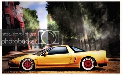
jgda9rs gt4 gallery -PMC Week 190 entry

  • Thread starter jgda9rs
  • 1,904 comments
  • 115,235 views
It is not you at all!!! The good part of it is that the texture of the road is amazing. But the car is uber-blured and the works on it look totally unfinished and rushed. The background looks as weird as the car, with a total sense of incomplete depth of field. There are objects closer that are more blurred than other object further.

I know I am being too negative, but, as I already saw, I know you can and could do ALLOT better 👍


sorry about the double post and the crappy previous update. i was really worn out and felt a bit lost with that one to be honest. hope you guys like this new one.
 
Last edited:
Looks pretty good. Love how it turned out, though. The atmosphere is awesome in this shot. There is a lot of smoothness in there and that's what I like most. The car itself war kept very clean and shiny and that's a great thing! 👍
 
Looks very nice Adrian 👍

Watch out with the body panels though. They're a little bit too dark for such a light and blurry image as that.
 
thanks for the comments people.

MinoltaMan89: this was taken at the clockwise version of seattle track.
at the steep uphill section past the pitlane.

Bram: thanks for the advice :) the dark body panels i felt suited the
picture more. but yeah some of them are a bit darker than they should
be. but i think the position of the lighting and the perspective shadows
from the tall buildings justifies that. i did have a lighter version of it,
but i think the high contrast with the darker shadows makes more
sense to me. in this one i was simulating a street light reflecting off the car's
body. all the while using spot metering ( was simulating real life situation),
hence the darker areas from the background and the body panels. now if the
whole frame was light, then it would've been a different story.

ooh, btw. i should send you the original and see what you'd be able to do with it!
i still owe you that TVR stock. sorry i keep forgetting!

now for my new update. same thing with the previous one, but lighting is a little different. slow shutters, street lights and a bit of an off camera flash. i dont know
if it's correct in all ways with the perspective, but i still like how the background
makes the car stand out.


the wheels were from my last NSX update a page back.

Advanced 2.0 Competition Week 120 Winner :D
 
Last edited:
thanks to everyone that voted for my entry for the last advanced comp 2.0 with the theme "Profiles" i'm glad my buick did well. here is another profile pic, i was gonna enter this for that competition, but i wasn't able to finish it on time. it's not the best of things that i've ever done, but i like it. glad i didn't use this, i dont think it would've won :lol:


and yes, those wheels are from gt4, it's just a combination of two.


the worst update i've done in a long time :(

this has got to be the worst update i have ever done in a long time...
it's just not up to my liking at all.


Problem is the side of the car that is covered in shadows. You've done a great job highlighting areas that are exposed to the sun, but keep that dodge tool away form areas that are not exposed by the sun. The side of the car should not be dodged at all, it's that what brings this picture down so much.

You're doing a great job of highlighting, but keep in mind where the lightsource comes from and which areas are therefore exposed to the sun, and which areas are darkened due to them being shadowed. 👍

problem was, the reflections were already on there with the stock photo. but i did fall prey to dodging them again. i hate these old shots. the roof area and the middle part of the bumper i even brushed because the highlights were too washed out from the original, then i just lowered the opacity. oh wells. if anything i wish i had dealt with the body surface a little bit better. i was rushing to get this in on time. it was a hopeless case anyway for me hahaha. i should just send you the original and you can re-do it. i can't seem to find that TVR pic i was gonna send you anyways. let me know if you want.

SVX: Thanks buddy. yeah the wheels are from a phototravel stock. i admit i didn't do very well here. oh well, there's always next time. great avatar by the way! it reminds me of LRG clothing :D that's a good thing.
 
I noticed your last update is also competing in a photomode competition. Very nice! It looks good!
 
first of all, i wanna wish everyone a very merry christmas and all the best wishes for the fast approaching new year. i've re-mixed one of my older works from when i first started here, before i even had photoshop. i can't remember if i even used this for a competition or not. i was just messing around with ttv texture layers and duotone processing, and thought that this piece would be a perfect application for it. the toning is already, well close, the way it is. all i had to do was desaturate it a bit and re-process it again in photoshop, then add the texture layer. so yeah, just a touch of my old works from the gimp era. sorry about the size. this file's just from my older imagesucks archive that i've managed to retrieve the photos from. expect more remixes in the not so distant future. Enjoy the Holidays and try not to be a pooper or a grinch!

 
thanks guys. yeah it's a bit on the smaller size. i dont have the original
anymore. i just fished that one out from my photobucket stash i think..
can't even remember.

now for the new update, i dont even know what this track is called now.
it's been so long :D i think it's one of the beginner stages.. whatever.
i think it's the autumn ring but i'm not sure.


here it is..

I actually had this for a very long time.. just finally decided what to do with it.
since gt4 is aging fast, i just thought i'd give it a vintage touch with some
black and white, and a film style border and texture treatment.


Back