jgda9rs gt4 gallery -PMC Week 190 entry

  • Thread starter jgda9rs
  • 1,904 comments
  • 115,236 views
That looks great. Really it does.

However if I wanted to add more nostalgia to it, I would try and recreate the GT1 graphics in that picture.
 
I first though that those white things where snow :lol:

I have to echo what others have already said, awesome job there, jgda, great photograph, great composition on it, it's just perfect.
 
this piece of mine has won a challenge at one of the groups at redbubbledotcom today!


and now for my new update. i was gonna use this as an entry for the new and final photomode tournament competition, but it just didn't work as a pmc edit. i dont know
if i still wanna join that event. i mean, if i do end up moving past the qualifying, i dont
think i'll have enough stock resource to continue and have a shot for a specific theme.
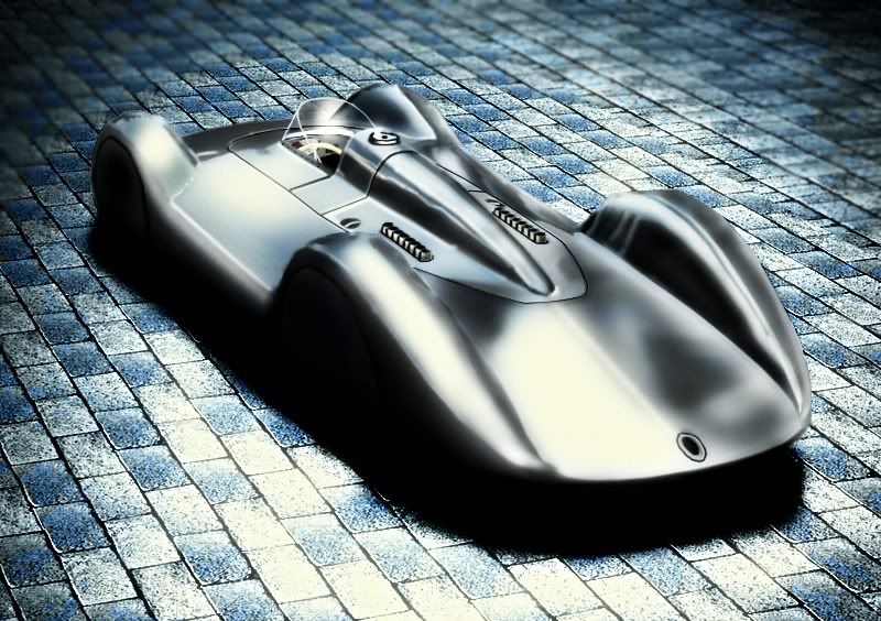
so i think i might just ditch out on that idea. anyways here's the new update, and i hope you guys like it. It's the Auto Union V16 Streamliner from 1937.

enjoy


on other news, i just got a new computer (finally) and will be replacing captain slow pretty soon, if any of you can help point me to a direction on a faster way of backing up files to transfer to a new CPU. any help will be appreciated. i've tried downloading that Norton Clone whatever, and just like their antivirus products, is total rubbish.
Thanks in advance! and enjoy the bday bash update! :D
 
I think I've seen that Auto Union shot before, I think Beerz did an edit of it a couple years ago - here I believe. It's a nice shot, great lighting and tones, but the whole image seems blurry, especially the car. I think it has to do with the way that you clean, oversmudging the car's reflections. Anyway, it's still a great shot, also, congrats on winning the challenge and happy birthday.

Also...you couldn't use it for the tournament, as the unedited version has already been shown in your gallery :P
 
Last edited:
^^ What he said. I love the tones on the ground, but I feel it is allot sharper than the actual car, that is kind of blurry in overall.

The Auto Union seems a bit of a pain to clean, as well :scared:
 
This Autounion is really nice looking. Kinda reminds me some crazy choppers on DA. If I do an editing like this, I would be more careful with the reflection because they are wrong in GT4 in the first place. Rework the reflection would be perfect.
 
MinoltaMan :
ohh yeah... LOL i totally forgot about that. yeah i posted the stock version here before
and got people to have a go at it. either way, i'm screwed even if i wanted to join the tournament. i dont think i'll have the time to work on anymore of these for a while anyways, since my course is already going to take up a lot of my time. anyways may
the best entry win! hope everyone that joined gets a great amount of votes. thanks for
the comments and the birthday greetings by the way.

franz: if you wanna edit that piece, i still have the original. would love to see how it would look, done your way.

for my new update, again, i've probably shown this before too. this was another option that i was gonna use for the tournament, but like i said, there would've been no way to move on if i was able to. just a simple contrast adjustment and some diffuse glow, and just smudged some parts of the body so to speak. so it's probably not gonna be as smooth as anyone would expect. i just like how the colors have that sort of polaroid feel to it. enjoy.

 
Now this shot looks great! Contrast and brightness are set perfectly, as is the saturation. I like the smooth feel to the background of this image. The car is sharp and clean, which speaks for your great editing qualities, Adrian. 👍
 
thanks buddy 👍

here's my PMC Week 190 entry..
just thought i'd put it up here so i dont forget i used it for a comp...

 
Back