The "Rate My Photo" thread! **Read the OP Before You Post**

  • Thread starter Thread starter MSD Drifter
  • 2,388 comments
  • 185,887 views
Superspeedway-Indy_1.jpg


can you guys rate mine ?
 
oops sorry :guilty:

that f40 pic i would say 7.5/10 looks great at back but it would be good if the front was a bit blurry, blurry background is good makes it look like its going fast :D 👍
 
Bump fail.. you're doing it wrong.
Please rate the picture above yours..
Read the OP Read the OP Read the OP
Thanks
 
How about this (I'm a TOTAL noob!!)
*Image removed to save length, but see above post*
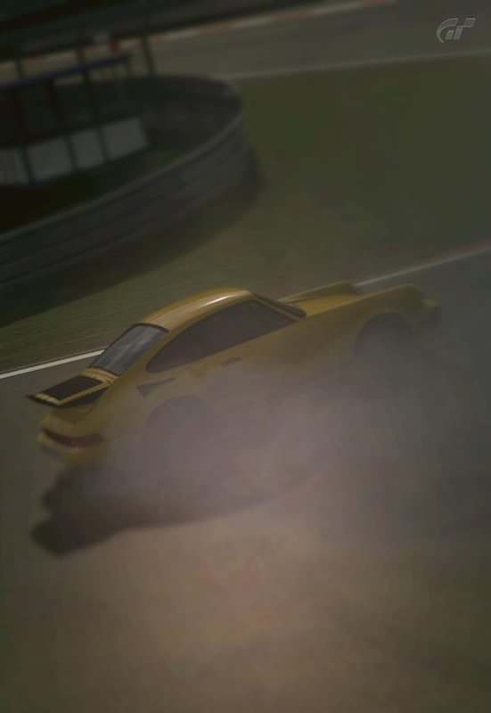
I actually quite like it. White in white. Maybe a bit too much motion for my taste, but simple and aestethically pleasing. 7/10.

NrburgringGP_F.jpg

NrburgringGP_F_2-1.jpg

NrburgringGP_F_3.jpg


You can do them all, or pick one, IDC.
 
@priesty_lfc: I give it a 7/10. I like the sky in the background. It gives a nice atmosphere. You also have a sense of motion, but the overall composition is a bit dull. You don't get a sense of anything really happening in the shot. A different angle and maybe a little tilt on the camera would help. Actually I think just pointing the camera more upwards to get rid of some of the tarmac would help alot. Overall I would say it's a nice shot.

Mine:


So, what's the verdict?
 
@[Nor]MclarenF1

Nice subtle low sun catching the roof, like that.... 7.5/10 maybe just a bit more scenery or zoomed out a bit more would do it for me but its well focused and sharp.


comment(s) welcome.

@breezy23d 'read the OP'.
 
comment(s) welcome.

@CCShaft7 - I think I'd give it an 8/10, I usually don't like the partial colour shots (I'm assuming that you did use a partial colour type filter?) but for me it works because of the neutral colour on the car. It's a subtle colour / black & white mix rather than a brightly coloured car that pops and sort of looks out of place and that's what works for me.

Only thing I might do differently would be to change it from a landscape to a portrait orientation given the tall clock tower in the background, maybe 3:2 size so you can still get the car and some of the buildings.. but I could be wrong :).

Also here's one of mine..
HighSpeedRing_5.jpg


I think it's one of my better ones so far, though looking at it now I almost wish the background was a touch more in focus, but please feel free to critique as you all see fit :).
 
Christoforo - Not a fan of the car but the top image in your set is awesome... my picky criticism and im pushing it at this is the choice of car lol everything else is spot on!

Here's a few more of mine


@Feldynn
Thanks for your comment, I see what you mean about the landscape v portrait thing but that sky was just begging to be kept in, totally get what your saying though.

edit: also with you on the partial colour filter cos it can be a bit too gimmicky and I try to veer away from using it.
 
First my impressions on your pictures...@feld: 6\10 It could be improved if the car looked a bit clearer :) ; @fku: my favourite is the first one, of the gt, very nice and clear 👍

now here are some of mine, please be kind I just got the game a month ago so these are my first pictures taken during online races ;)

nrburgringnordschleife1pe.jpg
[/URL] Uploaded with ImageShack.us[/IMG]

tokyor24620.jpg
[/URL] Uploaded with ImageShack.us[/IMG]

thanks for any comment :sly: bye
 
[Nor]MclarenF1;5086577
@priesty_lfc: I give it a 7/10. I like the sky in the background. It gives a nice atmosphere. You also have a sense of motion, but the overall composition is a bit dull. You don't get a sense of anything really happening in the shot. A different angle and maybe a little tilt on the camera would help. Actually I think just pointing the camera more upwards to get rid of some of the tarmac would help alot. Overall I would say it's a nice shot.

Thanks :)

Lookign on flickr I didnt even pay mutch attention to the tarmac, no you've mentioned it it all I can see :( , your totally right and will bare that in mind for fture shots 👍
 
[Nor]MclarenF1;5086577
@priesty_lfc:

Mine:


So, what's the verdict?

i like it, a 7.5/10, pretty decent composition, and it looks very real. but the photo looks a bit centered, it would've been cool if you'd fill the frame or used the rule of 1/3's. also its a bit dark, especially around the tires and rims, so its hard to see the sense of speed. but other than that i like it, keep it up and practice makes better!

here's my enzo at circuit de la sarthe after a rain :D
url=http://www.flickr.com/photos/gtp_harneal/5534727631/]
Circuit de la Sarthe 2009 by hsdiocee, on Flickr[/URL]
 
@[Nor]MclarenF1

Nice subtle low sun catching the roof, like that.... 7.5/10 maybe just a bit more scenery or zoomed out a bit more would do it for me but its well focused and sharp.

i like it, a 7.5/10, pretty decent composition, and it looks very real. but the photo looks a bit centered, it would've been cool if you'd fill the frame or used the rule of 1/3's. also its a bit dark, especially around the tires and rims, so its hard to see the sense of speed. but other than that i like it, keep it up and practice makes better!

Thanks for the feedback guys, appreciate it! I'm no photographer by trade, so composition is something I'm still striving to perfect.
I'm a graphic designer, so the editing part comes natural.

Thanks :)

Lookign on flickr I didnt even pay mutch attention to the tarmac, no you've mentioned it it all I can see :( , your totally right and will bare that in mind for fture shots 👍

I'm glad you appreciated the critique. I'm still learning about composition myself.
And regarding the only seeing the "flaw" when pointed out. I know the feeling. ;)
 
here's my enzo at circuit de la sarthe after a rain :D
url=http://www.flickr.com/photos/gtp_harneal/5534727631/]
Circuit de la Sarthe 2009 by hsdiocee, on Flickr[/URL]

I love the vibrancy of the colours against the black sky. Really effective. For me, though, I'm not sure I like the flatness of the Enzo's paint job. I think it detracts from the overall effect and gives the picture a slightly artificial look. Not a bad effort at all though - 7.5

Here's a couple of pictures of my R8 V10.

I'd like to know what you guys think, and which pic you think is the most effective. Neither of the front end ones have come out quite like I was after - I don't like the amount of light showing under the car. Anyway, I open myself to critical analysis :)

On to the photos...

nrburgringnordschleife1e.jpg


nrburgringnordschleife2f.jpg


nrburgringnordschleife3yo.jpg


nrburgringnordschleife4w.jpg


I'm still fairly new to this photomode thing so don't be *too* harsh!
 
I love the vibrancy of the colours against the black sky. Really effective. For me, though, I'm not sure I like the flatness of the Enzo's paint job. I think it detracts from the overall effect and gives the picture a slightly artificial look. Not a bad effort at all though - 7.5

Here's a couple of pictures of my R8 V10.

I'd like to know what you guys think, and which pic you think is the most effective. Neither of the front end ones have come out quite like I was after - I don't like the amount of light showing under the car. Anyway, I open myself to critical analysis :)
thank you for the feedback, its much appreciated, but its funny the though, the enzo has a metallic Rosso Corsa paint job, but i guess the lighting made it look slightly matte but thank you :D
 
I love the vibrancy of the colours against the black sky. Really effective. For me, though, I'm not sure I like the flatness of the Enzo's paint job. I think it detracts from the overall effect and gives the picture a slightly artificial look. Not a bad effort at all though - 7.5

Here's a couple of pictures of my R8 V10.

I'd like to know what you guys think, and which pic you think is the most effective. Neither of the front end ones have come out quite like I was after - I don't like the amount of light showing under the car. Anyway, I open myself to critical analysis :)

On to the photos...

nrburgringnordschleife1e.jpg


nrburgringnordschleife2f.jpg


nrburgringnordschleife3yo.jpg


nrburgringnordschleife4w.jpg


I'm still fairly new to this photomode thing so don't be *too* harsh!

hmmm... i think 7/10 on the last one, the thing that gets me is that its a bit dark and slightly blurry, did you use panning? personally my favorite is mode 3, but anyways the idea and composition behind it is great. but in another respect i like the darkness against the back audi, and with headlight it looks slightly evil (in a good way :P). but i think to emphasize that some more, you could darken it, and maybe in photoshop or something emphasize the light and the light beam on the road. like i said, i like the idea and composition behind it
 
@ Leicht 10/10 it is an amazing pic.
it looks like you havew been on the ring yourself :drool:

35lzspt.jpg


what do you guys think of my pic?
 
Back