@ Sam48:
1. The Zonda photo is quite nice. Maybe it would be better if you had the entire car in the shot? Or reversely if you just hinted a detail of the car together with the flag (I'm thinking maybe a close shot through the window?). If I were a fan of Zonda I would probably give this a higher rating, but as for now I give it a 7/10. Very nice with the flag! Keep working on that.
2. Is this chrome paint? It looks like the car is made of concrete, which is an interesting thing of course. I think the angle could have been better though, right now it's a square headlight, a square air intake and a concrete car. Looks an awful lot like a Soviet apartment complex. Interesting, but not very beautiful. I give it 6.5/10 for great texture work and the rough smell of crushed concrete.
3. I think NASCAR photos require some extra thoughts behind them. Like this it's not very original, and not very interesting. Maybe you could lift the camera a bit to show some of the surroundings as well, so we at least get a sense of where they are (if it's one of the classic tracks then would certainly help). 4/10.
4. A captive bird, sitting lonely in its cage, looking at the world outside wishing it were free... X2010's were born to run, so it's a 5/10 I think.
5. The Prius photo is... Well it looks like a screen shot from The Sims 3. I don't really know how to improve it. Maybe if the nature was more green and the sky more blue? And if the shot was not taken from the car's shadow side...
Edit: Actually, I think an easy thing to improve most of the photos (except the Zonda and the X2010) would be to decrease shutter speed, to make the photos more dynamic. Especially the NASCAR photo and the Lamborghini photo would benefit from that. The Prius is a lost cause I'm afraid...
---
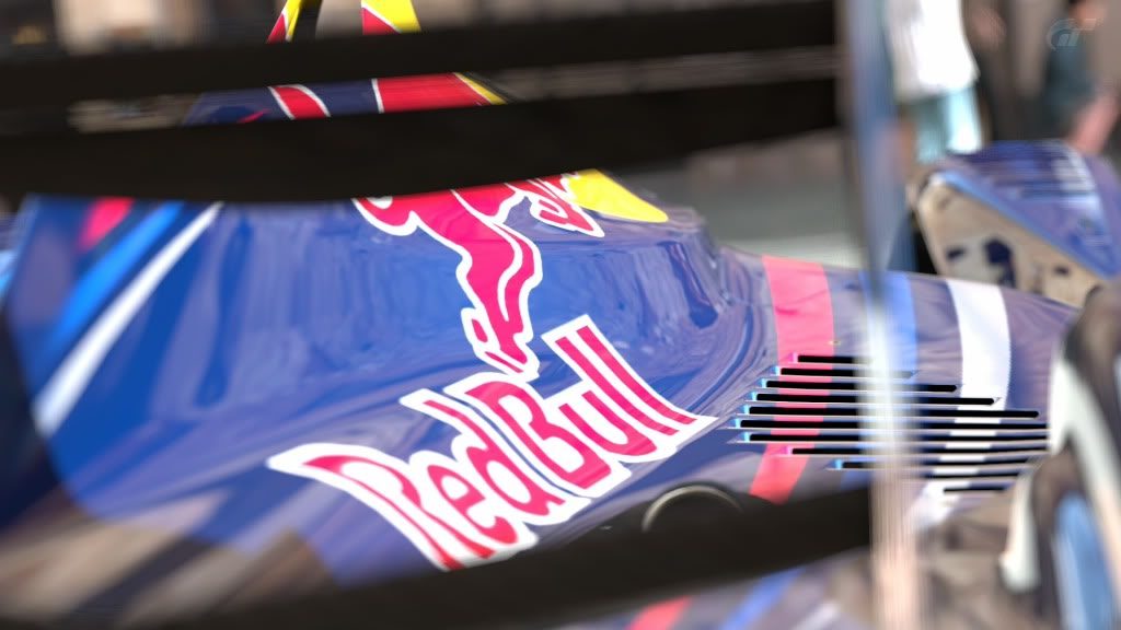
Here another one of my pictures, very different from the other ones I submitted. A Red Bull trying to be a Blue Angel.
(not really good in giving criticisms)


")