The "Rate My Photo" thread! **Read the OP Before You Post**

  • Thread starter Thread starter MSD Drifter
  • 2,388 comments
  • 185,888 views


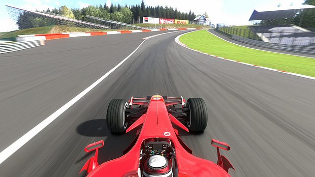
Nice pic, like the filter and positioning. 8/10

SuzukaCircuit_11.jpg
 
^^^ 7.5/10 Great photo, don't like the angle that much. Sorry:indiff:^^^

- MPVeir-ZwölfC | Volcano Oranje -

-click for large image-
 
Hm, looks really nice, glossy but at the same time realistic.

8/10.


Looks pretty good, but the sense of speed (if that's what you're trying to aim for) isn't really in there. Try lowering the shutter speed next time.

8/10

But at the same time I'm feeling you're going for a Sunday driver feel....

8.5/10

Here's mine:

 
Nice Stevenmars (press the edit button mate, dont double post;)), but no movement in the pic takes the fun out of it a bit. 6.5/10

Heres mine:

circuitdelasarthe2009se.jpg

By mines_r34 at 2011-10-12
 
Nice Stevenmars (press the edit button mate, dont double post;)), but no movement in the pic takes the fun out of it a bit. 6.5/10

Heres mine:

circuitdelasarthe2009se.jpg

By mines_r34 at 2011-10-12

I like the composition and sense of speed. It does however feel a little washed-out. Could use some more contrast to really make it pop. I give it a 6/10.

Mine:


So, what's the verdict!? :nervous:
 
^ fantastic sense of speed. 8.5/10


wow at steven mars. Nice!


Alright this is me having a go. Please don't be too harsh lol

2uzs7ky.jpg


2gv3fyq.jpg


16kzxft.jpg


2wcqtkg.jpg

They're all good, nice sense of speed, but a bit too dark.

Overall, it's a 8.5/10

Somebody forgot to rate my pic (He seems new, I forgive him.)

6261580141_37acd4cf79_z.jpg
 
This has gotten a little messy:)

@[Nor]McLaren: 8.5/10 Love the realism, but the car colour slightly spoils it.

@ghskilla: 7/10 Nice idea, love the view of the track, but I think more of the car and sky could've been in the picture.

- DB9 -

-click for large image-
 
[Nor]MclarenF1;6081132
I like the composition and sense of speed. It does however feel a little washed-out. Could use some more contrast to really make it pop. I give it a 6/10.

Maybe its the white matte? Could be a bit better if i change the colour:tup:.
 
Maybe its the white matte? Could be a bit better if i change the colour:tup:.

That would help yes. You could also just increase the contrast to get out more details on the car, and also boost the green colour of the trees.


@[Nor]McLaren: 8.5/10 Love the realism, but the car colour slightly spoils it.​

Yeah, I was trying to replicate the M3 Competition Pack. This was the closest I came colour-wise.
 
[Nor]MclarenF1;6081346
Yeah, I was trying to replicate the M3 Competition Pack. This was the closest I came colour-wise.

You CAN get an M3 Competition Pack without the matte paint you know ;) Great shot, by the way.


I would give that a solid 8/10. Cool sense of speed to it but for whatever reason I just don't love the colors in it. Is there like a tint to it or something? Still great though.


Curious as to what rating/feedback you guys have for this one...

 
Curious as to what rating/feedback you guys have for this one...

Looks extremely realistic, also like the flame, really a great shot right there. 👍 9/10

Here's mine, I was going for something different/alternative:

 
I like the sun beam stripe. Different angle is nice, too. I`ll give it a 8.5/10 👍

Here is my Ruf approach...

*pics*

1.) 7.5 The concept is good, but I'm finding myself looking more at the background. A bit lower so that the majority of the front is in the light area, and it'd be a good shot.

2.) 7.7 The speed of the picture is a bit weird. The lights and board are flying past, but the car doesn't seem to be showing any movement.

3.) 8.5 Definitely the best in the bunch. It seems like the styling of the car itself is helping give the effect of speed.

4.) 7.7 It feels the space on the right is being wasted. Move it left some, and use less exposure, and it'd be a solid 9.

5.) 5.0 The tires and area around the car is completely out of focus, WAY too much emphasis on speed, the tree in the back is missing a trunk, the road looks like silly putty, I could go on all day.

Now for some of mine. Don't be too harsh. :nervous:

KartSpace.jpg


KartSpace_1.jpg


CircuitdeSpa-Francorchamps_1.jpg


CircuitdeSpa-Francorchamps_4.jpg
 
@daYELLOWk1d

1) 8/10 - Nice concept, really like the composition of this shot, it is a tad dark, maybe adjust the exposure slightly. Overall great shot

2) 7/10 - I like the sense of urgency in this shot, would maybe benefit more if taken from a different ange, showing less of the road behind, and more of the back straight of Le Sarthe

3) 7.5/10 - Overall nice composition, really captures the movement of the car, i like the camera angle also. The only thing that lets it down (in my opionion) is that its a little too dark on the nose of tha car.
 
Apologies to Tonystew42... Stepped away from my PC for a while, didnt hit refresh...

1) 7.5/10 - I Like the fact that you used Karts, there seems to be a lack of them on the boards :). The Compo is good, could've maybe benefitted from a different shutter speed and aperture to enhance the sense of speed, the exposure could maybe be brought down a touch to help saturate the colours more (or use photoshop)

2) 7.5/10 - I really like this image, the drive has a "What you looking at" stare going on, the only thing is that its too dark (for me anyway)

3) 8.5/10 - I Like the B&W treatment here, could've probably used a slower shutter speed to accentuate the loss of control on the spin. Overall i like it :)

4) 6/10 I dont think the B&W works too well here, it looks a little muted and lacks contrast, there is also no sense of speed in the shot, they almost look as if they are parked

Hope that was helpful for both posts, tried to be as constructive as i could
 
@NaganoRN
I like the color of that skyline and the lighting seems almost perfect for both pictures. I especially like the angle on the first shot.

#1- 10/10 (nobody ever gives 10/10 and I love this picture)
#2- 8.5/10 (just a little too dark)

EDIT: I completely missed that first picture on SSR7 so my numbers 1 and 2 are the ones from phototravel, but anyways I like how it focuses on those huge screens on the bridge as I've never noticed them before in the game but overall it seems slightly bland. I'd give it 7.5/10

Took some pictures of my C 63 AMG tonight:


Back