Tooned/Vectored Cars + Stuff

  • Thread starter Thread starter donbenni
  • 3,937 comments
  • 306,737 views
Originally posted by keram
How do you create curves well using the pen path editor on Photoshop? I don't understand how that works?

Well, sometimes asking photoshop it's self is better than asking anyone online. Try to use the help, it does help some times...

C:/Program%20Files/Adobe/Photoshop%207.0/Help/1_11_4_0.html

Go to that in your browser, it will take you to the help, and explain to you how to use features of the pen tool. I hope this helps most of you.:D

P.S. I've been vectoring a drawing of mine, here's the progress.
172airbrushedcar.jpg
 
Sorry for the double post my first true attempt any suggestions?
 

Attachments

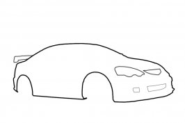
  • rsx.jpg
    rsx.jpg
    23.3 KB · Views: 114
Looks good DC.

Thanks for the help OmicroN.

:EDIT: I'm starting to get the hang of drawing lines now, my work is much neater also.
 
Hows this...
 

Attachments

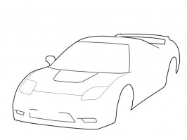
  • vector nsxr-2.jpg
    vector nsxr-2.jpg
    31.4 KB · Views: 112
Thanks...
 

Attachments

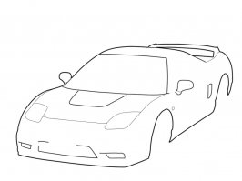
  • vector nsxr-2.jpg
    vector nsxr-2.jpg
    33.4 KB · Views: 108
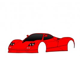
i'm working on my first vector, i'm doing a Pagini Zonda. I have most of the outlines done. The Pen tool makes life a lot easier than using the polygonal Lasso.
 
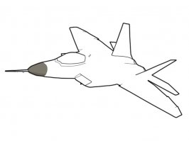
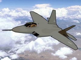
I know its not a car but...
 

Attachments

  • f22 copy.jpg
    f22 copy.jpg
    18 KB · Views: 93
heres the start of mine
 

Attachments

  • vector zonda.jpg
    vector zonda.jpg
    23.9 KB · Views: 90
Sweet visua, hope you aren't offended by my comments, cos it's good... real good 👍
 
That's damn good. I do have some beef with the rims as well, but that's understandable, I hate doing rims. I really like your shading and highlights, works out really well. You and vman did a good job, i'm not all fond of the pipe leading from the intercooler, doesn't really fit well with the overall look of the image.
Props to you vman and Initial Racing.

I would like to work with someone also some time, I think that'd be an interesting thing to do.
 
Yeah i'd be up for that sometime too. Gets a bit boring trying to come up with ideas on your own.
 
this is my first try, some of the lines looks really bad on it, low resolution
do u think its ok?
i know the colour is ugly but i did it quickly, cuz before it was gray
vector.bmp

s14.jpg
 
Originally posted by Initial Racing
http://www.deviantart.com/view/6427837/
Sweet job Initial, I wish it was screen resolution so I could use it as a wallpaper :). It'll make a nice door poster, definitely. Just one question...should it not be black (or darkish) inside the front rim, rather than the blue of the background?
 
Originally posted by VipFREAK
Donbenni, I'm dissapointed what happen to your avatar?

Don't you like the new one? :(

I thought the last one was too bright and th roundness annoyed me. ;)
 
Nah I thought it was a nice prgression from the one before the circle. This one is really flat I guess would be the word. It doesn't do anything for me I guess. I'd really like to change mine. I guess I'll keep it up till the end of the semester or maybe I'll put a concept of my redesign up. 👍
 
Hehe yeah it's good. Very nicely drawn and vectored, but why a hotdog?
 
Thank ya both.:D

Who knows, why is it a hotdog, no clue... I guess it's just different from the ordinary...
 
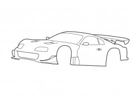
My latest piece...
 

Attachments

  • esso supra - vector copy.jpg
    esso supra - vector copy.jpg
    28 KB · Views: 75
I have Flash MX and every time I try to vector something, it comes out very messy. Anyone have any advice or like tutorials?:(
 
Back