Which GT had the best interface?

  • Thread starter Eks
  • 84 comments
  • 7,037 views

Which GT had the best interface?


  • Total voters
    169

Eks

2,055
United States
United States
Brucifxr
In your opinion, which GT had the most appealing interface? Would you like to see something similar in GTS/GT7, or an entirely different UI?

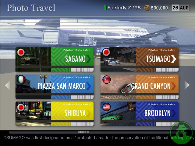
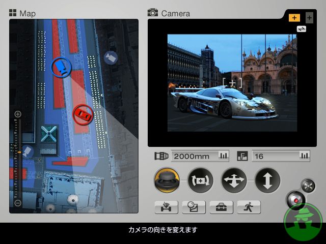
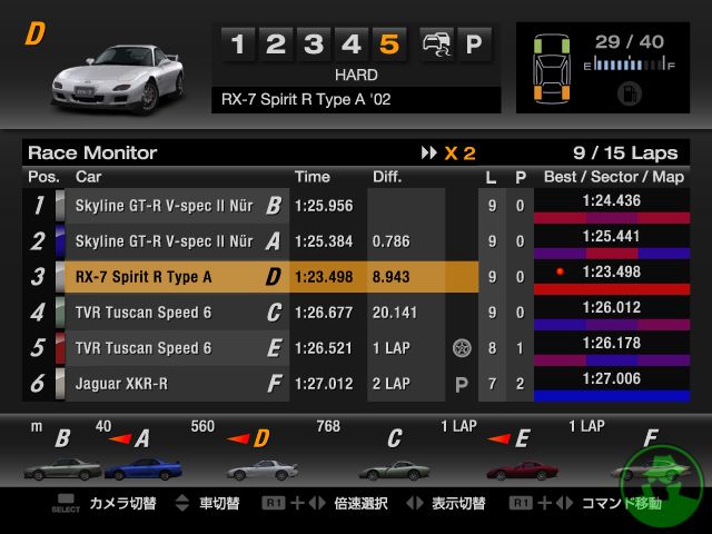
I may be the oddball here, because my favorite was GT5's. It was slow, but, that aside, I thought it was beautiful. I really liked the tabbed browser-esque garage, the Premium dealership that spun cars onto the screen as you scrolled, the GT Auto animations, and little touches like the digital clock and calendar at the top right.

Yours?
 
I really liked the GT6 and GT2/1 but my favourite is GT4 because of its overal presentation, everything was organised very well.
 
I think GT6 has the best interface. Very clear and easy to navigate.
It's definitely quicker to get around than in GT5, but to me, it's somewhat bland. Maybe it's all the blue.
I would like to see straight to the point UI in future Gran Turismo games.
Perhaps a balance could be found; entertaining your eyes, but not stretching your patience. 👍
I really liked the GT6 and GT2/1 but my favourite is GT4 because of its overal presentation, everything was organised very well.
I really enjoyed GT4's layout as well, I'd even name it my second favorite, but then again, I feel like that's only because GT4's menu OST was so good. It makes me incredibly nostalgic. The majority of my time was spent in the menus, drooling at just how many cars there were.
GT3 was lightning fast, everything was laid out in as minimal submenus as possible, it was pretty (the videos were a cool touch) and there was none of the extraneous clutter and padding that every game since has had.
Indeed, you could go from the Nissan dealership, to your garage, then to an event in seconds. The menu sound effects were really satisfying, too.
 
GT6. Best in the industry.

If only it has more customization. The color and animation and such. Also the cars on the enviroments as the screensaver.
 
Anyone picking GT4 is letting nostalgia get the better of them. GT4's UI is bad. It was slow as hell and frankly looked like crap. Doesn't anyone remember how long it took to scroll from one side to the other or top to the bottom? It was slow as hell, clunky as hell, and frankly even GT3's was better let alone GT6's which is like an optimized version of the past UI's with garage and options one button away

Prologues looked great but it was still a bit clunky compared to GT6. GT6 is just so much more streamlined than the rest.
 
The GT3 interface attracts me for some reason. Indeed, it is a bit spartan compared to others, but that's probably what I like. It's straight to the point without being bare bones. However, GT2 is a very close 2nd.
 
I'd say the original had the easiest to use interface. Probably because of it's simplicity.
ePSXe 2078.jpg
ePSXe 2079.jpg
ePSXe 2080.jpg
ePSXe 2081.jpg
ePSXe 2082.jpg
ePSXe 2083.jpg
ePSXe 2084.jpg
ePSXe 2085.jpg
ePSXe 2086.jpg
ePSXe 2087.jpg
ePSXe 2088.jpg
ePSXe 2089.jpg
ePSXe 2090.jpg
ePSXe 2091.jpg
ePSXe 2092.jpg
ePSXe 2093.jpg
ePSXe 2094.jpg
ePSXe 2095.jpg

However I'd say Gran Turismo 4 had the best overall interface. Easy enough to use but also looks pretty good aswell.
gran-turismo-4-image130438.jpg
carparts3.jpg
adabde3490e92caaad983bbedbb3e116.jpg

gran-turismo-4-20041207025016490-1004730_640w.jpg

gran-turismo-4-20041207024923773-1004723_640w.jpg
gran-turismo-4-20041207024838150-1004716_640w.jpg
gran-turismo-4-20041207025203987-1004745_640w.jpg
 
@JASON_ROCKS1998, I personally found GT1's layout very difficult to maneuver around. For example, let's say I want to go the Car Wash. First, I have to guess which way the cursor will move: to Nissan or Mazda. Half the time, it doesn't go where you want it to. Then, I have to move left again, same story. Such a hassle. Same applies to GT4 too.
 
GT6. Best in the industry.

:lol:

Oh boy, that was a good one!

GT1's worked at the time, but it was working with a much smaller scale of content. It was clever enough to have shortcuts available on nearly every screen, though. GT2 tried to scale up with middling results. GT3 was very fast, and personally, it's aged fairly well considering. GT4 stuck with the same map motif, but was slow and not especially clear in its layout.

GT5 Prologue had a really classy layout, which makes GT5's Homer's Makeup Gun approach all the more bewildering. GT6 improves on it a bit – and compared to something like PCARS, it's vastly preferable – but it's still a little clumsy. Far bigger of an issue, though, is the lack of responsiveness. It's slow, constantly, and I'm still not sure why.
 
GT5 Prologue for me. It's stylish and classy, while still maintaining user friendliness and speed (though it remains to be seen how well that style will cope with GT5/6 levels of content). Love the dynamic background with you car in exotic locales, and the clock and date in top right. Also the dealership presentation was amazing with two cars spinning in the manufacturer page. And you can see your car being prepared in the pits when you enter a session.

GT1 is the quickest menu, and it worked back in the day, but looking at it now it's quite dated. GT2 is quite similar to GT1 but slower.

GT3/4/4P I never played so I wouldn't know.

GTPSP works for a mobile game, but it's nothing special.

GT5 is vibrant and has heaps of options (I love the customizable theme colour and top banner), but it's the worst in terms of user friendliness and speed.

GT6 is an improvement over GT5, and it's almost as fast as GT1 but it doesn't feel that special to me. It feels like a console version of GTPSP's menu.
 
Eks
I may be the oddball here, because my favorite was GT5's. It was slow, but, that aside, I thought it was beautiful. I really liked the tabbed browser-esque garage, the Premium dealership that spun cars onto the screen as you scrolled, the GT Auto animations, and little touches like the digital clock and calendar at the top right.
No no i think that GT5 interface was one of the best for the series, altough i voted GT6 because let's face it: it is in terms of navigation and it's user friendly, gets you exactly where you want to. GT5 was a little more "facebook page" with themes to be applied and the thousands of functions (that now in GT6 are gone) it was really vivid, made you feel like part of the entire GTUniverse, but it would make you also feel lost if you didn't pay enough attention. Hope GTSport takes the better from those 2. The term "best interface" is a little bland; best which terms? navigation?usability? aesthetical? I'll take the title in a subjective light, "my personal best" is GT6
 
I guess speed and user friendliness are not thing you look for in a UI? :P I mean sure, the GT5 UI visually looked nice most of the time but the UX was just not good.
I guess that is true :D

For the people saying GT4, did you just memorise the locations of the icons hidden off the main menu? That wasn't good design.
I memorised them pretty fast. Plus, I like how the GT4 UI was some kind of world map with some little details here and there, but this may also just be nostalgia. :)
 
Eks
In your opinion, which GT had the most appealing interface? Would you like to see something similar in GTS/GT7, or an entirely different UI?

I may be the oddball here, because my favorite was GT5's. It was slow, but, that aside, I thought it was beautiful. I really liked the tabbed browser-esque garage, the Premium dealership that spun cars onto the screen as you scrolled, the GT Auto animations, and little touches like the digital clock and calendar at the top right.

Yours?
I couldn't have said it better.

Although GT5 was slow, lets talk about how it looks rather than how it performs.

It was a mess. But I loved it. I learned where everything was in no time. It soon became very simple and I knew how to use it no problem.

The design fit all on the page. You didn't have to scroll or have any screen movements to see something else.

It was the best in my opinion.

I support you 100%!
 
Back