Any Artists Here?

  • Thread starter aidan8500
  • 262 comments
  • 36,836 views
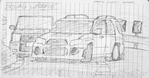
My new car design, actually a complete redesign of this vehicle, drawn on MS Paint :sly:

I tried to make the car as aesthetic as possible, while keeping the aerodynamics as good. Of course, I'm a noob at this, so I really need GTP opinion on this car, and how it can be improved :scared:

1eteub.png


EDIT: Changed the diffuser design to be a bit more sharp edged, fits the car better IMO ;)


24ez57t.png
 
Last edited:
I would work on the perspective a little more first off, because I know a race car's cockpit isn't that "boxy". Consequentially, it looks very spacious and thus luxurious.... since when are race cars luxurious?! :P

Forgive me if I sound rude, but when it comes down to designing vehicles in my opinion, what a car should look should be based on its functionality at most, if you want to simply style it where all the focus is based on its appearance (not aesthetics), then go wild... with everything; don't say "but" to this or that, just accept any thing that comes to mind and throw it down on paper.... do several different sketches, either pick one or pull apart bits you like fro ma few and merge those together. This will end up being conceptual and that is a very good starting point for refining your design so it's not outrageously unusable...

I'll see if I can illustrate what I mean in a short bit. Check back later.
 
I'm a bit of an artist myself as well. I can't get any pics of them in right now, unfortunately. But I can tell you that drawing has been my hobby for many years, now. However, they are still some points on all my drawings that it "lacked", other than color. Perhaps it's something simple, like proper proportioning, I'm not sure. But anyways, I have an F1 drawing that I could share, but note that the dimensions, its name, the specs, even the designated driver will be misleading (couldn't figure out a good name for it). I'll post it in momentarily.
 
I would work on the perspective a little more first off, because I know a race car's cockpit isn't that "boxy". Consequentially, it looks very spacious and thus luxurious.... since when are race cars luxurious?! :P

Forgive me if I sound rude, but when it comes down to designing vehicles in my opinion, what a car should look should be based on its functionality at most, if you want to simply style it where all the focus is based on its appearance (not aesthetics), then go wild... with everything; don't say "but" to this or that, just accept any thing that comes to mind and throw it down on paper.... do several different sketches, either pick one or pull apart bits you like fro ma few and merge those together. This will end up being conceptual and that is a very good starting point for refining your design so it's not outrageously unusable...

I'll see if I can illustrate what I mean in a short bit. Check back later.

I agree on the perspective bit (need more practice with that) :guilty:. However, I did design it as a road car with an interior spacious enough for comfortably seating two people, along with ample storage space (see the extra doors on the side), while being insanely fast on the track :D

And yes, I did put functionality into mind when I did design this. I took inspiration from LMP cars for the aerodynamics, along with two adjustable flaps highlighted for the aerodynamics.

I follow a design thinking where form goes hand-in-hand with function :dopey: In-fact, this is my 14th version of my design for this car after experimenting with various ideas, some of which either looked like 🤬, would have the aerodynamics of a brick (see my previous drawing of this car :banghead:) or would be unusable at all in the real world :ouch:

Thanks for the feedback by the way 👍 Would love to see your interpretation!
 
I'm not a person who's technically engaged in creating arts in a certain period(weekly or monthly), but making drawings and paintings has been one of my great hobbies for many years since I was a small kid and took up a pencil to start drawing something imaginary on a blank paper or margin at the corner for the first time... As a pleasure or to mitigate myself from a feeling of gloom after I underwent a disappointment or poignant moments(bullies, for instance) at school or somewhere else.

I used to display my works to my parents or grandmom for pleasure, just to delight them with my talents of creating artistic stuff though, it's rare for me to show them off because I'm not too confident in referring myself as a "good" artist fully appreciated by other fanciers sharing the same likings. :rolleyes:

I do the exact same thing :D Whenever I'm at school, I always have a habit to doodle around the margins of my assignments :P
 
Btw: Is that drawn with a pen? :drool:

Wel I first started with the bottom one, but I was getting all caught up with what the drawing profs were teaching me by being neat and I feel so constrained doing that, so I was like "screw that", threw away the pencil and scribbled quicker entirely in pen which would be the top 2 sketches...
 
bubblechamberpainting.png

Bubble Chamber

Jackson Pollock look-a-like style of what Bubble chamber photos look like:
000329_sm.jpg


It's a component to the last assignment in my physics class; creating an art piece based off our essay topics.

Literally did this in under 2 minutes last night for as an assignment that's due in 2 hours from now. 👍
 
-> I don't know if I posted this yet:

2007-01-29-0451-17.jpg


^ It's a ball-point pen based, freehander pic. Its my old B13 (Philippine-spec) Sentra that will be applied on the manga I'm working on.
 
Does being a bit of a photographer count as an artist? I do have some older painting and drawing work from when I was younger, but it was more design and color theory focused than pure "art" focused.

Vanishing, pretty impressive for a ball point pen. I can't stand writing with the damn things even, always use Pigma Microns for my notes.
 
That's such a waste imo, those pens should be used for drawing....

Then again, I draw with ballpoints as well....
 
Does being a bit of a photographer count as an artist? I do have some older painting and drawing work from when I was younger, but it was more design and color theory focused than pure "art" focused.
^ Well very yes! I do say so myself.

2011-01-15%2B16.35.46.jpg


2011-01-09%2B16.09.10.jpg


Vanishing, pretty impressive for a ball point pen. I can't stand writing with the damn things even, always use Pigma Microns for my notes.
^ Thank you! I tried my very best each time I draw these things:

2007-01-29-0443-11.jpg


OT -> Facebook is being like an ish. I can't share my pics here! As seen on the previous page... :indiff:
 
That's such a waste imo, those pens should be used for drawing....

Then again, I draw with ballpoints as well....

I have a very light hand from all my work with pencils and when I use to work with fountain pens a lot. I don't like the pressure required for most ball point pens, outside of ones like the Precise V5.

And I'll share one of my more heavily processed shots here. Do click for a larger size, and I'll be doing a split, 24x12 inch print of this later this week, for a total 48 inch long hanging piece.


The moving weather by Cody Schroeder, on Flickr
 
Nice work Cody. Is that a digital bit of art there?

Here's some of my crappy stuff that I use for class. I got a sketch of a manikin from the web and set it's transparency to low, printed it out and drew quickly over the top.

I give you: Teacher Art!

6429686183_2139b2a9b7_m.jpg
6429690897_df8996bb02_m.jpg


Poor quality pics from the poor quality lighting in my office.
 
Nice work Cody. Is that a digital bit of art there?

Somewhat. It is a 3 exposure HDR made from 6 sets (18 in total) stitched into a panorama and tone mapped. So each bracketed set of 3 was merged and mapped using a program, and then the resulting outputs were merged in Photoshop. Some additional editing, cropping, and adjustments followed. The resulting PSD file is over 300 megs and the image, before cropping, is about 17000 pixels wide.

Those sketches are actually quite nice, more so given what you are using them for. Even given they are traces. And is that a gun? :odd:
 
Somewhat. It is a 3 exposure HDR made from 6 sets (18 in total) stitched into a panorama and..........

.....lost me in tech talk, sorry, I'm an idiot when it comes to photography but I can see how several pictures would have to be merged to get the shot. Fantastic. 👍

Those sketches are actually quite nice, more so given what you are using them for. Even given they are traces. And is that a gun? :odd:

A quick throw back to my days spend doodling on school book. And yes, it's a gun. My (male) students are obsessed with FPS games.
 
I like how the shadows aren't too strong in the photo..

I thought I did a pretty good job with these photos when I went to the Zoo:

299458_10150444483549097_511439096_11025505_1817037495_n.jpg


296831_10150444479344097_511439096_11025478_809319544_n.jpg


306989_10150444475704097_511439096_11025449_714476975_n.jpg


320263_10150444492329097_511439096_11025602_2081006626_n.jpg

 
I like how the shadows aren't too strong in the photo..

I thought I did a pretty good job with these photos when I went to the Zoo:

The one of the frog (?) is the best, would have worked out a lot better had it not been taken on a phone though.
 
Dude, that's a clear image for a phone, I think. I'm probably wrong, but still.

I didn't want to turn up the blue and cyan in shadows because that's all I do and it kills the warmth of the picture. I don't study photography so I don't know what I'm doing wrong. :lol:
 
Dude, that's a clear image for a phone, I think. I'm probably wrong, but still.

I didn't want to turn up the blue and cyan in shadows because that's all I do and it kills the warmth of the picture. I don't study photography so I don't know what I'm doing wrong. :lol:

To be honest the film grain effect does nothing for it then! It just makes it look like noise to me? Although I did think the short depth of focus was quite impressive for a phone... Maybe it is too sharp to be a mobile phone picture, I don't really know either... I have a DSLR that I take with me pretty much everywhere so I tend not to use my phone...

Either way, kill the grain, make the dark shades a little darker, and IMO it would be 10× better! But, like I say, I think it's an interesting picture anyway.
 
It wasn't on phone, you're looking at film grain and color balance via photoshop :lol:

The grain makes it look like crap, sorry. For images of this nature, they contribute nothing besides making it look like a cheap camera with crap for noise handling.

NEVER DO IT AGAIN.

I'd add a touch of fill light and then maintain strong blacks for the actual black values. What file system are the originals in?
 
29ct9j4.jpg

Last project of highschool 2010.

2dr8mr4.jpg

Drew this for my vert skater friend who moved.

2ezn2gg.jpg

Doodle

24m6trn.jpg

For my mom.

wvbt6f.jpg

Doodle from senior lunch.

I have a lot of stuff just don't want to flood the thread.
 
Back