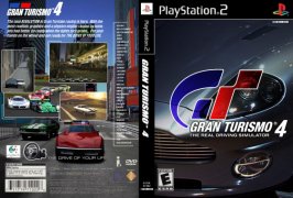
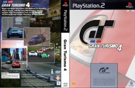
BOX ART Version.2

  • Thread starter Thread starter ZEE
  • 548 comments
  • 30,090 views

What do u Think of Cover Version 2?

  • Good Work, Some Nice touches.

    Votes: 109 71.7%
  • Neither Good or Bad, it's OK.

    Votes: 33 21.7%
  • Bad, Not as good as the First Version.

    Votes: 10 6.6%

  • Total voters
    152
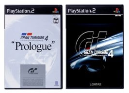
Look at the comparision........ :D

They do look entirely diffrent, I might consider the redesign of my cover with the prologue covers design cues...

:trouble:
 

Attachments

  • gt-cover-comparision.jpg
    gt-cover-comparision.jpg
    40.4 KB · Views: 315
how bout this, sort of took ideas from the prologue cover... :D :trouble:
 

Attachments

  • gt-cover-v.12.jpg
    gt-cover-v.12.jpg
    68.8 KB · Views: 311
it looks good WAY TOO GOOd, except one thing, i think the "GT" white lines look jagged and it should be more solid
 
email these to PD Zee they are great
 
I wish I could, but they would probably jack the ideas and pay me nothing....... :rolleyes: :trouble:
 
Originally posted by ZEE
I wish I could, but they would probably jack the ideas and pay me nothing....... :rolleyes: :trouble:

Actually, they would turn them down, Sony will not use ANY ideas given to them as a policy to avoid any possible legal problems.
 
I have my first attempt ready. Let's see if I can get it attached...
 
Here you go:
 

Attachments

  • gt4_version1.jpg
    gt4_version1.jpg
    92.2 KB · Views: 268
I really like the back of that one.
But the front is a little messy and confused and the car is too dark.
 
Glut,

You said it. I am pretty happy with the back, I just have to clean up the front. I think I will try a different approach.
 
nice try, man the back resembles the American GT3 Cover, but soem nice desing ideas in there.
 
Nice job jkrobby. 👍 The back cover is really great.

The front is not bad either, but the car needs to go. PD has started to use a part of a car zoomed in so much, it is hard to tell what car it is. I think they do this to please the other car manufactures. PD doesn't whant to upset them for not using their car on the front cover.

I think the number 4 on the front needs to be inlarged. It should be about 3/4 the size of "GT" and not about 1/3 the size, which it is now.

Nice first time addition, keep it up.
 
Here's my second version:
 

Attachments

  • gt4_version2.jpg
    gt4_version2.jpg
    62 KB · Views: 414
Thats a pretty damn fine effort, maybe if you could go closer to the car ni the next pic, to maike it harder to see what car it is.
 
WOW! That cover looks so REAL! I think thats the best cover so far.What program did you use to make it?
 
I am using Paint Shop Pro 8.0 and for the money ($99 US) I think it the best thing out there. There are some more powerful programs out there, but they are way to expensive for me.

If anyone is interested I have the template I made in the PSP format. The ability to use layers makes the effects a lot easier to achieve.

For my next version I will zoom in more on the car and see how that works.

Thanks for all the comments.
 
I have used Photoshop 7.0 for most of my work, adn here is one of my new creations.... 👍 💡
 

Attachments

  • cover-v.15.jpg
    cover-v.15.jpg
    84.2 KB · Views: 364
you do good work
 
I like the way you have used the little silver sticker thing on the front cover as the GT4 Prologue cover has, makes it look authentic
 
its the newest additon ot the car range in GT4, its the Peugeot (606) LM Racecar, a keen rival for the Toyota TS020 Racecar
 
Was feeling a little creative, so I design this as a "Could-be" GT4 Cover Design.

What do people think of it?

:D
 

Attachments

  • gt4-cover-final-v.10.jpg
    gt4-cover-final-v.10.jpg
    50.5 KB · Views: 282
Looks good, not as keen on the GT logo though, but other than that it's fine.
 
You detect correct.
 
Originally posted by ZEE
Was feeling a little creative, so I design this as a "Could-be" GT4 Cover Design.

What do people think of it?

:D

thats pretty good looking, but If I had a choice i wouldnt pick it for a cover, The "GT" logo should be in color, (blue, red) and take out the blue/red little square things under it, lower the "GT" and raise the "4" higher then center the logo and it will then look decent....
 
how about this, Rport03?

:trouble:

WARNING 56K Users - 84kb Image "Plz Be Patient":
 

Attachments

  • gt4-cover-full-v.5.jpg
    gt4-cover-full-v.5.jpg
    70.5 KB · Views: 237
Back