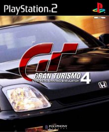
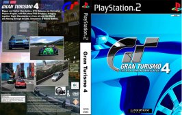
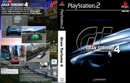
BOX ART Version.2

  • Thread starter Thread starter ZEE
  • 548 comments
  • 30,090 views

What do u Think of Cover Version 2?

  • Good Work, Some Nice touches.

    Votes: 109 71.7%
  • Neither Good or Bad, it's OK.

    Votes: 33 21.7%
  • Bad, Not as good as the First Version.

    Votes: 10 6.6%

  • Total voters
    152
ill be back with a new cover soon...... just u wait....

any vehicle requests?
 
ill have a go
 
I couldn't find a suitable pic of the R34, but heres a new cover I've just done.
 
2 min job...
 

Attachments

  • gt4-cover-v.6.jpg
    gt4-cover-v.6.jpg
    21.2 KB · Views: 342
sorry zee, but that last one needs a serious color-make over (IMHO).... and i wouldn't show any type-marks as well on the front.... those taillights look good though.... keep it coming!
 
i cant find a good good pic of the prelude, can any send me one.... or post one in this thread?
 
this was the best i could do quickly, but really there was not enough good prelude content that i could find.... :trouble:
 

Attachments

  • gt4-cover-v6-web.jpg
    gt4-cover-v6-web.jpg
    36.1 KB · Views: 316
Zee how do you do your GT logos?
 
I scanned in the image in from my GT3 Cover which was the PAL version, not the American version....
 
Ahh, and you cut out the inside of the G and T anf gave it that transparent look.
 
Here a fresh cover, I belive this is my 6th version, OPINIONS?

WARNING 56K Users, (80K Hi - Res Image....) :trouble:
 

Attachments

  • gt-cover-v.6.jpg
    gt-cover-v.6.jpg
    63.7 KB · Views: 305
Very nice and very blue.
 
I don't like the blue. GT3 was blue, yes, and red too.

GT4 Prologue will be white, so how about black? Can you do that? If not, think green.

Looks great though. 👍
 
Do one yellow, is catching on, on many sports cars lately.
 
this is a mixture of 2 of my previous designs, just an experiment....


:D :trouble:
 

Attachments

  • gt-cover-v.6.jpg
    gt-cover-v.6.jpg
    60.2 KB · Views: 250
I can't really say which is best anymore, you've done so many great ones this one included.
 
thx very much. :trouble:
 
wow theese are absolutly awsome man, seriously go get ur self a job doing this stuff :p
 
yo zee, that last one has a very good colorscheme imo... on car logo's and stuff so i'll have this one on my GT4 box....
 
Fresh Design, I beleive it is one of my personal favs, what do u think? :D :trouble:
 

Attachments

  • gt4-cover-full-v.10.jpg
    gt4-cover-full-v.10.jpg
    54.1 KB · Views: 333
I like that one alot.
 
It's black. Good choice. 👍

I still have to say that 4 is still not at the correct angle. You should angle the 4 in unison with the GT. You should also make the 4 bigger, but not as big as the GT.

 
Allllrrriiiighghghhhhttttt Zee, way to go man... keep it dark, keep it mysterious...'couse that what it is....!
 
That last one is very nice, but I don't like the little bit of red on the bottom of the 'G'
 
the redness at the bottom is because i wanted to keep some color in the picture left, so that it has resemblence to the other GT Covers
 
Back