You forgetting someone?Feeling inspired by that FCA design comp ^ (although i'm well past school age and not in the US), thought i'd have a quick stab of a future Challenger, though it's more like a 2020 than a 2025.


Who am I forgetting?...You forgetting someone?
I dunno about the 2020 bit, to be honest, most of these competitions just get silly-futuristic and don't bear in mind that 2025 isn't too long away, so they're anti gravity racers powered by a distant star or something so a sensible 2025 concept is refreshing.
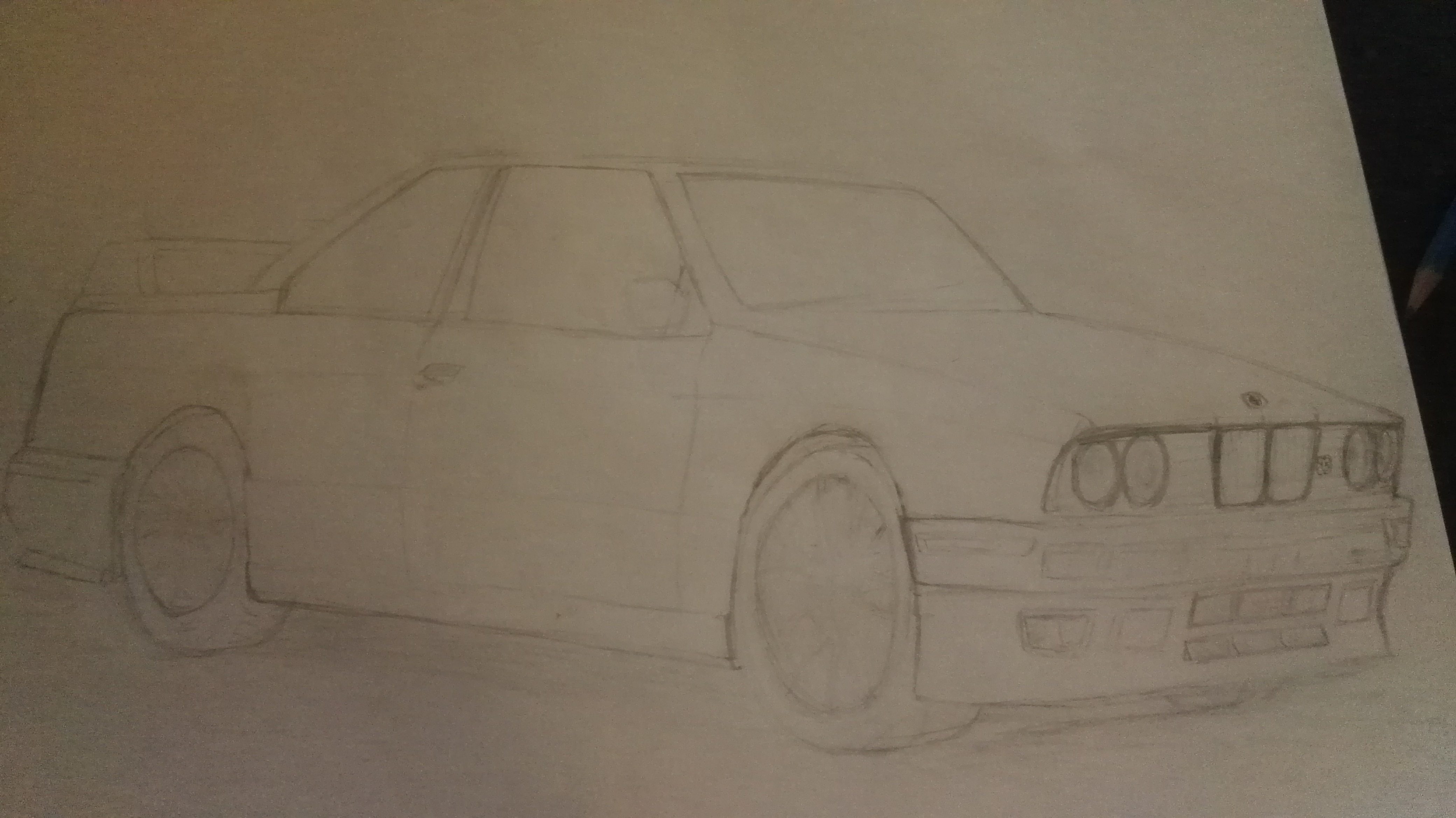
Looks like a Levin to me.
I'm going to go with Levin too.
Were you guys looking at the right to see how "tall" the vertical bit was to distinguish the headlamp?
2025 Dodge Challenger SRT Hellcat concept design
for the FCA Drive for Design contest.
I'm not looking for first but maybe a mention at least.

Notice the full metal bumper
Quick update, I didn't place. Seems like my conservative design worked against me. All the winners went with futuristic styles. If anyone is interested here are the winners.
Quick update, I didn't place. Seems like my conservative design worked against me. All the winners went with futuristic styles. If anyone is interested here are the winners.
I remember when I used to make up car designs that involved deploying a cheap trick of enlarging the grills to attract the eye.
The one who placed first didn't draw as well as second and fourth place, though fourth place looks like they almost copied an existing sketch I remember seeing somewhere before.
Anyway, the pencil drawing done by second place looks better than any of the drawings of the four.
Of course this is a design comp, so execution is not as important as ideation. I would think the reason why First-place got picked amongst the four was because it was the one design that blatantly looks it's a Dodge. Fourth has some resemblance to the Dart's facial features, and I can see how the third has resemblance to the Tomahawk, but I'm not feeling Dodge with that one. Although I like that one most, it's got a more Mclaren/Marussia form to it.
If I may make some suggestions if you are interested in the idea of making your car drawing more attractive, I would consider increasing the visual contrast in the overall presentation of the drawing. You can do this by using less values to define the midtones and work more with highlights and shadows only. Car bodies (or any solid objects) really attract our attention when there is a strong sense of form. The one other thing I would do is to opt for more striking angles (and/or persepctive) at which you visualize the car at.
They all look like something I've seen before-
Quick update, I didn't place. Seems like my conservative design worked against me. All the winners went with futuristic styles. If anyone is interested here are the winners.
A quick chalk sketch I did at work. I found some time while there, Lol.
Every holiday me and a coworker make a related drawing on this board... we had a dead zone in the year, and the board being clear was bothering me. LolView attachment 507104
Thank you.That is really neat given the medium.
That sounds like fun. I never have the motivation to start and finish any sketches lately.
Whatever you can do would be great. I will at least sketch something.I think it's a great idea even though I may not have time to participate right away. I might be able to make time for a quick sketch or something, though.
") Yes, it's an AE86, but is it a Sprinter Trueno, or is it a Levin? ^^
Yes, it's an AE86, but is it a Sprinter Trueno, or is it a Levin? ^^


 +100 cookie points to the both of you.