GT Photomode 2.0 Competition -Week 98- closed

Damn, Bram, there goes my opportunity to enter something that could look good.:grumpy: Curse you!!!:mad: (j/k)
Great entry as always, and indeed, pen tool FTW, since I started using it I didn’t want anything more. It’s (for me) one of the best tools in photoshop. 👍
 
Yeah, indeed. But the pen tool isn't my main tool though. I only use the pen tool for parts that are curved, like wheel arches ad pillars. But for square parts, the most simple tool is still the lasso tool for me 👍

Thanks for the comment :cheers:
 
Nah, I can't use the lasso tool anymore, neither for straight lines. Pen tool all the way!!!

Anyway, here is my entry. Nothing especial, just though I would drop something in though... (Bram wins) :P

Final Entry


(note to self - nevermore use red cars for 2.0).
 
OK...please please please give me tomorrow to finnish mine...it's been a real battle and it'd be great if I submit something.....you'll see why it took such a time...just please wait

sorry for any inconviniences
alrighty man! Extended till tomorrow. I wasn't gonna enter but might now...dont know

LdS
Final Entry


(note to self - nevermore use red cars for 2.0).
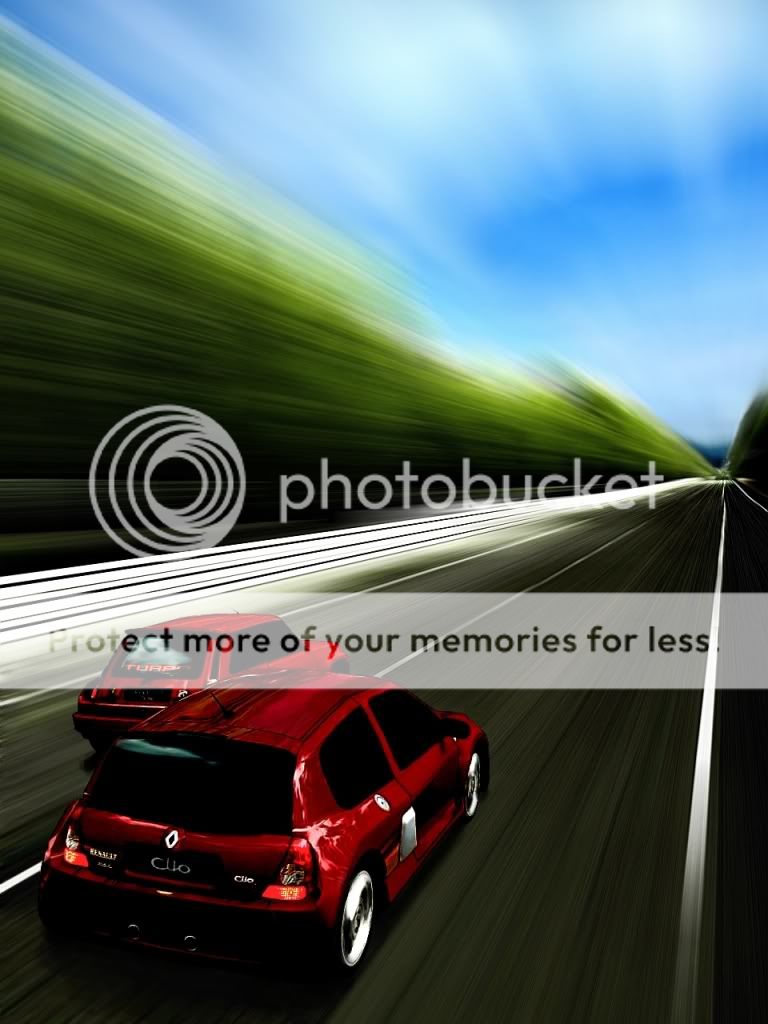
Nice entry LdS:tup:, white cars are kind of a pain too.
 
red does seem bad as a colour. it's weird.

and actually, LDS, the angle work there is fantastic. I really like it. whilst i don't think it'll outdo Bram, it's certainly a worthy entry!
 
Hehe, no you didn't. I'm still nowhere near the realism your 787b shot had. That was a stunner 👍
 
It's not going to beat Bram's, but it was fun;

FINAL ENTRY

I decided to go down the retro route and go for a vintage look with plenty of space for a magazine title;


Click to enlarge

 
I like that Moglet, really digging the colors 👍

The problem with the background though is that the 2D mountain comes forward too strong. "2D, not wantz!" But hey! That's what you get from a PS2 eh?

What did you do with the area in front of the Renault though, is that smoke or fog? I like the effect, and the dirt track looks detailed, crisp and sharp as well 👍

Also, before I forget. Your car choice fits the bill way more than the Clio cup car. The rally car points a bunch more to the good ol' time in my opinion :cheers:
 
Thanks Bram!

I was very disappointed with the mountain, it bugged the hell out of me while editing but the only way to fix it would have been against the rules :( The 'misty' area is meant to be fog infront of the car but I did a little bit and gave up :lol:

If I thought I stood a chance against your entry I might have taken more time over it, but as it stands it'll probably get 0 votes like my last contest entry so I rushed it so I can go to bed ready for work tomorrow!
 
^File>Automate>Merge to HDR 👍

@ Moglet - 👍 man I like the tone to the shot, as well as the car choice. Leaves a lot of room for the magazine cover. :D However, the sky looks a bit funky, like it wasnt blurred or something, many square colors coming through. But the fog (smoke?)effect is cool
 
I highly recommend Photomatix for anything HDR. You just save three images of your shot, low medium and high exposure, and it makes a nw shot for you. The only you then need to do is to select the tonemapping option and there is your HDR shot 👍
 
I'm not sure about Photoshop as I use GIMP but I believe there is one built in.

Gimp doesn't have a built in HDR tool but I use the Exposure-Blend Plugin found here: http://tir.astro.utoledo.edu/jdsmith/exposure_blend.php

EDIT: Seems Swiss beat me to it, more info provided aswell.
Didn't mean to steal your thunder mate. :)

I highly recommend Photomatix for anything HDR. You just save three images of your shot, low medium and high exposure, and it makes a nw shot for you. The only you then need to do is to select the tonemapping option and there is your HDR shot 👍
That is a great great awesomely fantastic program. I actually paid for that one! (well that and PS at a 75% student discount):sly:
 
Finally here it is...I don't care if you guys don't like it, but it was a HUGE trek and a very steep learning curve.....and will NEVER do this sort of shot untill I get PS.....phew

Final Entry

 
Last edited:
it's got my stamp of approval ! you should continue like that, gradually going up the higher level. the body could use a bit more smoothing, but this i actually like ! dont let gimp hold u back. it's how you use or approach every project.
 
It looks very nice, but the black lines over the cars aren't quite right in my opinion.
Still, better than what I can manage - very nice :)
 
Wow, the blurs in GIMP really have improved 👍 Back in the days when I was using GIMP, the quality of the zoom blurs really left a lot to be desired, but it seems they've done a huge upgrade on that 👍
 
Some of you remember the Espace F1 concept? The van with Renault's F1 V10 in it? Well, with the Avantime, I imagined they did something similar. I have many other shots, in which it looks especially "mean", that I'll add to my gallery later on today, or tomorrow. ^^

 
Last edited:
^ Finally someone willing to use this car :lol: Seriously it is kinda like a cute version of Espace F1
 
Back