- 15,500

- TRAPPIST-1g
- ProjectWHaT
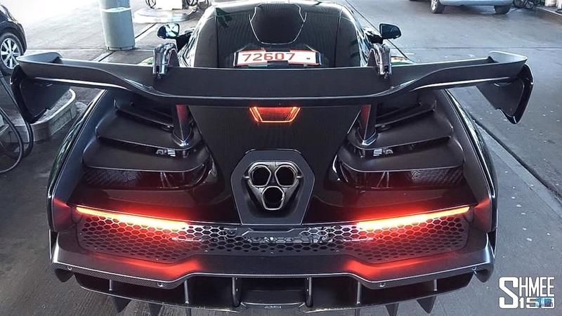
Is there a technical reason as to why?Read on the McLaren forum US/Middle East cars will not be getting a triple exhaust outlet; only duel which leaves the design around it a bit odd looking.
Is there a technical reason as to why?Read on the McLaren forum US/Middle East cars will not be getting a triple exhaust outlet; only duel which leaves the design around it a bit odd looking.
Neither the US or the Middle East market require the additional silencer, so the third exhaust is not needed.Is there a technical reason as to why?
Neither the US or the Middle East market require the additional silencer, so the third exhaust is not needed.
Kind of looks like a 90's NSX from certain angles . I mean Senna did help in developing the NSX.
")

Maybe? Not sure, but the info I posted is straight out of the brochure according to the member who posted on the Mac forum.It only has one silencer?
The P1 was part of the Ultimate Series. This time around there'll be two Ultimate Series cars, this and BP23. This is the more track focused one and the BP23 is a grand tourer with three seats.Is this the P1 successor or a limited production car?
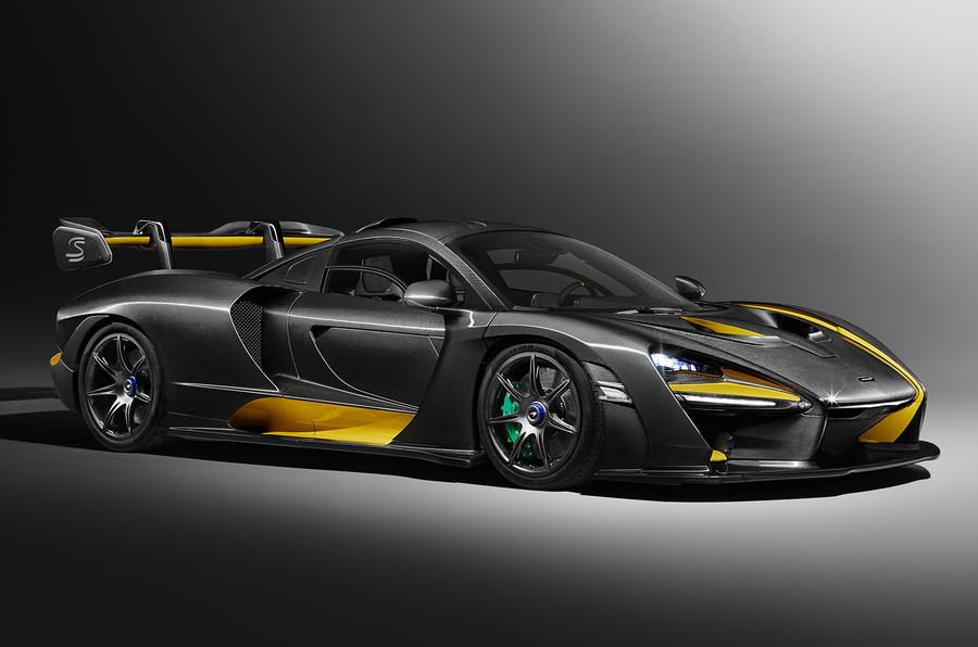
People tend to say that when a performance car ends up looking ugly, but to my eye the designers are at fault in this case. The shape of the car isn't bad. Whatever they tried to do with the headlights and black trim on the back is horrible though. The image of the car in full black already looks better to me. The insistence on having McLaren logo headlights is another thing that I'm not very keen on, much like the glass on the door. Having the headlights recessed like that also doesn't seem very efficient and looks weird.Wow that’s an ugly car... that’s what happens when you let engineers put their calculators ahead of a designers artistic approach.
The car was built and designed for one purpose, pure performance. I agree though I don't like the glass on the door, the side profile looks really weird purpotionaly, and I'm not a fan of the recessed headlights, the 720s had these too. I think the Mclaren P1, and P1 GTR are absolutely gorgeous.People tend to say that when a performance car ends up looking ugly, but to my eye the designers are at fault in this case. The shape of the car isn't bad. Whatever they tried to do with the headlights and black trim on the back is horrible though. The image of the car in full black already looks better to me. The insistence on having McLaren logo headlights is another thing that I'm not very keen on, much like the glass on the door. Having the headlights recessed like that also doesn't seem very efficient and looks weird.
Well, almost. It's surely a very performance oriented car, but I doubt that a company like McLaren wouldn't take styling and marketing into account for such a vehicle. This car definitely has styling elements that don't seem to have any functional purpose. It's the norm for road cars, even the extreme ones.The car was built and designed for one purpose, pure performance.
Here's another pic
I agree, the spoiler is placed too far forward. It makes the rear half very odd looking.
MSO have a ghastly Carbon Theme for Geneva.
https://www.gtplanet.net/mclaren-senna-ordinary-try-400000-carbon-theme/
The price of the carbon personalisation? £300k on top of the £750k base price.


It was designed to make those Lego Speed Racers look more accurate.

It was designed to make those Lego Speed Racers look more accurate.
 And now there using the GTR brand on this ugly fest of a car
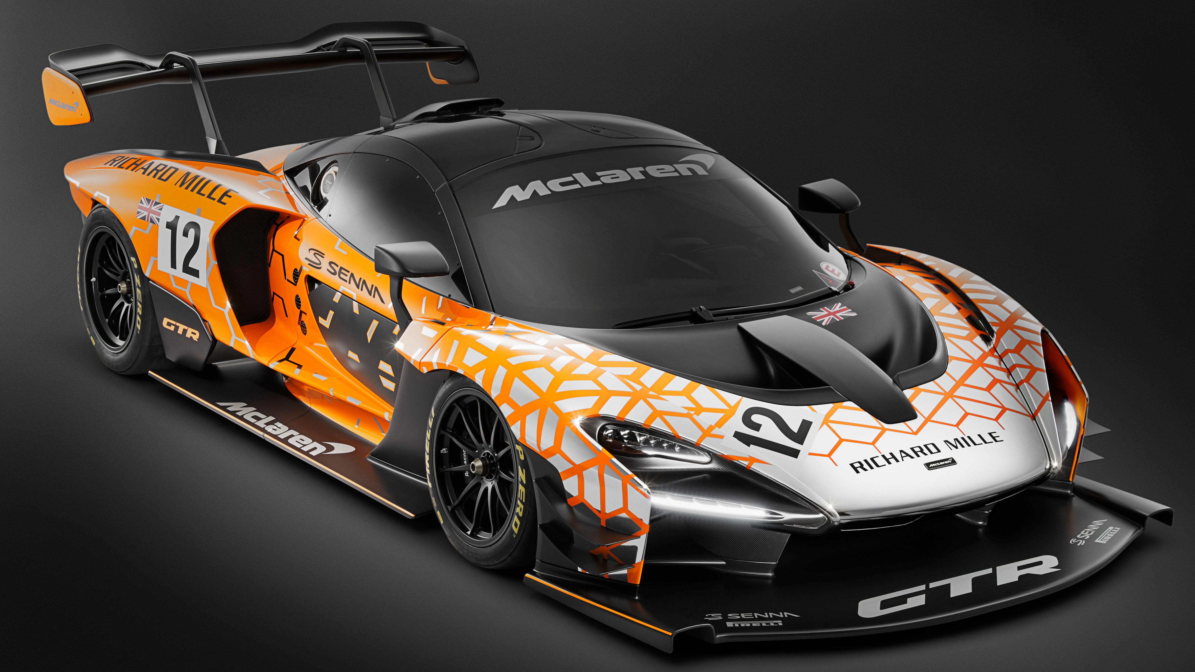
It looks like the front splitter goes on for miles!
I agree, the agressive aero makes it look better. The sharp edges at the front and the rear are quite interesting.
")