- 13,827

- Down under

Fujian 35mm f1.7


Fujian 35mm f1.7
Thanks for the feedback Cano, appreciatedThis is really good. You have a keen eye for capturing people on the street doing random, spontaneous stuff. I have a helluva hard time achieving that myself, my photos of people always suck.
") .
.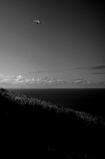

Industar-69 28mm f2.8
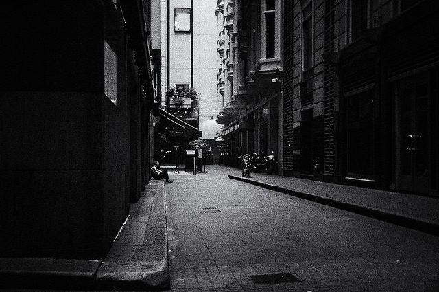
Thanks mate - I have a colour version with deep saturation and it took a long time to decide between the two but the gradation of the sky was proving unnatural in colour, so b&w it wasAaaaaaa dude, this is FANTASTIC. I would have shot it in full color and turned the saturation to 165472, but the black and white approach works awesomely in here with such high contrasts! Love the grainy sky!


I very much like this. Did you try upping the exposure in post, exposing the subject right and blowing the background?
Fujian 35mm f1.7
Thanks 👍. Hmm. I haven't tried your suggestion in my PP as I was ok with the balance at the time, although now the "under exposed" clothing is all I can seeI very much like this. Did you try upping the exposure in post, exposing the subject right and blowing the background?
Maybe it doesn't work, but I was just wondering.
 .
.That really means a lot mate, I appreciate the feedback 👍. To be honest, stumbling onto your website in December and @F1GTR's, was a real wake up call/ source of inspiration as it made me realise I had no direction in my pictures and that my PP was dire at that point. I'm happy with where my B&W is at (mostly), although it's at the cost of my colour progress!You're really smashing the street photography thing. Your images are great, and being a sucker for B&W you've got your PP down.
Yeah, I know the feeling. C&C can be a bitch.although now the "under exposed" clothing is all I can see

I really was on the fence with it.... I like the look of it when I stand back and look at the whole image, but it can feel heavy at a second glance. I'll work on it tomorrow and see if I can get more balance 👍Altough I quite like how that looks, and understand it was on purpose, I think you overdid the darker parts a bit.
I really was on the fence with it.... I like the look of it when I stand back and look at the whole image, but it can feel heavy at a second glance. I'll work on it tomorrow and see if I can get more balance 👍


Is the second picture the broken window? I am struggling (visually) to understand the picture. I see a filing cabinet with envelopes sitting in it on a white showroom floor. Can you please help? It is decieving me!Some of this is very cool! Standout would have to be the broken window from the first post - but then again I am a sucker for strong geometrics 👍
Is the second picture the broken window? I am struggling (visually) to understand the picture. I see a filing cabinet with envelopes sitting in it on a white showroom floor. Can you please help? It is decieving me!