Tooned/Vectored Cars + Stuff

  • Thread starter Thread starter donbenni
  • 3,937 comments
  • 306,711 views
ooops forgot the pic!
 

Attachments

  • wheel.gif
    wheel.gif
    9.9 KB · Views: 171
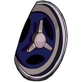
how is this pic?

some parts arnt circular, though its not bad for a quicky.
 

Attachments

  • bla copy.jpg
    bla copy.jpg
    5.8 KB · Views: 164
Originally posted by SiGNAL
Someone make a new vector art tutorial please that last one sucked ass. No words and **** wtf.

You make one then, or work it out for yourself... no in fact just work it out for yourself, i don't think anyone really wants to see the sort of excrement that you're going to include in a tut
 
Preview :

111003-copy5.png


The wheels are finally done, but I think it doesn't look too good. Oh, this is only a preview, I've still the shading to do. Any comments on the colours? I would love to hear comments on the colours.

:)

Inspiration music : Metallica. All my MP3s are gone since I reformated my PC, save a few.

EDIT: Okay, the shading is pretty much done, but I've still a few spots to go. So far, so good IMO.
 
what can i say its sux ...hehehe j/k :D .. good cant wait to see the final result ...;)
 
Originally posted by Venom_supra
be sure to show us all the final product:D

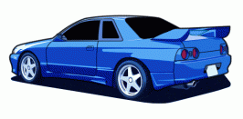
well here it is.........i dont think its finished so could some one give some pointers.......1 is not much detail on the side.
111003-gt90%20copy.gif
 
Ta-da! :trouble:

111003-final2.png

Personal advice : Listen to Tool and create vectors. They give you energy. 👍
 
I dont know why, Carbon, but I like the line art better. I really dont care for how you did the wheels either. Still looks good though, but Im sure you can do way better.

Oh, and I listen to Linkin Park when I doodle, heh.
 
even though i dont like it much techno gets me jumpin.........comments on my gt90 plz
 
I dont know why, Carbon, but I like the line art better. I really dont care for how you did the wheels either. Still looks good though, but Im sure you can do way better.
Yeah, I tend to agree. The line art looks better.

gtmaniak = The car looks good overall, but the front and rear wheels looks somewhat odd to me.
 
yea as soon as i piced the car i new that the wheels were going to be the hardes......and im not a fan of vectoring in white.
 
Looks way better than the first one. 👍
But, there is just one small mistake. See the area around the rear wing, I don't really know how to explain it.
 
i know how to explain it - the little polygon of blue whichcan be seen through the rear wing which is not part of the car should be white :p
 
aaaahhhhhh such a silly mistake........how embaresking.

i had to read the post like five times over.......i thought u meant the blue bit on the foil of the wing
 
Looks good, but those wheels and tyres don't look vectored, they look filtered. Also the r32 is a moose, quite literally :)
 
Dammit I haven't vectored a car in ages, I should get on with it. :irked:

And yes, listen to Tool - it gives you much en3rgy and inspiration! :D
 
Hey guys

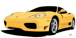
This is my first vector (well, second really, though I never finished the first) so any comments would be appreciated.
 

Attachments

  • 360_modena_vtr2.jpg
    360_modena_vtr2.jpg
    42.8 KB · Views: 159
Originally posted by donbenni
Looks good, but those wheels and tyres don't look vectored, they look filtered. Also the r32 is a moose, quite literally :)
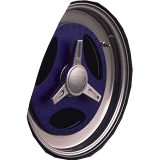
naaaaaa filtering in vectors is against my religion..........just forgot to add lines......another silly mistake
 
is anyone else getting sick of this tracing bull****?

personally, im sick of it.

IT would be alright if the people actually drew their own pictures and coloured it.. instead of just tracing a picture.. it doesnt take much skill to do what everyone is doing here.
 
Back