Tooned/Vectored Cars + Stuff

  • Thread starter Thread starter donbenni
  • 3,937 comments
  • 306,709 views
You needed another line defining the other side of the hoodscoop. Also, what helps me is to draw every single line I think I'll need to do the shading. That means every little reflection, shadow, highlight, etc. Then I color it in, then I delete the lines. Also, it's really cool to watch the car come together as you delete those last lines.

I'd like to see you continue working on that.
 
Also, what helps me is to draw every single line I think I'll need to do the shading. That means every little reflection, shadow, highlight, etc. Then I color it in, then I delete the lines. Also, it's really cool to watch the car come together as you delete those last lines.
Now that's a grood and awesomes idea. Thanks for that Mister E! ;)
 
Intentional mis-spellings of good and awesome, than a "Thanks Mister E" with a winking smiley at the end signaling sarcasm... I have no clue what that sentence meant. :confused:
 
Intentional mis-spellings of good and awesome, than a "Thanks Mister E" with a winking smiley at the end signaling sarcasm... I have no clue what that sentence meant.
Well, 'grood and awesomes' was something our very own member Race Idiot 'invented', in which grood means great and good. See? :)

I've no idea what awesomes mean though.

So, there ya have it. I'm just really saying thank you for that idea, no sarcasm, nothing. Just thank you. :)
 
No problem. Another hint would be to use Flash MX for your Outlines (and fills if you want to) and then Photoshop for the fills. The line tool in Flash is awesome. Point to point, then bend, and you have a perfect curve.
 
Well, 'grood and awesomes' was something our very own member Race Idiot 'invented', in which grood means great and good. See?

Actually, it's from the TEEN GIRL SQUAD! from www.homestarrunner.com

Sooo good!
 
Originally posted by under18carbon
And it's finally finished.

031003-saleendone.png


I screwed up the layers, and I did not do the shading. The original picture of the car had like, just one colour and very few reflections. The word lazy maybe sums up everything well. :D
Lovely gradient work on the background there, Shant, but I must say the wheels don't look too real. That'd have to be the only "not quite real" thing about it. Nice work!

You pretty much summed up that "too lazy" aspect, I think it's part of ALL vector artists. ;)
 
Yeah it's a great 'basic' vector. Could've done with the shading and highlighting on the bodywork, detail on the wheels and any detail at all with the lights, but i know that's tough... so good job, especially on the line work 👍 I read what you said about the shading, and all i can say is... either make it up 👎 or chose a better picture 👍 ;)
 
15 min line drawing.. 30 sec. coloring. lol.. u can tell :D

SRT-vert.jpg
 
Originally posted by SandStorm
Good job?! You can't be serious! :D

:p

Be nice.

It's a great job for the short amount of time spent.
 
Originally posted by AltF8
Be nice.

It's a great job for the short amount of time spent.
Now now, don't start that Fascist crap again. Oh yeah... I forgot, you're a mod, you wouldn't recognise a joke if it danced naked in front of you wearing a tea-cosy...
 
I'm a mod? When did that happen?

Oh, and name one time where I've exhibited 'fascist' behavior where it was unwarranted. Please. I'll wait.
 
Originally posted by AltF8
I'm a mod? When did that happen?
Dammit. I forgot you're Admin. You can go edit my post if you want. Sorry. :O

Oh, and name one time where I've exhibited 'fascist' behavior where it was unwarranted. Please. I'll wait.
Well... I suppose you're not one of the offenders. See, us 'mortal' members categorise mods into one general group (ie "Good" "Bad" or well... "Fascist") so when the attitude of a few mods changes, it reflects upon all mods, no matter if they're fair or not.

Seeing as you're Admin (I admit, I forgot) I suppose I don't categorise you. And you don't appear around GTP much anymore.
 
Originally posted by SandStorm
And you don't appear around GTP much anymore.

I'm here several times a day. I just don't usually see something that I feel I need to comment on. :)

Carry on - nothing to see here. ;)
 
Originally posted by AltF8
I'm here several times a day. I just don't usually see something that I feel I need to comment on. :)

Carry on - nothing to see here. ;)
That's what I mean - you're not generally active a lot of the time. ;)
 
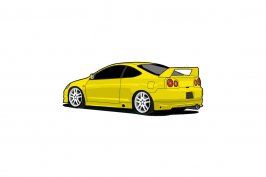
Here is my Integra Type-R w/ R34 Tails:

The Only Thing That Came Out Like Crap Were The Rims I Think. But Its Not Bad For My Second Try At Vectoring.
 

Attachments

  • r34 integra.jpg
    r34 integra.jpg
    32.8 KB · Views: 162
Yeah it's a great idea to add the r34 lights, i looked at it was like, wtf!? Looks nice overal too :D
 
so where yours ... how about this not vectors but chops
my entry for week 41 i call it

RAMSTANG....!!!!! :D
 
Looks pretty good, but the front left tire looks flat, just a bit.
Overall, it's pretty nice. Good colours.
 
XGRaViSmOrSX <- one word on ur vector... CROP!! it'd take a LOT less time to load if u took away all that white space.
 
Originally posted by SiGNAL
Someone make a new vector art tutorial please that last one sucked ass. No words and **** wtf.
 
Nice effort so far, Shant. Pretty sweet line work, and good detail. Keep it up. 👍

Oh, and I've discovered that the wheels are the best part. :D
 
Could some one vector this.........is so plz leave the same size
 
Back