@ProjectWHaT
Long post inbound!
I'm no expert editor, but here's what I threw together in fifteen minutes using Adobe RAW converter - all of these tools are accessible to you in Lightroom.
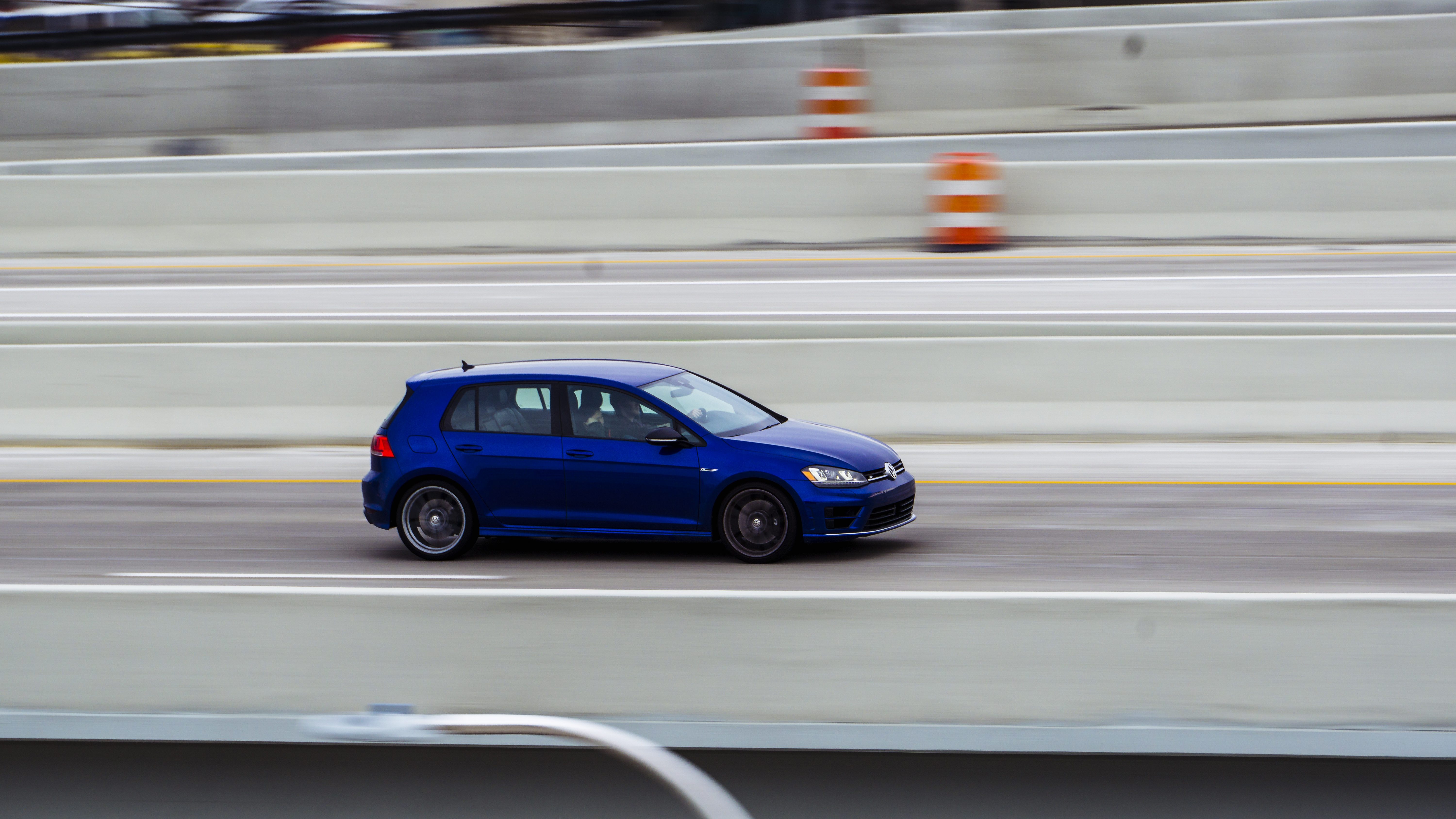
Here's what you started with:
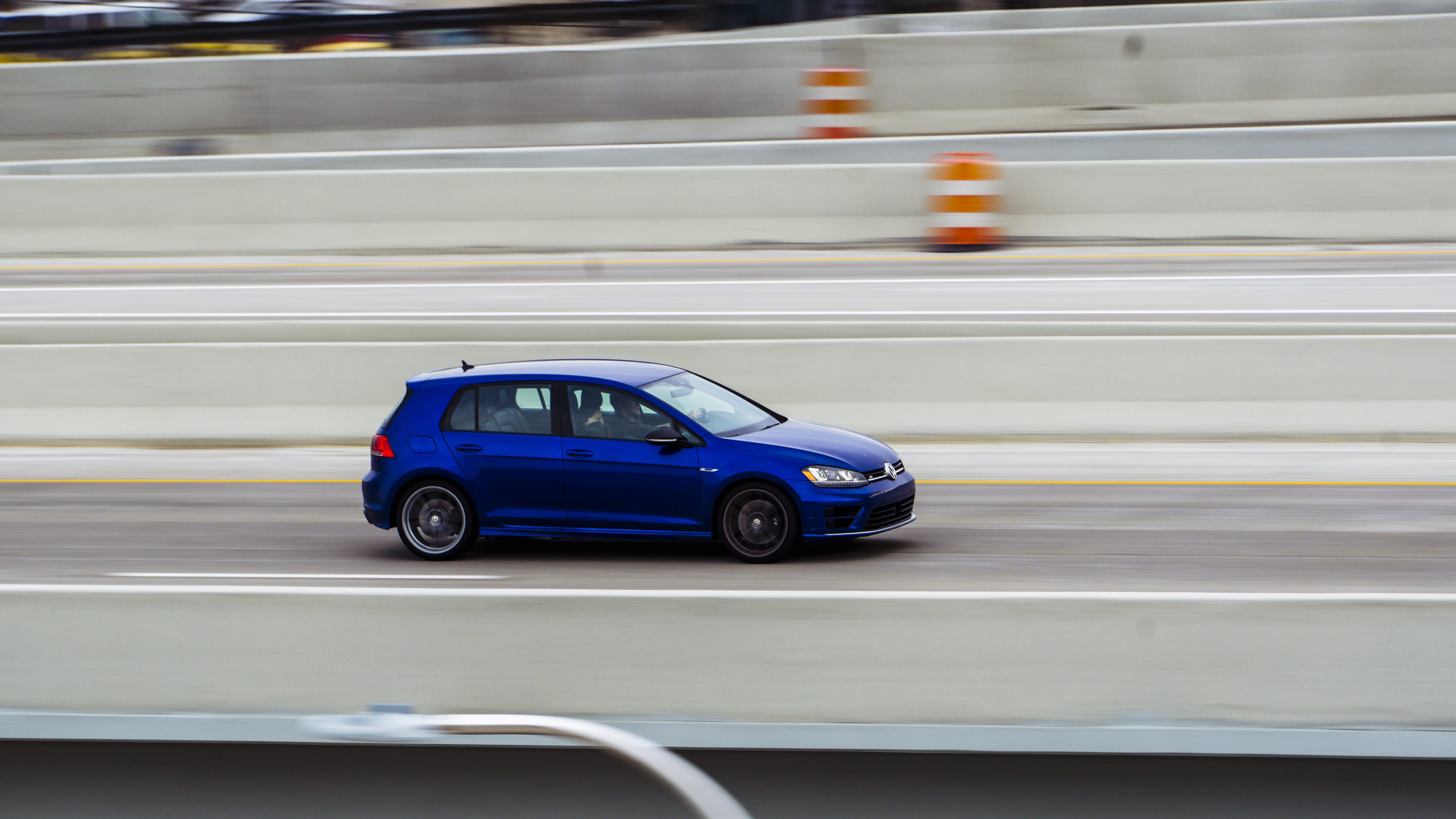
First, I started by opening the Tone Curve settings. I made a basic "S-Curve" by pulling the shadows down a bit and raising the highlights. I don't typically make this S-curve very strong unless I'm done with most of my other settings and still want more contrast. For this particular image, I lowered the shadows a decent amount and only raised the highlights a very small amount. I also pulled the blacks a very tiny bit. It costs you some shadow detail, but it looks really nice a lot of the time. It's very easy to overdo this effect, so use some restraint. Some people like to remove any semblance of detail from their shadows and blacks - I'm sure you've seen plenty of photos like this on automotive photography sites - and it just looks amateurish to me. Anyway, here's what I got after just changing this one setting:
As you can see, the whole image is much more bold. I might be tempted to leave it here, but I like to experiment when I'm editing, so I'm going to go a little farther. Next, I'm going to do basically the same thing but for each individual color channel. Doing this will increase the contrast of your image further, which is why I keep my changes to the RGB curve pretty subdued. By altering each channel individually, you get a lot of control over the toning in your image. If you want your shadows more yellow, for example, just pull the blue channel down farther in the shadow area.
This is one of the hardest parts of editing because until you've changed every channel it's going to look like complete trash, making it hard to tell how far to "bend" the line. It's very easy to mess things up in this part of editing, so be careful, and switch between before and after views frequently before moving on. It gets much easier with practice, I promise.
For this photo, I made my changes to the red and green channels very,
very, slight with my largest change being to the blue channel. All three channels still use a basic S-curve, so nothing fancy, but with the blue channel I put an additional point towards the center of the curve as sort of an anchor.
I wanted something that really popped, and given the grey scenery and flat lighting, I decided to pull the blues higher towards the highlights. This makes the concrete seem slightly cooler in appearance, and makes it seem a bit more interesting in my opinion.
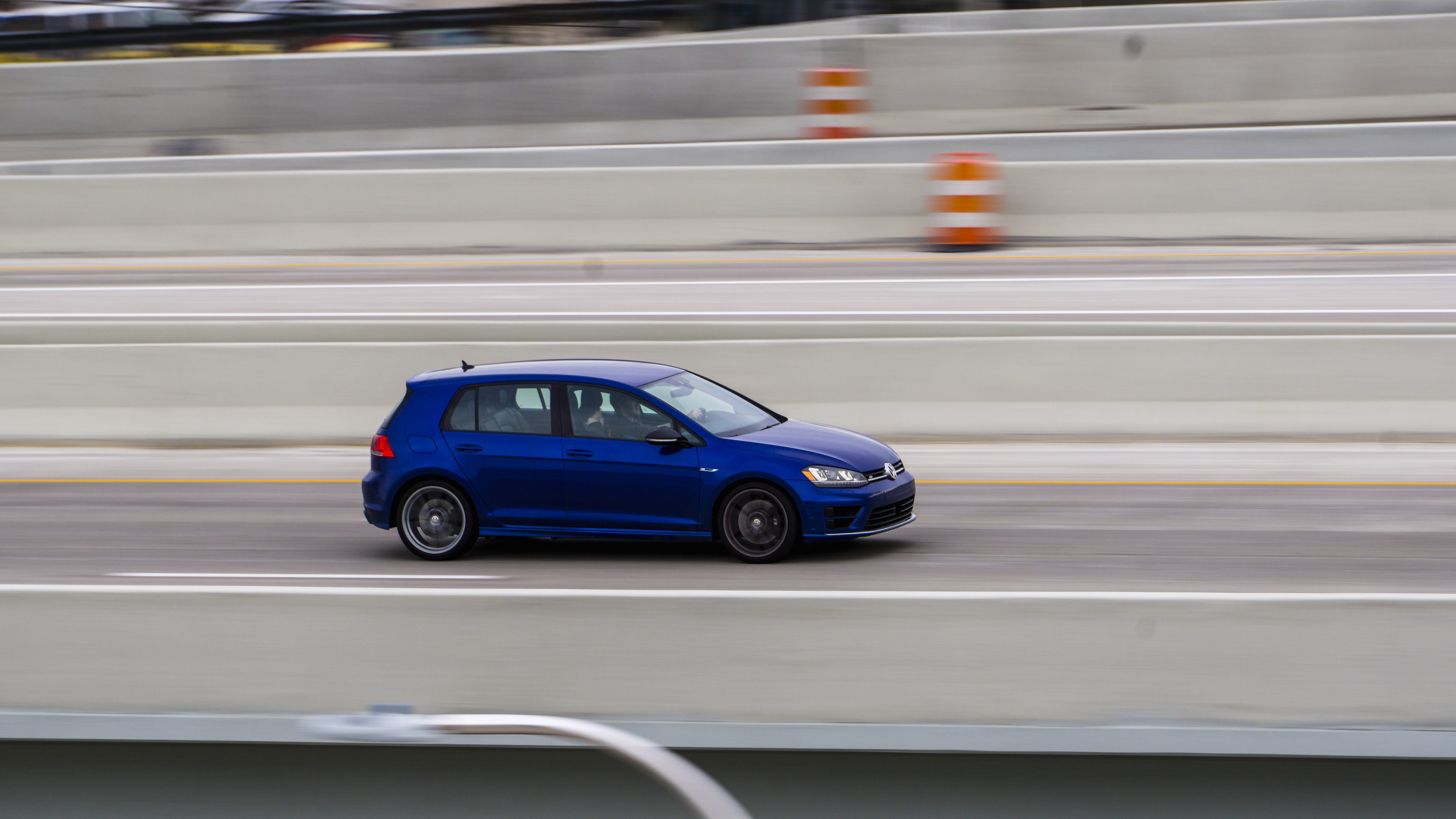
Big difference again, huh? Now I'm onto my final step, the H/S/L sliders. Since there's only a few colors in this image, it's pretty easy to make changes here. In the "hue" section, I mostly changed the oranges, making them a bit more yellow. Under "saturation", I decreased the reds a little to make the taillights a little easier on the eyes. I boosted the saturation on the yellows and oranges to make them pop a bit more as well. Next, I increased the blue saturation and decreased purple, which made the paint on the Golf stand out more. Under "luminance" I boosted the blues a fair amount (+23), which made the Golf's paint even contrastier.
After looking at it more, I decided I had overdone the cooling effect in the blue channel to the highlights. The smart thing to do would be going back to the blue channel and messing with that a bit more, but I'm not very smart, so I just made the white balance temperature ever so slightly warmer.
After all that, here's the final image:
More interesting, wouldn't you say? The end result isn't perfect, but it's almost there, I think.
Notice how I didn't make any changes to the vibrance or saturation sliders you'll find near the exposure sliders. I almost never use them, as they rarely give the control that I'm looking for when editing. Also notice that I didn't mess with the exposure sliders in order to increase the image's contrast. I rarely use them for that purpose, just for saving detail in the highlights and shadows. I didn't have to make any of those changes here, since it was a low-contrast scene.
I also didn't use the split toning options. Though they can be fun, it's another setting that can very easily make an image seem over-edited or amateurish. I only use it if I can't figure out how to get the effect I'm looking for in any other setting. I most often use it in order to add a tint to the shadows or highlights without messing with the RGB channel curves.
Obviously, everyone likes to edit their photos a little differently. I'm sure that if all of us that frequent the photography subforum were to edit the same photo, we'd end up with a pile of completely unique-looking images, even if we all started in the same place. For me, I draw inspiration from people like
@Azuremen and
@35mm who use more film-esque toning as well as photographers for magazines like
Road & Track that have a more contrasty, digital look. Since I like both of these styles, I like to edit in a way that has characteristics of each style, thereby making something that is my own and unique.
You might not like the way I edited your photo; you may prefer the version you originally uploaded, and that's fine. The key is to find a look that you're proud of, and it takes time. It took me, personally, a very long time, and frankly I'm glad I wasn't uploading any photos during that period of time where I couldn't figure out how I wanted to edit my work, because they looked bad. I'll probably feel the same about the photos I'm most proud of now in six months, but hey, that's what artists do a lot of the time.
Continue to play around with things, that's the best way to figure these things out, in my opinion.
Hopefully this was helpful to you or to other people who read this thread. I can post screenshots of my settings too, if you're a visual learner or if I've been unclear. If you want more, I'd be happy to help out - I think I like teaching.


 Ferrari F1
 IMG_1010
 Sanctuary of Truth

")
 Hey that works.