You are using an out of date browser. It may not display this or other websites correctly.
You should upgrade or use an alternative browser.
You should upgrade or use an alternative browser.
Gran Turismo 7 and GT Sport User Interface Fan Art
- Thread starter Scuderia Paul
- 1,721 comments
- 339,761 views
- 15,074

- Melbourne
- ScottPuss20
- CheetahsMeow
I'd like to see this menu style as a HUD on track.License Center - Intermediate IB License
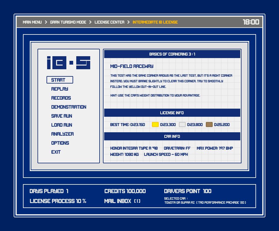
Icons and images are from google image search. Some with minor modification.
Grid, license text form GT2.
@Hallitrd I know these are just for fun but it's pretty unrealistic that every single screen in a game UI would take up a significant portion of the screen with the same consistent information, especially not one in the old 4:3 days when you have less space. A user wouldn't need to know much of that information 100% of the time, on every screen.
- 712

- Brazil
- wagnerFAM98
- 973

- Morrow, OH
- DRR_Sinyster
- Sinyster Plague
now this is what I like to see!
- 1,325

- England
- Doomotron
Finally, something modern in this thread!
- 435

- Iceland
Nissan - Used Car Dealership
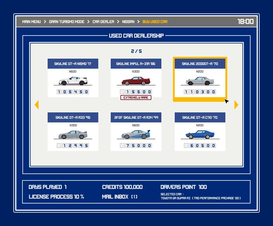
Icons and images are from google image search. Some with minor modification.
Nissan cars from www.importarchive.com/
Icons and images are from google image search. Some with minor modification.
Nissan cars from www.importarchive.com/
- 973
- Morrow, OH
- DRR_Sinyster
- Sinyster Plague
@Hallitrd may I potentially suggest posting these in their own thread from now on? I understand this is more of a dream concept for you but it isn't really much of a GT7 UI fanart at this point with the constant repeating of the same general 90s aesthetic. Fans of your work would enjoy it still in its own space but it does feel rather clear that a majority of people don't really enjoy the (for lack of better words) clutter of space with these constant posts.
I appreciate the work you put into it and the passion you have for your designs but frankly it doesn't fit after the 20th+ post of more or less the same thing over and over.
I appreciate the work you put into it and the passion you have for your designs but frankly it doesn't fit after the 20th+ post of more or less the same thing over and over.
- 435
- Iceland
Looking forward to see more from you. Nice mild colors and subtle design.
- 975

- Usa
- lgfd070
- Nowyx
Can someone make GT7 home screen how they think it is going to look like .(final product)
Haven't PD released it?
View attachment 979242
Haven't PD released it?
Well yes, but it could change between then and release. There are several different GTS menus from the early days that were changed by the time of the game releasing.
- 975
- Usa
- lgfd070
- Nowyx
So true, then. It's really difficult to predict the final UI design, who would've thought in 2016 that the main color for GTS UI would be dark gray instead of white?Well yes, but it could change between then and release. There are several different GTS menus from the early days that were changed by the time of the game releasing.
- 15,074
- Melbourne
- ScottPuss20
- CheetahsMeow
Yeah I learnt that at uni. Uppercase letters should not be used for paragraphs, and there should be some hierarchy across the board or else the design becomes too repetitive.Whilst uppercase text is OK for headings and short text it's really not good for readability on paragraphs. Also with the entire page being uppercase there is very little visual hierarchy in these images.
Last edited:
So I was procrastinating and decided to have a go myself. Just done the home page following the PS3 era style of tiles, rather than having everything hidden like GTS. Got bored a bit way through so the images used aren't all great, but you get the idea. Might do some better ones at some point. Also the background image could be better, everything just sourced via google images.
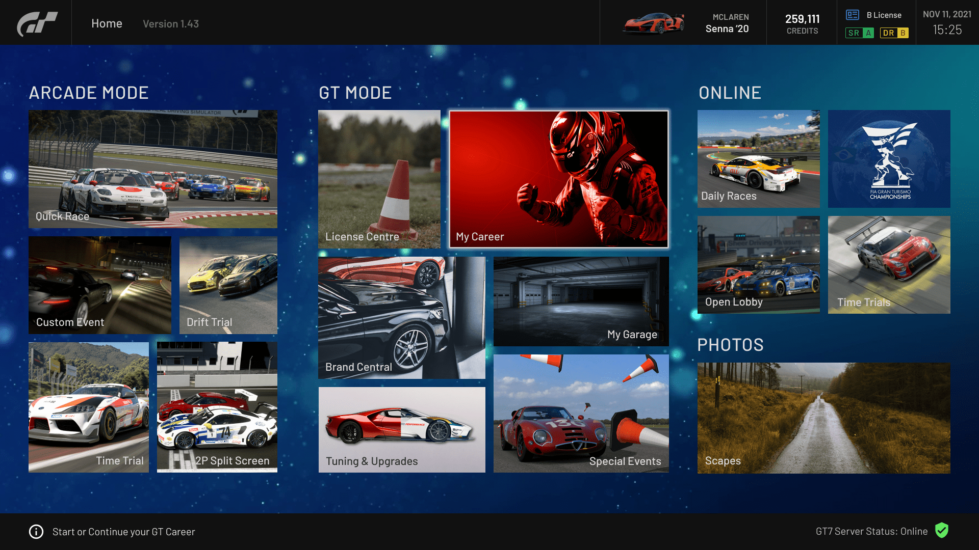
Also did a persistent top menu for what would be most other menus other than the home, with the links to the core functions always present on the top left. Again, might do some more/an actual other menu when I feel like.
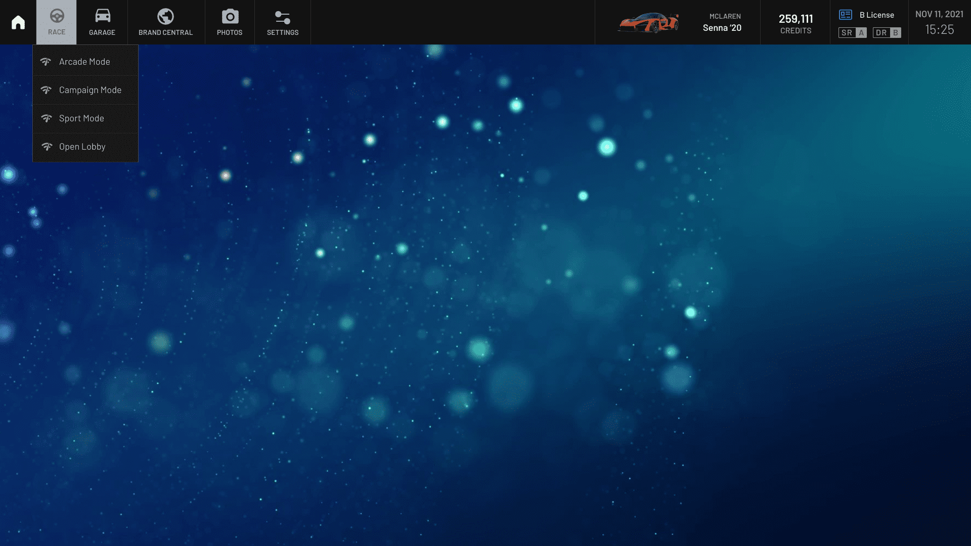
Also did a persistent top menu for what would be most other menus other than the home, with the links to the core functions always present on the top left. Again, might do some more/an actual other menu when I feel like.
Last edited:
- 445

- Toronto
- NigrickUS
I can also recommend to post these on Behance and update them there. Im sure many people will enjoy 90s aesthetic. Hallitrd, you can even attach link to your profile. Let's make some room in this thread for others to share their designs with community.@Hallitrd may I potentially suggest posting these in their own thread from now on? I understand this is more of a dream concept for you but it isn't really much of a GT7 UI fanart at this point with the constant repeating of the same general 90s aesthetic. Fans of your work would enjoy it still in its own space but it does feel rather clear that a majority of people don't really enjoy the (for lack of better words) clutter of space with these constant posts.
I appreciate the work you put into it and the passion you have for your designs but frankly it doesn't fit after the 20th+ post of more or less the same thing over and over.
Last edited:
- 1,497
- Nurburgring, Germany
So I was procrastinating and decided to have a go myself. Just done the home page following the PS3 era style of tiles, rather than having everything hidden like GTS. Got bored a bit way through so the images used aren't all great, but you get the idea. Might do some better ones at some point. Also the background image could be better, everything just sourced via google images.
Also did a persistent top menu for what would be most other menus other than the home, with the links to the core functions always present on the top left. Again, might do some more/an actual other menu when I feel like.
Very nice work Samus, I love the menu look it kinda reminds me of the DRIVECLUB UI system. Love to see you have a go at some box-art designs too.
 👍
👍- 1,208
- Melbourne
- Nicky-Boy_7
Great job man.So I was procrastinating and decided to have a go myself

- 1,446

- Indonesia
Persistent top menu was a thing on GT1 and GT2's GT Mode. Wasted opportunity for GTS'.Also did a persistent top menu for what would be most other menus other than the home, with the links to the core functions always present on the top left. Again, might do some more/an actual other menu when I feel like.
Persistent top menu was a thing on GT1 and GT2's GT Mode. Wasted opportunity for GTS'.
Yeah the GTS menus are very nice visually but the UX is really not so good. I hope they go back to putting everything in easy reach from anywhere on GT7.
- 348
- United Kingdom
So I was procrastinating and decided to have a go myself. Just done the home page following the PS3 era style of tiles, rather than having everything hidden like GTS. Got bored a bit way through so the images used aren't all great, but you get the idea. Might do some better ones at some point. Also the background image could be better, everything just sourced via google images.
Also did a persistent top menu for what would be most other menus other than the home, with the links to the core functions always present on the top left. Again, might do some more/an actual other menu when I feel like.
Absolutely love the Gran Turismo 6 feel to this. Although I prefer the GT4 retro menu shown in GT7’s trailer for nostalgic reasons, this is spot on! Love it!
Only thing I would change is to have all the ‘tiles’ colours muted or monochrome, and only have the colours pop when the tile is selected to make it easier to see what the player is selecting whilst scrolling through
- 1,919

- Recklinghausen
- n_blkr
Guess who's back...

Last edited:
- 15,074
- Melbourne
- ScottPuss20
- CheetahsMeow
You need to add "Sport Mode" to this menu.Guess who's back...
- 1,919
- Recklinghausen
- n_blkr
True, good shout!You need to add "Sport Mode" to this menu.
Absolutely love the Gran Turismo 6 feel to this. Although I prefer the GT4 retro menu shown in GT7’s trailer for nostalgic reasons, this is spot on! Love it!
Only thing I would change is to have all the ‘tiles’ colours muted or monochrome, and only have the colours pop when the tile is selected to make it easier to see what the player is selecting whilst scrolling through
Yeah I know what you mean, it is a little busy on the eyes with all the bright tiles, some need to be more muted. I think ideally many of them would have custom icons/designs rather than most being photos, but I ain't got time/inclination to do all those.
Guess who's back...
I know you're just emulating the old games but the problem with this approach is that several options are hidden from view. A user shouldn't have to scroll through all the options available just to simply see what those options are, and have to remember each time. Not if it can be helped, anyway.
Last edited:
- 1,919
- Recklinghausen
- n_blkr
Thanks for the feedback, I was jst casually fooling around in InDesign to see if I can still do some stuff.I know you're just emulating the old games but the problem with this approach is that several options are hidden from view. A user shouldn't have to scroll through all the options available just to simply see what those options are, and have to remember each time. Not if it can be helped, anyway.
But hey, it seems like I can:

Last edited: