Photoshopped cars.

  • Thread starter Thread starter sn00pie
  • 7,970 comments
  • 629,466 views
It is in production. I've seen a few at the Ford dealership near my house and I think they look perfectly fine as is.
 
Yes it is very saturated. You should have saved it as a different files before you coloured it. You can re highlight that spot and then desturate it maybe? It will go grey but it is a fresh start...
 
I'm doing the Flex thing for Fangio as well.
It's about all I'm looking to do to it for now. I thought about lowering it, but obviously decided not to. The only other change I would've made was making the lower window trim into red, instead of chrome (in keeping with Ford's H-D vehicles, which typically have a red pinstripe)

fordflexsz6.jpg


I did a fair amount of subtle changes. See if you can pick them out.

I saw quite a few of these recently as rentals - I'm not fond of the looks, particluarly. Too boxy, and much larger than you'd expect from pictures. I was expecting something more Fuzion-sized.
 
Harley badge
Wheels
Black roof
Extended side markers
Tailpipes
?
 
Muzzy maybe just desaturate a little? Slicks, I like your chop 👍
 
Lovely chop Slicks. I womt pick them all out but i can see them....
 
patriotrubiconkh4.jpg

Patriot Renegade
google the original "Jeep Patriot" for reference. Yes, I know, something is wrong with the rear tire, but i'm too lazy to fix it now.
 
The first thing i saw was the rear tire but you have mentnioed that so, get that fixed and I cant exactly see any other flaws. The picture is too big so...hard to look at flaws when i cant see the whole thing...
 
Yes, resize that monster so i don't have to save it just to view it.
 
Firefox opened that perfectly, thats a decent browser right? Lol
 
Firefox did it great. Have you fixed the rear tire yet?
 
Why is the sidewall writing backwards?
 
because the tires on the wrangler i stole them from were facing the other way, and I didn't feel like changing them. :P
 
because the tires on the wrangler i stole them from were facing the other way, and I didn't feel like changing them. :P


I don't think i have ever seen something so lazy come from you:lol:
 
It's true, but her chops are excellent so it really doesn't matter.
 
Did I ever say they were...
 
lol.. if you guys are arguing about tire direction.. i'm not concerned. lol..


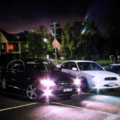
Mods:

  • Colour change
  • Spoiler added
  • Wheel change
  • Lowered
  • Window tinting, Rear lights smoked
  • Scissor door
  • Big wheelarches
  • Lots of decals
  • Neon
  • Exhausts

It might look a bit overloaded but I didn't feel like starting a new car at the time.


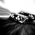
I didn't spend long on this one..


  • Colour change
  • Wheelarches
  • Side skirt
  • Decals
  • Wheels
  • Mesh Grills (intercooler was on stock picture)
  • Neon
 
This brings back memories from Photoshopchop...
 
stuff is a bit on the low-res side, GM
 
The wheel areches on both cars are blurry. On the second car, the spoiler is blurry. On the first car alot of the stuff looks like it has been cut with scissors and with no definition to it. The door for example and the spoiler but the spoiler just looks choppy.

Im not really fussed about anything else.
 
I know this is the car chop thread but its where all the people are that chop so i will post this here. A local radio station is having a photoshop contest and the winner gets so many free PS school sessions at a local college. Its not open to people that have went to school for graphic arts either which is nice.
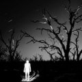
The challenge is to PS the image given of the dj however you like and this is what i did, any commnets? I like doing horror and such so i just did what i like and what im good at, before and after. You have to include a headline in the email you send them and mine is going to be, glamour shot zombie. Click for higher res, and yes i know they are low res images but thats what they gave us. It was like chopping a NES screen shot:crazy:


it looks okay so far, but i think if you went all out on your imagination, it'd be a winner.
Since you've mentioned aobut the Horror theme thing, i was thinking you make the DJ lack so much nutrition that'd he would look anorexic. Afterwards, change his skin tone to a dead rotting one, and possibly a few exposed parts of the skull and hand from Burnt off skin or something.

Perhaps these can further motivate you:

Exposed Bone

i have no clue what to say aobut this one
 
Last edited:
Make him look dead. He looks more like a burn victim than anything else.
 
Well contest was over the day before i put in my entry but they sent me an email and said if i would have sent it in a day earlier that i would have one. They told me i could come by and get a T-Shirt....i don't want a shirt so they can keep it, i wanted some classes!
 
Sorry, havn't been in this thread much, it was pretty dead. Nice chop and shame you didnt make it.
 
Back