- 1,041

- Inkster, MI
- Lameonade
- Lameonade One
It looks like it's made from earwax.This is bad enough as it is without choosing "baby food beige" as the colour.
It looks like it's made from earwax.This is bad enough as it is without choosing "baby food beige" as the colour.
The Storm normally looks good.
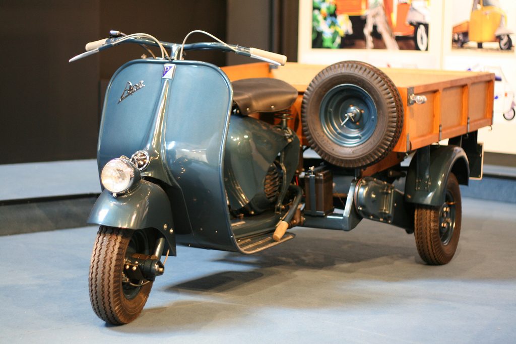
I raise you a secondary
I don't find it that ugly even in the games lol but that's just me.This trim is much worse imo:
You think that design is ugly?

I mean...the quarter windows are nice, I guess.You think that design is ugly?
I concur with that. Very cool looking design for the period.
I'd say all versions of the Storm look good, but the race variants to stand out more. Though the one type of Storm which could be considered ugly, is the Storm LMP (No relation to the original Storm of course).
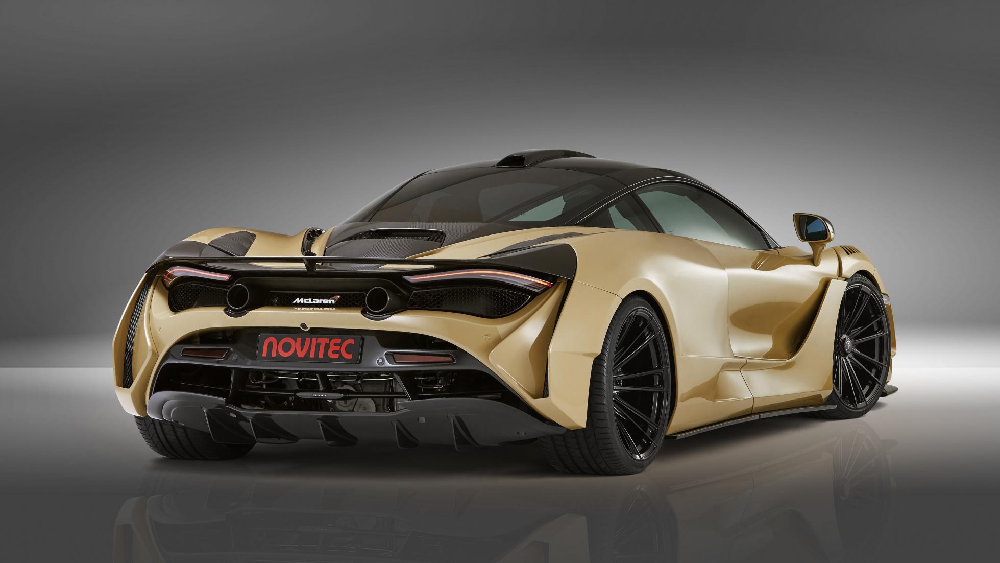
View attachment 784548
That's not a good look.
I honestly never understood the problem people had with how this car looked. I think it looked good then and compared to some more recent LMP machinery, it's positively a beauty queen.
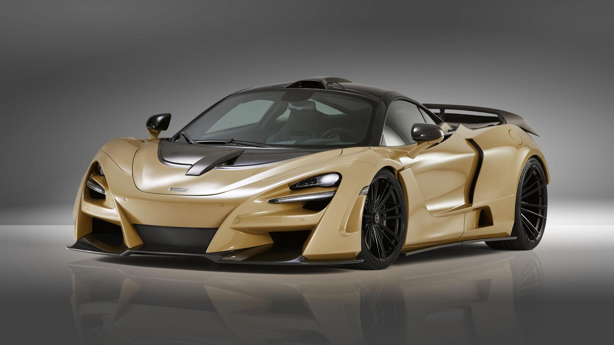
I'm going to be completely honest, I do not see what your seeing about the stretched econobox comment, the design imo blends in with a lot of the styling choices going on with supercars in the 1990s. Other things you mentioned such as the crease on the side (only straight line? Um, what about the straight lines on the front and rear ends of the car?), the body work distance between the rear panels, the front fenders, and the curved bulge in the rear don't really bother me. If anything, I think the front end looks okay; it reminds me of the Lancia Stratos from the front.It's like they took a sporty-ish FWD econobox (something like an Integra), widened it right down the middle, took the standard engine out and hammered the nose in an effort to reduce frontal area (an odd decision given the desire to wedge a big V12 in there), got creative by putting a diagonal crease in the side (which is the only straight line on the danged thing, by the way) all the way into an integrated spoiler at the rear above some B3 Audi 80 taillights, oh but the thing still wasn't wide enough so they ballooned the front fenders and put a curved bulge in the rear, conflicting with that diagonal crease.
I get that, and I readily acknowledge that the world would be a pretty boring place if everyone thought as everyone else, but there's a fair amount of wiggle room between "beautiful" and "eyesore", and I generally think of "good" as being much closer to the former than the latter. When prompted with a request to elaborate as to why I thought it wasn't "good" (at least that's how I interpreted your question), I didn't hesitate.To note, I'm not saying it's a beautiful thing; I just don't see it as an eyesore.
Oh for sure there's a lot of wiggle room, I think the design is around the middle. To note, my initial question wasn't serious; I was just messing with you (though I guess I should know better than use the crazy smiley when trying to make a joke). However, it was nice to hear your elaboration regardless. 👍I get that, and I readily acknowledge that the world would be a pretty boring place if everyone thought as everyone else, but there's a fair amount of wiggle room between "beautiful" and "eyesore", and I generally think of "good" as being much closer to the former than the latter. When prompted with a request to elaborate as to why I thought it wasn't "good" (at least that's how I interpreted your question), I didn't hesitate.
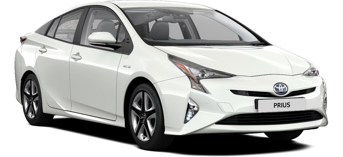
I'd say that the whole pinched-face look that Toyota is doing in general these days is just daft. Putting all kinds of severe angles and sharp edges on the front of a sedate 4-door is nothing but tacky.Need I say more?
Good. Now to clear my search history
I'd say that the whole pinched-face look that Toyota is doing in general these days is just daft. Putting all kinds of severe angles and sharp edges on the front of a sedate 4-door is nothing but tacky.
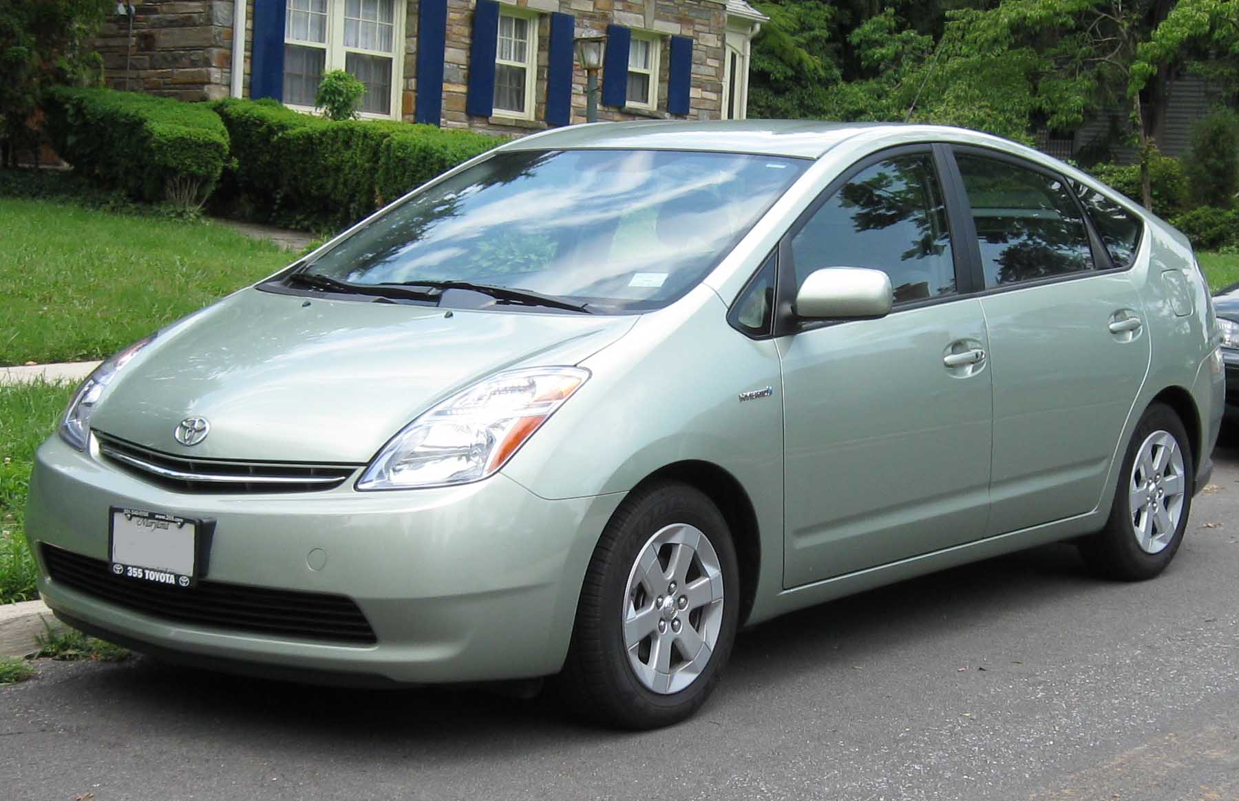
They definitely aren't design masterpieces, but the version from the picture is the only I can call badly designed.The Prius never looked great
Many people on gearhead sites do. And that's sad.I don't know if you noticed, but I really hate the Prius.
I find it way more attractive and good looking than it's older brother from 2004:Need I say more?
Good. Now to clear my search history