User Decals - A Tutorial On How To Make .SVG (Request in separate thread)

  • Thread starter daan
  • 1,460 comments
  • 346,661 views
Hello everyone!

I'm sure by now you all have heard you can import your own user decals to use within the game!

For all you guys and gals out there with little understanding of how to do this, I've decided to make a tutorial thread on how to make those logos ready for upload!

The image type you need in order to use it within Gran Turismo Sport is .SVG. This is short for Scalable Vector Graphics.
This is basically an image that doesn't get any loss in quality no matter how big or small the logo is! Isn't this great?

First, let's start with the basics.

300px-Bitmap_VS_SVG.svg.png


What are the differences between Raster (for example BMP, Bitmap data) and Vector(SVG)?

The BMP format generates an image using groups of dots. If this type of data is enlarged, the small dots will start to be stretched, making edges of curves jagged or blurred.

On the other hand, the SVG format converts images to numbers when storing them. The advantage of vector data is that even if an image is enlarged, the image quality will not deteriorate, and the data size will not increase either.

The diagram below shows a comparison of an enlarged BMP file (left) and a SVG file (right). On the SVG file, the sharpness of the edges is maintained.

i1zJ51h2lF9ifuB.jpg i1BaU3Ij4tF14.jpg

But remember guys and girls! We have a size limit of 15KB!
The data size of a SVG file depends on how the image is created, even if the end results may look identical. If an SVG file size is too large and the image cannot be uploaded, you can reduce its size by editing the anchor points and path data of the SVG image. Specialised optimisation software for SVG files can also be effective in these instances. If you use Illustrator you could try to click Object > Path > Simplify. If that doesn't work to well, try this online optimizer to get the size down!

Let’s take a look at a comparison of two SVG files generating the same image.

i1jtHNkuJLDQbz.jpg i19agYBw7Xxup7c.jpg

On the left there's an SVG file that was generated automatically using a non-structured Bitmap image (a collection of dots) as a base, using the auto trace feature of an editing software: unnecessary anchor points can be clearly seen, and they are not accurate either. As a consequence, the file size becomes large.

On the right there's an industry standard SVG file created by manually editing vector data of a Bézier curve: it consists of the least number of anchor points, and each applied with high accuracy. Because of this, its file size is also small.

Now you've got the basics, let's begin with the tutorials!

I want to start off with a video tutorial, much like the Affinity Tutorial(since it is Affinity Designer I'm using), but here you can see more to it! If you use Illustrator or any similar program, it shouldn't be too different to this. Also, if you're unsure how to upload the decals once you make them, keep watching until the end! Here you can see the entire process.


TUTORIAL #1: ILLUSTRATOR

What you want to do is to download an application an application that handles .svg files. For the first tutorial I'm going to show you a real easy way using Adobe Illustrator CC. This application can be downloaded for free for Windows and Mac OS, and has a 7-day trial.

This method works great if your logo is simple, because like we've just covered, this will create unnecessary many anchor points, and bring size up. Most single and two-colored logos should work fine this way though, so don’t be afraid.

Okay let's begin! Find a decent logo that has some size to it already if you're able to. For this tutorial I've chosen to use a Speedhunters logo.

sh.png

This logo is 900x900, not particularly big, but it isn't too bad in terms of quality, so it should work fine.

Open up the image in Illustrator.

Skjermbilde 2017-10-11 23.29.06.png

Then click Window > Image Trace. This will open up the bar you see on the right side on the image above.

Skjermbilde 2017-10-11 23.30.13.png

Play around with the settings you see here, until you're happy. Choose ignore white if you want the white to be transparent. This is especially important if you're working on a logo that is any other color than white, or else it will make a white box around the logo, and inside letter like O, A etc..

Edit the mode if you plan on choosing a multi-color logo, and set total amount of different colors. The fewer colors the better.

And you're done! This method should work for most images you find. All that is left is to export the image, don't forget to choose SVG!

Skjermbilde 2017-10-11 23.30.34.pngSkjermbilde 2017-10-11 23.30.42.png

The finished result can be seen or downloaded here.


Enjoy making decals for Gran Turismo Sport!


Good sites to find pre-made vector logos:


WorldVectorLogo
Brands of the World
Logopedia
Instant Logo Search
Wiki Commons
 
Last edited:
TUTORIAL #2: VECTOR MAGIC

Now to the second tutorial! This one was provided by our very own @Lord Protector :)

Vector Magic can be downloaded for free for Windows and Mac OS, but it is a little more restricted. You can only preview your work in the trial, not save it. A license can be bought for $7.95 / month, which is cheaper than Illustrator, which stands at $29.99 / month. You can choose an online browser version or an actual application.

Anyway, let's continue!

Step 1: Find a logo on the internet. Logo must be a JPG or PNG format. I use Google and just download any picture I like.

Castrol Vintage.jpg

Step 2: Open the logo in Vector Magic and click "Fully Automatic". There is no need to go with "Basic" or "Advanced" because the first one gives the best results anyway.

PIC 1.png

Step 3: Once the logo is scanned, make sure the color palette is only the colors you actually need. Do NOT let it set "Unlimited Colors" as the logo will look worse and more importantly, size will be dramatically higher (remember, 15kb is your limit).

PIC 2.png

Step 4: If there are artifacts in the vector based logo, choose "Edit Results" and correct artifacts with either "Pencil" or "Fill", depending if artifact is connected to the logo or not. You can easily change colors by selecting "Color" and clicking on the color you want to use.

PIC 3.png PIC 4.png PIC 5.png

Step 5: You want your logos to have transparent background. Click "Remove Background" and then use "Erase" tool to erase parts you don't want present in your logo. Don't forget the insides of letters, like "a, o" etc. Do this really carefully, zoom-in the logo and look at every part, I can't even say how many times I had to everything from scratch because I missed something.

PIC 6.png

Step 6: Choose "Done Reviewing" and then save the results. I use drag and drop method as it seems easier to me, just don't forget to choose .svg!

PIC 7.png

Step 7: Review your results and check the size. Size must NOT be greater then 14.999 bytes otherwise it will not upload. Size on disk does not matter.

PIC 8.png PIC 9.png

Step 8: Use the online optimizer mentioned earlier if needed. It's a very handy tool, but only use the precision that's needed. Remember 14kb is your target, not 8kb. Don't screw up your logo, always try the lowest precision first.

Step 9: Go to the GTS Community website and upload your decal. Always type in a good titles for decals, so you can find it more easily in the game.

PIC 10.png


The finished result can be seen or downloaded here.


Enjoy making decals for Gran Turismo Sport!


Good sites to find pre-made vector logos:


WorldVectorLogo
Brands of the World
Logopedia
Instant Logo Search
Wiki Commons
 
Last edited:
TUTORIAL #3: AFFINITY DESIGNER

Now let's focus on manually tracing a logo, and the tools you'll use! This tutorial was written by @Belifant :)

Affinity Designer can be downloaded for Windows and Mac OS, and is the cheapest alternative of the three applications we've covered, reasonably priced at $49.99. It does not feature a monthly subscription, so you can jump right in without a worry about affording the next month! You can buy it directly on their site for the Windows version, or in the App Store if you're using Mac OS.

Without further ado, let's start!

Basic introduction into Affinity Designer:
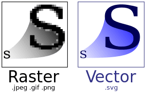
Shapes vs. Curves

A curve is an open path that has a distinct start and end. These end points are defined by nodes. The path between nodes is known as a segment and can be straight or arched. A shape is a closed path with no discernible start or end. It is made up of multiple nodes and segments.

In Affinity Designer, there is another difference between curves and geometric shapes: curves are editable paths where you can change anything you want. Shapes are pre defined sets of curves, for example a rectangle, where you have options to edit the shape as a whole and, depending on the chosen shape, have different options to change that shape, for example, add rounded corners to the rectangle:
0.png

This lets you create very different shapes and designs very quickly, but in order to access the full control over that shape, it has to be converted into a curve.


For creating a vector curve, we will work with the Pen Tool (P) and the Node Tool (A). Basically, the Pen tool is to create/convert points, the Node tool is for moving and editing them. Even though they are two separate tools, there is no need to switch between them. While the Pen tool is active, holding Command/Ctrl will temporarily activate the Node tool. Released, it will return to the Pen Tool. To move and scale complete shapes, we can use the Move Tool (V).

Basic functionality of the pen tool and node tool:

Mouse click: creates a point. Move cursor to another position and click again, creates a new point and a straight line between them.

Mouse click and drag: creates bezier handles. Necessary to create and control curves.

Hold Command/Ctrl: temporarily activates the Node Tool.

Hold ALT: splits the bezier handles. Ideal to make sharp corners.

Hold Shift: restrains the curve to standard axis.

This is the very basic functionality. For an in depth explanation on the Pen and Node tool in Affinity Designer, please see this very good website:
https://www.shortcutfoo.com/blog/affinity-designer-pen-and-node-tools-tutorial/

For a more application independent learning of the curves and points, please try this fun little game:
http://bezier.method.ac

If you use another application, the basic principle of the above is the same everywhere.


Vectorising a logo:

We will use 3 different methods for the creation of this logo. These methods are available in all vector applications and are used for almost anything.

We will:
  • use shapes, and edit them.
  • draw curves with the Pen tool.
  • use boolean operations (using a shape to do something to another shape, like deleting parts of it)

Now let’s get started:

Drag your raster image you like to vectorise into Affinity Designer. Vector files are resolution independent, so the size of your document does not matter. The image will be placed on a pixel layer. Click on that layer in the Layer's panel to activate, then click the lock sign to freeze it, so this layer doesn’t get in our way. Add a new layer by clicking on the layer icon at the bottom of the Layer’s panel.

1.jpg


We will use Shapes where we can and if necessary, modify them to fit the design. Let’s start with the main ring. Drag out a circle and fit it as close as possible. We may have to change the appearance of the shape, so in the color panel, disable the fill color and add a black stroke, in order for us to see our curves better. As you can see, our circle does not fit the logo perfectly, so we will convert our circle to a curve in order to edit it. Click the „Convert to Curves“ button on top of the main view.

2.jpg


Having done this, we are getting 4 edit points for the circle. Change to the Node tool (A) and click the right edit point on the circle. Additional handles will appear. Dragging either the upper or lower handle point, we are able to change the curvature of the circle. Click on the upper handle point, hold Shift (to restrain the movement to the vertical axis) and drag it up until the curvature matches the logo. Do the same on the other side.

3.jpg


After you have done this, copy/paste this circle and do the other shapes, except the centre vertical one. For moving shapes around and adjust their size, you can also use the Move Tool (V)

4.jpg


The whole logo could be created just with using these circles, but we will draw the centre vertical part ourself. Grab the Pen Tool (P) and start drawing out the upper „triangle“. Because there are no straight lines, we will need to click and drag in order to create curved lines. Start click and dragging on one corner, go up to the top, click and drag, go down and then click on your starting point to close the curve. Don’t try to match the curve perfectly at this stage. It may look like something below and that is fine, we will edit the curve after the creation.

5.jpg


We use the same technique as we did for the circle shapes above. Click on points with either the Node Tool (A) or the Pen Tool (P)with pressed Command/Ctrl button, activate the curve handles and drag them so the curve fits the logo. As you can see, the two bottom points are having sharp corners. So far, we have always affected the curves on both sides of the edit point. In order to only change one side, hold the ALT button and drag a handle. Once finished, do the same for the lower part.

6.jpg


We have created all our curves now. It looks good so far. Now, we want our logo to be filled red, and don’t have the black outline, so let’s do that from the color panel. Remove outline color, and fill all shapes with red.

7.jpg


Not really what we wanted. We want some parts of it to be transparent. That’s where boolean operations come into place. We want to add or subtract some shapes from the others. Let’s start with the most outer shape again. Select it, and then select the next inner one. With those two selected, click the subtract button on top of the main view, and the inner circle will be subtracted from the outer circle. This is what we get now:

8.jpg


Now we need to do the same to the other shapes, either add or subtract them from each other. Select two curves, and click either the Add or Subtract button. Note that the order you do this matters, and also the layer’s position in the stack. You may have to experiment a bit to get the result we need. The above layer will be the cut out for the below layer, so if you get undesired results, you may have to put the layer you want above or below the other. Having done all this, we get one single shape, our final logo:

9.jpg


If, at any point, you want to see the just the curves points you have created, you can activate the layer, and then hit Command/Ctrl + Y, to see the lines:

10.jpg


It’s not quite perfect yet, there are some points we could delete to optimise it further, but let’s see if it is even necessary to make the file size smaller. Let’s export the logo so we can use it in Gran Turismo Sport. Go to Export from the Menu, chose SVG for web. As you can see, we are at less than 2 kb, way below the 15 kb limit of Gran Turismo Sport. Just hit export, save the logo to a location and you’re done.

11.jpg


If this was a bit hard to follow from screenshots and text alone, I have also recorded a video of the whole process:


Enjoy making decals for Gran Turismo Sport!


Good sites to find pre-made vector logos:


WorldVectorLogo
Brands of the World
Logopedia
Instant Logo Search
Wiki Commons
 
Last edited:
TUTORIAL #4: INKSCAPE

Now to the second tutorial! This one was provided by our very own @daan :)

This guide will only be using a single colour image. Inkscape has issues tracing colourful images so we'll start off here with a simple, one colour, design. The advantage of having a single colour image is that it can be changed in game

Step 1:

Find your image. You need to find the largest, best quality, jpg/png/gif that you can. A little bit of touching up the image beforehand in an image editing program might be of use too. If the image is white, or other light colour, you'd need to invert the colours in order for Inkscape to pick it up.

I'm using the GTPlanet globe and logo for this tutorial.


Step 2:

Start up Inkscape.

Go to File > Import and select your image. As you can see, our image appears in the middle of the screen.

inkscape1.PNG inkscape2.PNG

Step 3:

We now need to trace the image, so go to Path > Trace Bitmap

inkscape3.PNG

The following box appears. I think the options shown are the default options and we don't need to change anything here.

inkscape4.PNG

Select OK. Our image appears in the preview box. The Trace Bitmap box can now be closed.

inkscape5.PNG

Step 4:

We are now back at the main window for a very important step. It will look like nothing has happened, but what we have now is a vectorised image on top of the original bitmap. The original bitmap must be removed. Click on a black bit of your image and drag it away. Click back on the original, and press delete.

Note: The image you are dragging is the vector. The one that is left is the bitmap. Be careful that you delete the right one as there is very little difference between the 2 images. The bitmap will usually have a larger selection box around it when you click on it.

inkscape6.PNG In this image, the bitmap is top left, the vector is bottom right.

If you are confused as to which is which, an easy way to find out is to select the Edit paths by Nodes option and click on one of the images. If nodes appear, then that one is the vector. If no nodes appear, then that is the bitmap and can be deleted.

inkscape8.PNG

Step 5:

Not really a step this one, but I think it helps out to do it. Inkscape will ignore white areas when tracing, but the workspace is white, so you can't really see the vector as it will appear in game. You can go to File > Document properties > and tick the "Checkerboard Background" option.

inkscape9.PNG

Step 6:

Inkscape starts off with an A4 page in the background that we've ignored up to this point. However for your decal to work, that page needs to be round the vectorised image. We do this by selecting the image, then going to Edit > Resize Page to Selection. The page will now move so that it now envelops your image.

inkscape9b.PNG inkscape9c.PNG

Step 6:

Saving the image. Inkscape has many options for saving images. The default is "Inkscape SVG." We don't want to use that option as it leaves too much irrelevant information in the file, and can mean the image could be to large, or may not even work at all. I use "Optimised SVG" but "Plain SVG" will work just as well.

inkscape10.PNG

If you use "Optimised SVG" then the following box will appear. These are the default options and do not need to be changed. Just click OK.

inkscape11.PNG

And there you have, hopefully, an SVG under 15kb. If it is still too large, you can use OMGSVG to reduce the size, or you may need to manually remove nodes (but that's for another tutorial.)

------

Enjoy making decals for Gran Turismo Sport!


Good sites to find pre-made vector logos:


WorldVectorLogo
Brands of the World
Logopedia
Instant Logo Search
Wiki Commons
 
Last edited by a moderator:
This is a nice idea. I'm not familiar with free software to make vectors but they exist.

Just found this one and it looks decent and simple. They have a bunch of tutorials for those who are starting out and I'm sure I wouldn't be able to make a better one.

I've been using freehand and then illustrator for the last 12 years and I can say they're pretty easy to learn, especially for basic stuff like decals, logos and lettering. :)
 
I've been using CorelDraw for years, but it's not easy to just explain to people how to draw a logo, they need to learn the application they're going to use. Fundamentally people need to understand the difference between a raster file (like a JPG or PNG), and a Vector file... beyond that, YouTube tutorials for whatever application people use.

I tried my way of making a SVG but the quality didn’t end up well.

How did you try making your SVG? Quality shouldn't really be an issue?


edit:

I think a Request/Request Fill thread will be useful too.
 
I use Corel Draw and Illustrator, but in my opinion Corel is much more intuitive.

You can search logos here save as EPS format (is already a vector file) and import to Corel. Resize, change colours or whatever you want and then export it as SVG. Done.
 
How did you try making your SVG? Quality shouldn't really be an issue?
I just used the pen tool and filled it in with no feathering. In Photoshop that is. The edges were a little blurry
 
I just used the pen tool and filled it in with no feathering. In Photoshop that is. The edges were a little blurry

Hmm, if you're talking about feathering it sounds like you're using a tool that generates a bitmap in the first place, rather than vector information. Get on Youtube and watch some "Raster vs Vector" videos.
 
Hmm, if you're talking about feathering it sounds like you're using a tool that generates a bitmap in the first place, rather than vector information. Get on Youtube and watch some "Raster vs Vector" videos.
Oh I don’t know. I just thought you could use the pen tool to do this. I just need to know the program and tool I should use for best results. :)
 
One thing I haven't seen mentioned and needs to be brought up for those with no experience with creating/editing vector images is that generally speaking you cannot take an already raster image (ie, .jpg, .png, .gif, .tif) and convert it to a .svg (or any other vector format) file and scale it up without loss of quality.
 
@Scaff @SlipZtrEm or any other mod - do you mind deleting all posts except OP? I feel like this thread needs a fresh start now that the OP has been updated. Thanks!
 
Live tracing isn't always optimal when it comes to this, it only usually work for really clean and simple logos in black & white. One of the downside of it you might get the svg export but it might end up looking super goofy once traced.

Also you want to make sure you export with a transparent background unless you want the black square behind it :P
So far it has worked fine. Haven’t done manual tracing yet, feel free to explain how and I’ll add it to the OP.

For this decal I actually wanted the black square. Will make one without it too obviously. But for the tutorial I wanted it like that.
 
I use Illustrator, but I think there are free programs that let you do stuff and save it as SVG. Far as converting a photo to a vector, Illustrator has a trace option that you can you use to do that but you have to play with it and sometimes you end up with a file with hundreds of nodes. Not sure what kind of limit there will be when uploading SVG to the GT website but when you trace a photo to a vector sometimes you end up with a large file.
 
Why can't you just go into Photoshop and save the image as a .SVG file?

Because vectors and bitmaps are fundamentally different ways of storing image data and presenting it. Think of an SVG as a list of instructions and co-ordinates for a program to be able to draw an image itself... in comparison, think of bitmaps as painting.
 
Why can't you just go into Photoshop and save the image as a .SVG file?
Listen to these guys.

I guess that would be possible, but then you get a raster image and it will look pixelated when you scale it up. By making it vector graphics you can scale it to any size and the edges will still be clean.

Because vectors and bitmaps are fundamentally different ways of storing image data and presenting it. Think of an SVG as a list of instructions and co-ordinates for a program to be able to draw an image itself... in comparison, think of bitmaps as painting.

Amen to that. I tried using Photoshop and it just looked like any .png I’m used to make. It looked like utter crap. Illustrator is a lot better for this kind of design. I’m new to Illustrator though, but the automated process works fine so far!
 
Why can't you just go into Photoshop and save the image as a .SVG file?

Think of a 'raster' file as an image made up of Lego or Mindcraft blocks. It may look a decent quality, but if you look closely it has jagged edges. Once you start scaling a jpg up from it's original size those blocks become more obvious.

A 'vector' image is made up of a series of strings with the spaces in between filled in with colour. No matter how much you increase the size of a 'vector' those strings retain their smooth edges.

That's as best as i can describe it.
 
Amen to that. I tried using Photoshop and it just looked like any .png I’m used to make. It looked like utter crap. Illustrator is a lot better for this kind of design. I’m new to Illustrator though, but the automated process works fine so far!

You can do raster graphics in Illustrator and vector graphics in Photoshop though. If you import a png in Illustrator and save it as an SVG it will be just as pixelated as when you do it in Photoshop. If you vector trace it in Photoshop and export it as an SVG it will look just as good as when you do it in Illustrator.

It's just that Illustrator has much better tools for working with vectors and Photoshop has much much better tools for working with raster graphics, but technically speaking you can work in either program.

Just to illustrate the difference between raster and vector, here are two SVG files:

1. This is the original file I used as a reference, I just saved the raster image as an SVG.
2. In this file I have traced the logo with vector graphics.

You can download the files, open them in your browser and zoom in to see the difference.

Also note that I traced this logo manually, which gives me much better control of the result. Automatic tracing is much quicker, but it's not always very accurate, so manual tracing is the way to go if you want a high quality SVG file.
 
@eran0004 that’s odd - the images I’ve used look perfect when zooming in on them though.
And I don’t know how to manually trace in Illustrator. Don’t know what to click.

And your example is pixelated when I zoom in on it. Note that I’m on my phone.
 
@eran0004 that’s odd - the images I’ve used look perfect when zooming in on them though.

Here are some details that are off. Sure, they are tiny, but noticeable if you look up close.

Skärmbild (249).png Skärmbild (250).png Skärmbild (251).png


And I don’t know how to manually trace in Illustrator. Don’t know what to click.

You use the pen tool, the direct selection tool and the convert anchor point tool mostly. In the case above it would probably be better to to an automatic trace and then just adjust the details that are wrong manually.

And your example is pixelated when I zoom in on it. Note that I’m on my phone.

Check this smartphone-friendly PDF instead.

https://drive.google.com/open?id=0B_nYaY13F28NQUswYlp0cGYxczQ
 
Here are some details that are off. Sure, they are tiny, but noticeable if you look up close.

View attachment 679566 View attachment 679567 View attachment 679568


You use the pen tool, the direct selection tool and the convert anchor point tool mostly. In the case above it would probably be better to to an automatic trace and then just adjust the details that are wrong manually.


Check this smartphone-friendly PDF instead.

https://drive.google.com/open?id=0B_nYaY13F28NQUswYlp0cGYxczQ
Ah, of course. Didn’t look too much at the toolbar because I noticed it was different from Photoshop. But the pen tool here autofills the pen tool selection as I trace. How do I stop this from happening? Sorry for being a noob.

Yeah that’s better. :)
 
Ah, of course. Didn’t look too much at the toolbar because I noticed it was different from Photoshop. But the pen tool here autofills the pen tool selection as I trace. How do I stop this from happening? Sorry for being a noob.

Yeah that’s better. :)

Set the fill and stroke color to be None and the shape will be invisible.
 
Back