I just realized that the HRT side pod is like available advertising space that no one took. "This could be YOU", hence they want a sponsor.

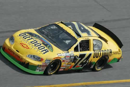
I believe that was the only time a TV channel was a sponsor.


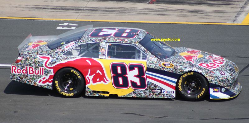
The Red Bull 'faces' collage liveryLooks like someone covered it in paper mache!


They did the same thing for their Cup cars as well.

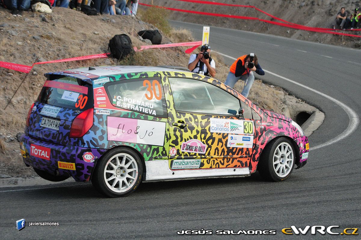
GOTMAXPOWEREkaterina Stratieva's Citroen from this weeks IRC round in Spain:
Words fail me.
I think we have a...uh, help me out here?
Well, that's uh.. definitely.. it's..
What is this... I don't even....
Ekaterina Stratieva's Citroen from this weeks IRC round in Spain:
Words fail me.

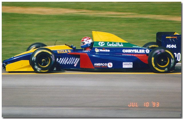
MazdaPriceLarrousse LH93
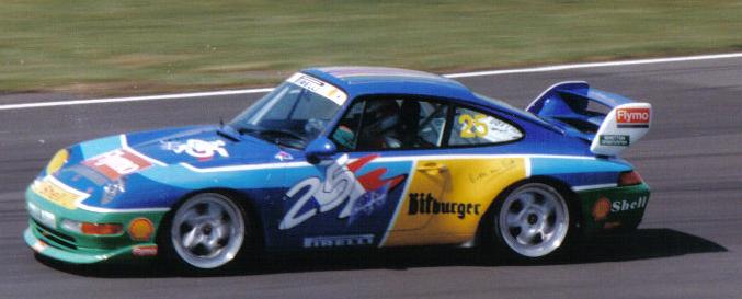
Now, I actually quite like this livery. But I can freely admit that it's not one of the better looking ones.
Not the worst, but unique in its own way.
[IMG/]http://thumbsnap.com/s/0c7j49Y9.jpg[/IMG]
No wonder F1 wasn't shown in Ireland until the mid-90s.
Not the worst, but unique in its own way.
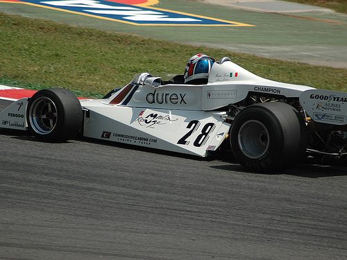
That's not even an F1 car. It looks like an F3000 or other formula below F1 from the late 70s/80s.
Looks like a TS20, with the distinctive rear twist of the side pods.
Looks like a TS20, with the distinctive rear twist of the side pods.

I like the car but sorry, stained glass windows are better seen in churches. To make it worse, the blue has like a purplish hue in GT5, makes it look even more mismatched.