Post your Drawings. Not about cars.

How amazing! I see you're way better than me in drawing the hightlights of the hair(contrast of the light reflected on the hair) which I still suck so much. :(
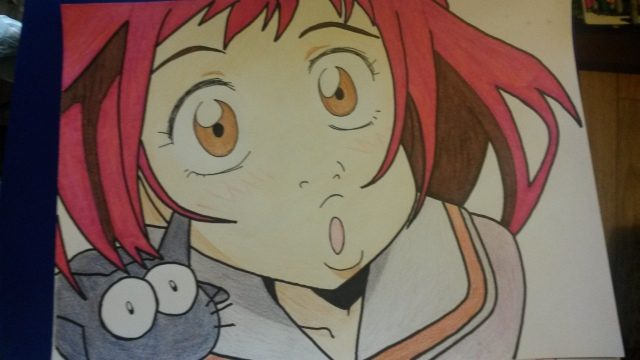
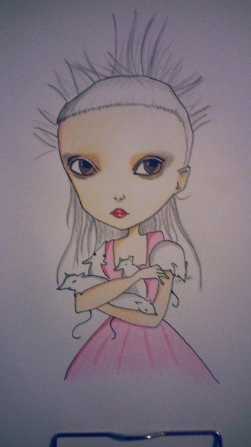
Tip: Get yourself an electric rubber and use a blending stump for hair. The black part of her hair is carbon/charcoal and the blonde part is carbon with small amounts of graphite
 
Lil' bump.

I'm sadly totally inept when it comes to drawing, but I've been designing brass instruments recently and have been pleased with the results. You can view them all here in my deviantArt gallery. (They're also all on imgur here.)

Here's a sample:

lHxdrt9.jpg
 
No worries, since I'm pretty much fond of your artworks and I'm anticipating to see more from you. :)
Thank you so much! It's much appreciated, more will come soon, camera button my phone unexpectedly stopped working :banghead: so cant take any photos of my sketches currently, I'm always in awe at your realistic portraits, very impressive!
 
Thank you so much! It's much appreciated, more will come soon, camera button my phone unexpectedly stopped working :banghead: so cant take any photos of my sketches currently, I'm always in awe at your realistic portraits, very impressive!

Thanks for the compliment. :) I've been working on pencil portraits for like 1 year and a half, but I did like making doodles of anime characters / paintings in watercolours since my early childhood, and when I started focusing on them in earnest I followed exactly how other people/professional artists did in their each step to create their artworks. It took me about 3 or 4 months to get to that level ;)
 
Variation in line weights would be good for enhancing the drawing. 👍


I need practise :P

By that you do mean how strong the line looks, right? or do you mean the thickness? Or both? I am really clueless with art!
 
Thickness can help define a line ~with strength~!

No but seriously, variation of line thicknesses will help increase appeal and keep your eyes more interested.

Here's an example I pulled off Pinterest:

476359b04d7e792e070280075674504b.jpg


Thicker lines can be used to create a focal point while thin faded lines can be used to create the illusion of depth.

I apologize that I can only think of a car as an example, but I used to draw cars a lot so I picked up a lot of drawing techniques from design sketching and rendering.

lugnegard-10.jpg


http://www.designertechniques.com/tutorials/mikaellugnegardtraditionalrendering01-page1.htm

I used to follow this tutorial before. Give her a read if you have a chance.
 
Last edited:
@AOS- many thanks! I was trying that with the picture but it really didn't work xD

Maybe I should invest in some more pencils than the single HB?

What about the coloured one? I suppose with that it is all about the depth perception through shading right?
 
The shading is to some extent a way to illustrate depth. Shading through my understanding of perceiving thing is a way to define the form* of something.

*Form meaning the 3-dimensional "shape" of something for a lack of a better term. All I remember being taught was "If it's 2D, it's called shapes. If it's 3D, it's called forms."

Some people have no problem with HB pencils alone, but personally, I dislike HB pencils the most. Drawing pencil starter kits are generally inexpensive, and what I suggest playing around with is hard pencils and the softs, like 4H, 2H, 4B and maybe even 6B. The black pencils are great for filling in value because they just rub into the paper so well. If you can get the hang of balancing dark sections with the white paper, you can get good contrast on your composition (like you see in that BMW pic above) which will further enhance the presence of form.
 
@AOS- thank you so much for your help mate!
I remember using a 4B and 4H pencil before many years ago in school where I did a tiny bit of art. And yes, I was hoping the shading would give the aircraft a little form as it were. Okay so one final question and I will stop bugging you: say I coloured that plane all in red. Would I be able to use a soft pencil on top of that to darken areas? I am guessing no unless I shaded it very lightly in red in the first place to leave untouched paper for the soft pencil to stick to?
 
Generally speaking, that probably wouldn't look very good. You can add value by using a darker red. IIRC, blending a hue with its complimentary colour is a trick to get darker tones. I think it's done in mixing paint, so I can't see why it's not allowed with coloured pencils.


But heck- this is art in the end. If you do it anyway and manage to discover something new, I'd encourage it.


thanks again lol. Next task (whenever I do it) probably draw Concorde ^^
 
Finished the work I posted here a week and a half back just now...., I tried using 10B of Mitsubishi uni high pencil for the first time to add dark values on the hair, and found that much easier to use compared to the 7B/8B pencils of Steadler made of carbon leads.

IMG_20150705_031512 (1).jpg
 
Back