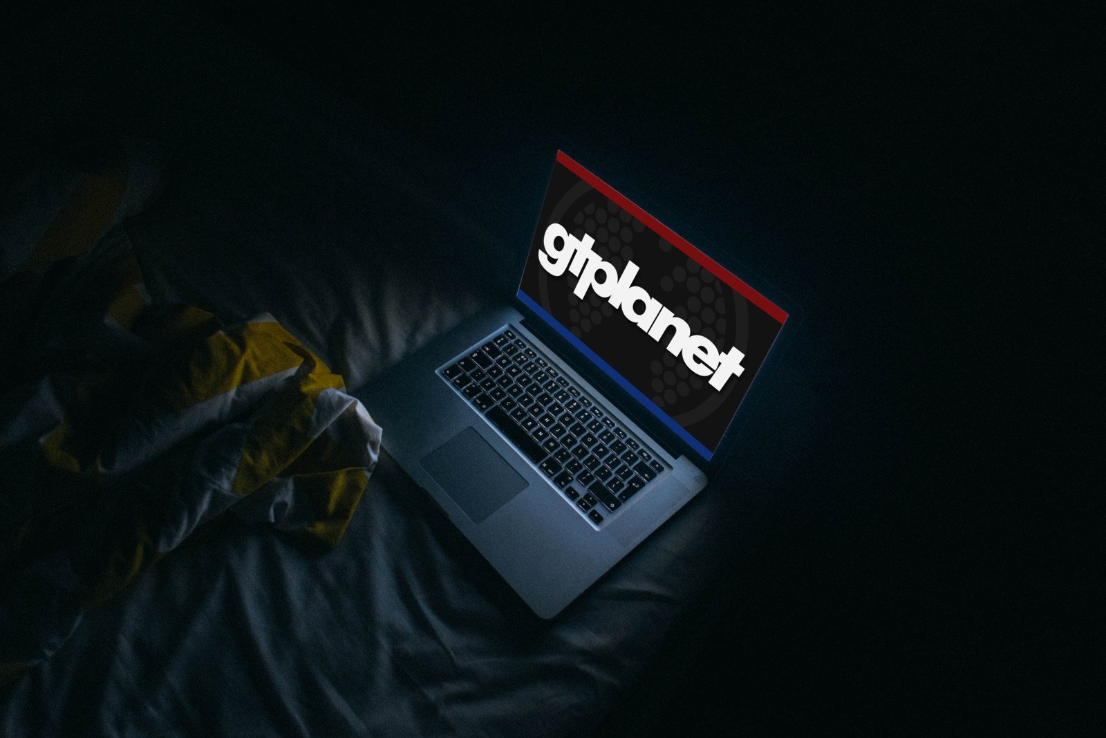
Earlier this year, GTPlanet reached a major milestone as we celebrated our 20th anniversary, and today we have reached another as we launch one of the most significant updates in our site’s history.
There are dozens of new features specifically for the GTPlanet Forums which I have detailed in a separate announcement, but there are even more changes to the rest of the site you should know about!
Dark Mode
One of the marquee features of this update is also one of our most-requested: “Dark Mode”! It allows you to view the site with either a light or dark background and quickly switch between the two themes.
Depending on your device settings, you may already be using Dark Mode now. Modern operating systems include system-wide “Dark Mode” and by default GTPlanet will reflect your device preferences in real-time. For example, if you have configured your device to change between modes based on the time-of-day or ambient lighting conditions, the site’s appearance will change along with it.
If you always prefer one theme over the other or if you want to quickly change between them, just scroll down to the bottom of any page and make your selection among the “Light”, “Dark”, and “Auto” buttons.
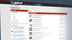
New Homepage
GTPlanet’s homepage has been completely rebuilt to make it easier to reach our most popular pages and to help you keep up with our community.
Every day, thousands of people post new messages and topics in our forums, and now we can showcase the best of that content with Featured Threads, Featured Posts, and Featured Images alongside all of our usual editorial content. Keep an eye out for daily updates, as our home page comes alive with featured content from around our community!
Article Comments
It’s now easier and faster to read and share comments on GTPlanet’s news articles.
Comments will be displayed immediately below the article text itself, and new visitors will no longer be required to go through the full account creation process to post messages — simply enter your name and a valid email address to jump into the discussion.
We have a new “upvote” system which enables registered members to give feedback on posts they like or disagree with. By default, the most popular comments will be pushed up to the top, but you can also sort them by recency.
Replies can be made up to two levels deep to allow for threaded discussions, and you can get notified of new replies to your comment by email. Registered GTPlanet members users also get additional features, like name reservations and the ability to edit comments after they are posted. If you are not already a member, click here to create your free account!
Behind the Scenes
In addition to the public-facing upgrades, there are many updates and changes under the hood which will allow our editorial team to better serve you, our readers. There are also numerous technical improvements and optimizations designed to make visiting and reading GTPlanet the best experience it can be.
Please let me know if you run into any issues or bugs with the new site. The best place to report problems is in our Site Support forum, or send a message via our contact form.
As always, it is a pleasure to serve and lead this community and I look forward to taking GTPlanet into its next chapter with these new features. I hope you enjoy the new site!


I like the new look. Made me load up the homepage again.
Sorry but I’m really not a fan of the new look. Honestly it makes GTPlanet look like it’s fallen on hard times.
Can you explain why you think it looks that way?
The formatting on the main homepage looks off, like I’m viewing the website on an unsupported browser with missing typefaces. On a widescreen desktop monitor the empty space besides the main body of the article looks like it’s missing content (ads for instance). Maybe worth stretching it out on the horizontal axis more?
The older design if anything looks like an evolution of this newer one. For want of a better analogy, it seemed “friendlier, more approachable”. This new design language strikes me as being overly simplified and a tad corporate. A lot more basic with less visual panache than the older design, hence my comment about the GTPlanet appearing like it’s “fallen on hard times” (e.g. reduced design budget). Don’t get me wrong, the website seems to be in great shape right now content and community wise. Visually this redesign just isn’t resonating with me.
Just checked the forums which to be fair do seem better.
Yet to view the site on mobile, but I imagine that will make for a better experience given the narrowness of the presentation. I know Eurogamer offer multiple versions of their website depending on the platform (phone, tablet, desktop), might be something worth looking into.
Sorry not a fan of the new look. Honestly it makes GTPlanet look like it’s fallen on hard times.
I’m sorry, but I just cannot get on with these changes. I much prefer the previous front page layout. I check GT Planet much less frequently now.
Thank you for the effort you’ve put in.
One question:
Why do all quotes look blank (white) in Dark mode unless I highlight by dragging my mouse over them?
Light mode is fine.
I think it would be best if you had the forum-related stuff in a floating siderail on the right rather than at the top of the page. That way, news (which is what we all come to the main page for, let’s be honest) gets top priority but the forum stuff is still just as easy to access as it is now.
My suggestion if this layout stays is to introduce images back for latest news for mobile users and to shift the latest news up to be the first thing users see instead of showing the forum category listings.
Forum users will know how to navigate into the sub sections regardless whereas the current layout might alienate, confuse and put off non forum users.
I have to agre with some of the other guys, who are not so happy with the change.
I uasely check the front page many times every day. At first i thought the website was broken or something was error when loading the page.
On my screen there is like 2/3 empty space, and the articles only fill like 1/3 of the screen in the buttom left.
I Use Google Chrome magnifyed to 150 %.
It really dont look very good. But I understand its new and improvements can happen. I just hope someone is working on it, because honestly this is the kind of design that can drive away users from a website really fast :-(
I only really ever visited the forums, and check out the news articles, and that’s about it. So what I use it for is fine. The only thing that I noticed so far is on the forums with the dark theme. Is it can be a little hard to tell what threads have been fully read, since the font/boldness is kind of similar to the threads that have been fully unread. Maybe a different shade of white or gray could make it easier to tell.
I kept refreshing the homepage thinking it was broken. As someone who drops by for just the latest news, not a fan of the new text heavy home page layout, like others mentioned it lacks visual excitement and is just more cumbersome to use for those who don’t know what to specifically look out for.(Speaking from 17yrs of UI/UX design work experience)
Will it make me check in less? Unfortunately, yes. Because it's just not as fun as it used to be. But that's just me.
Efforts are welcome, however, I also don’t like this new design. Feels like a very old website. The previous one worked so well and actually had a beautiful layout. Will continue to visit this site nonetheless.
Let me express my humble opinion here.
I may be the only one here, but… Sorry. This looks to me like a 2005 website.
No profile pics next to user names, no pic preview in articles, everything in front of you in the home page (forums, guides etc.) and just blue links.
Was more minimal and “clear” (for me) with the home page just having newest articles.
I just liked and fell in love with the previous one so much it seems..
P.S. Ok so I just replied to a comment instead of leaving my comment. No idea how that happened. I couldn't find where to comment and my thumb just summoned a comment box. Which I now found out it was for a comment reply….. Took me 5 mins to find again my comment in order to edit it through all lookalike comment and the random boxes (to reply in a comment) my thumb was summoning while scrolling down.
I wish all this is not taken in the wrong way. I just leave my honest feedback because I loved the minimalism of the previous website.
Everything is now text-based. No emotes, no options for comments (underline, strikethrough) etc.
First of all, thanks for your work! It’s great to see that you have initiative for improving the site! However, I’m not a big fan of the change. I prefered to see directly the news, and if I want to visit the forums, use the tab (I mean, at the homepage you have two options at the same time to access the forums, imho too much hahaha).
Thanks again!
I really like the dark mode.
Not sure about the forums up top on the homepage. I liked that clean, handsome look with landing on the latest news then selecting forum when you were ready to dive in.
Still my go to for sim racing, always will be.
Sorry to say, I am not a fan of the new look but it is only my opinion and I will probably just get used to it.
Question: What happened to the “Mark Forum(s) Read” button? I use this function a lot as I find it cuts down on the “noise” some topics generate, especially in GT 7 ;-)
Is there any chance of changing the homepage to how it was before?
The homepage for me is the best place on the internet for a mix of racing game, motorsport and car news.
Now unfortunately it just looks like one long forum topic list and therefore nowhere near as sleek looking as it was before.
Don’t know what everybody is whining about. It basically looks the same as before. A little sleeker, & cleaner, but…pretty much the same.
Although…it would be nice to be able to add pics like before. Any chance?
You can still post pictures in forums, but our article comments have actually never supported images. This area is really just about discussion so I think it’s best to remain text-based.
The dark mode is a nice addition, and comments seem more fun, but they lack an option to insert images. Although, having one could lead to problems, we had such an opportunity before, when everything was on forum.
Being premium, when I open the website now, I see 30-40% of blank space reserved for ads which I should not see. I can’t see something like a bic icon of the latest article or anything that should catch my eye.
Forum pages also suffer from misplaced article links and blank spaces for ads.
I could provide screenshots of needed
Can you explain what you mean by “forum pages suffer from misplaced article links”? I’m not sure I understand.
Also, the ad units should be hidden for you as a Premium user, so apart from the sidebar I’m curious to know where such a high percentage is coming from.
The good –
Dark Mode looks great
Forums are tidy
The not so good –
Front landing page, it just doesn’t stand out like it used to. The last build would hit you in the face with 4 of your latest stories and news features with large images and brief description of each story to pull you in. Now, it’s just a load of text and links, you have to scroll to see the good bits.
If I was a new user, I may just click by and not use your site, the other build held my attention
Before, you could navigate your site from the drop down tabs at the top (Games, Cars, Guides etc), not anymore
You had trending and hot topics near the top of the landing page that I used many times
There’s just something missing, it’s like the saying ‘it says what it does on the tin’ but as it is, your tin has no words, there is nothing telling me your site is about cars/esports/gaming etc from the new homepage
Please don’t take this all the wrong way, I am a massive fan of your site and appreciate the hard work you guys put in. The content is fantastic and you guys are always amongst the first to deliver news, it’s a site I visit daily
Thanks
Thanks for your feedback. Few users clicked on those category links so this is an attempt to redesign the site around how people are actually using it.
Honestly the old homepage looked way better than this. I would understand if you updated backend stuff for security reasons but the layout of the old homepage was way better. The site now looks 15 years older than it should.
Agreed. I thought I’d somehow clicked a mobile only view for the homepage.
Can you explain what you mean by “looks 15 years older than it should”?
The Facebook login doesnt work anymore unfortunally. I cant access my account anymore
Sorry about that, the external login feature has been restored. You should be all set now.
Like the dark mode, but I also miss having picture thumbnails as I scroll through articles ngl
I think for the comments section, it should show a few highlight messages that were highly upvoted at the end of an article, and if someone wants to look at all the comments, have a link that takes them to the full discussion thread
Forum threads look nice tho
If it ain’t broke don’t fix it comes too mind
Our old software platform had reached end-of-life and was no longer receiving patches or security updates. It was very much “broke”.
Thanks, I hate it.
Thank you for dark mode, it looks great.
Wow, this is horrible to navigate now. Whoever came up with this site needs to be fired.
GT planet is the first website I look at every day. I think I check the site more than I check my Gmail.
Much respect to the people who did the redesign but I don’t care for it. It feels more difficult to navigate. It’s a little confusing and it’s not as visually pleasing as it used to be.
It won’t keep me from coming to the site and I’ll likely get used to it over time.
Not being aggressive, but both of you should know it takes a bit to get used to navigating the site after a UI update
Cheers
Uh oh, I designed and built it myself and I own the site…
I guess I should just shut it down and quit? 😥
To be honest I don’t like much the new site. Usually an update should improve something, in this case is not very easy to navigate into the site.You the boss, you decide.
Can you explain why you find it harder to navigate?
Worked for me.
I have dark mode for my browser setting and it automatically had dark mode set when I first loaded up GTP this morning. But I switched it to Light mode because I’m a non-conformist. :P
Also like the little green men showing who is online now.
For me at least, in the past couple of years the phrase “site update” typically means becoming significantly worse to navigate/view/customize. It’s quite a pleasant surprise to see one that actually improves the site.
That’s a very nice complement to receive. Thanks!
Am I missing something? The home page has gone strange and isn’t easy to navigate like before?
Dark mode is great though
Also, just a note – I understand the need for advertising on websites for monetary reasons, but for users like me who have ad block and alike, the home page is very empty looking with big blank spaces
Can you explain more about why you find the new home page harder to navigate?
Keep in mind that blocking ads undermines our work, and it’s how we maintain and publish the site free for people like you. It’s how Andrew and I put food on our tables and a roof over our heads. If you don’t want to see ads, you can get a Premium subscription for just $12/year here.
Even without adblock on, it’s just massive spaces with ads. I get that bills have to be paid, but this is a big step towards user unfriendliness.
There are fewer ads in the new design and the content area itself is actually larger. I’m afraid I don’t understand your critique.
Thanks team.
Isn’t it too easy to use temporary email addresses to create as many new accounts as you like?
I do REALLY like the fact that it saves your comment even when you go to a different page, unlike a particular Youtube…
Nice update! Pretty nifty that you’re able to change your own username.
Dark mode…praise the hea-…wait, that’s wrong…praise the night?
Anyway, I love it, however…was the site always offset to the left like this or am I trippin’?
The text also appears to be larger, i.e. less words fit in one row…I feel like it’s maybe a tiny bit too large, it’s actually harder to read, but that might just be me…
Cheers. Yes, there has always been a sidebar but I can see how it might be a bit more obvious to you now.
What OS/device are you using that makes the text look too large?
W10, Firefox. 80cm display, 1440p, I normally viewed the site at 130% zoom. It’s like the font size of the main news article went up by one step after the update.
It’s no big deal…
I liked the big focus on the newest article in the old design, like, let’s say some big news happened and then you see it sort of highlighted and in your face, that was nice and…exciting? Made it feel more important than usual is what I think I’m trying to say…
Other than that, all good!
Comments on news pages return?
I am so down with this update.
Thanks for the effort, Team! 👏I’m sure the community will benefit from the update. Love the dark mode. Stay safe and have a nice Sunday you all!
edit: …function is working! 😊
Merry Christmas in Hot June from Las Vegas in triple digit temperature !!!
Dark Mode Galore finally!
Mucho Gracias from my eyes Jordan !!!!
Testing!
This is great!
For a moment I got confused, since the homescreen is a lot more different like it used to be, I couldn’t believe it myself, so I refreshed the page, and then I saw this article. Great addition of the dark mode as well!
Edit: LMAO SORRY I THOUGHT I WAS MAKING A COMMENT INSTEAD OF A REPLY
I find it improved compared to the previous iteration of the site. Forum looks better and the overall UI feels sleeker.