PSC: Weekly PSC Week 61

  • Thread starter Thread starter -Fred-
  • 146 comments
  • 4,715 views
If you want me to clean it up for you, you know where to find me. Take it easy.
 
Which one do you like better?
A
[image Deleted]

B
[image Deleted]
 
if you ask me I like the second one more, it gives more of a sharky look to the car
 
if you go for the second one, i think you should shorten the wheelbase..
 
actually i lengthened it from the original; i like it that way.
 
Oh HELL yes im in for sure. Suzq the vette is long enough as is and making it LONGER doesn't look very good. Just my 2 cents.
 
72, the nose tan piece isn't shadowed at all.

The car is still blurry, think about uploading it to a site and linking to it. The driver's head is also squished.

Other than that, it's a sweet chop idea.
 
thanks for the comments toyo, i will finish it up tonight and be done.
 
so many great photochoppers here, i feel like being a spectator on these things instead of participating.
 
which one guys... A or B, i still need opinions.
 
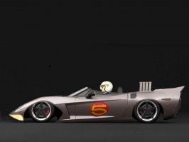
lol nice 72ElCamino i Love the idea for the speed racer
speed racer is the best!
 
Originally posted by 72ElCamino
thanks for the comments toyo, i will finish it up tonight and be done.


Super. I'm only trying to help ya' bud. You got some great ideas.
 
Originally posted by suzq044
which one guys... A or B, i still need opinions.


A, because the nose is a little long for me in the B version. :D
 
This is how a C6 would look like with an mid-engine, instead of front-engine. I decided only to use the original parts - just changing and moving them.
Final entry
c6_copy.jpg
 
Hey, Zodiac. A warm welcome to GT Planet! With chops like that please make yourself at home. Hell, have one of my cigars :)
 
nice chop there zodiac 👍 You might want to do something for the shadow since the car looks like hanging in the air now..
 
Nice version of the C6 there, bud. Welcome to GTPlanet!!! Enjoi ur stay!!! :D
 
Ok, New version.. Toyo, is it still screwed up?

Zodiac, looks good.. ZZII wannabee?:)

FINAL
 
Originally posted by GTJugend
Ok, New version.. Toyo, is it still screwed up?

Zodiac, looks good.. ZZII wannabee?:)

FINAL

Colors are fine now.
 
Ok, thanks skip.

I got to get me a new monitor...
 
ok guys just finished mine up,
 

Attachments

  • c6 vette copy.jpg
    c6 vette copy.jpg
    32.4 KB · Views: 309
GT, it's looking hella sweet there. No problems anymore. :D


EDIT: Nice work there 72, I like it. :D
 
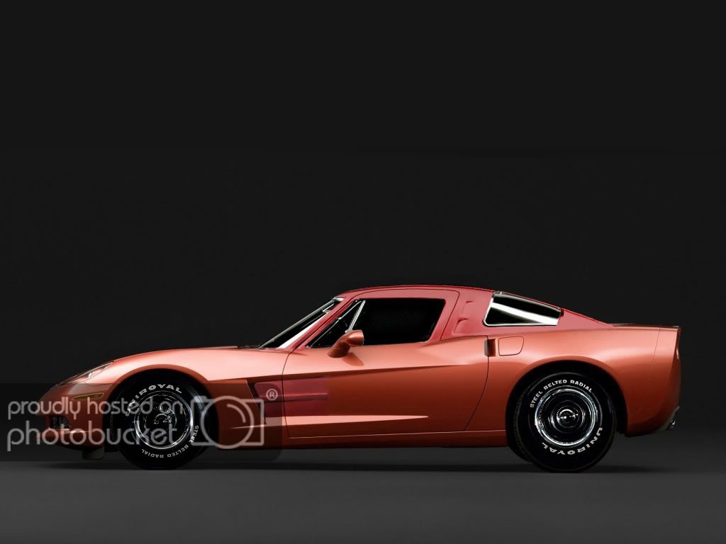
Might clean it up later, but for now this is my FINAL ENTRY:

chevrolet-corvette-c6-023_copy2.jpg


Edit - Minor Changes.
 
you noticed the uniroyal is backwards? The roof looks a little flat.. try some highlights on the top
 
This is weak compared to suzq's entry, but I started on the idea before she posted hers and didn't feel like starting again. Anyway, FINAL ENTRY mako shark 3.
burnout.jpg

and a warm welcome to Zodiac! nice work!👍
 
Originally posted by suzq044
which one guys... A or B, i still need opinions.


A - Looks better. B looks okie, maybe if you fixed up the blending where you shaved the gas door and handles. But I still think A looks better. 👍
 
Only tuesday and already a sleu of great entries; I'm impressed. I'm kinda taken this week, but if I get a chance I'll try and make something at least semi-competitive with these...
 
Sorry, I need to double-post it won't let me upload the new one.
 
Back