You are using an out of date browser. It may not display this or other websites correctly.
You should upgrade or use an alternative browser.
You should upgrade or use an alternative browser.
PSC: Weekly PSC Week 51
- Thread starter -Fred-
- 109 comments
- 3,330 views
") but not bad
but not bad- 7,965
Originally posted by suzq044
Any Comments on MINE btw?
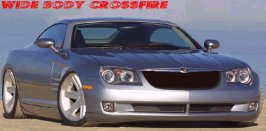
I would change the rims and maybe change the emblem of the chrysler grill. Maybe even pull a shadow from the emblem to the window along the hood. Like a peak in the hood.
- 5,071
this is not about taste, rather style.
I had my window /1024*70xwhatever) and the window was to the right.. Means I saw pics on the 1st page but not who had made the chops. When I came down to the blue, roof lowered tire-widened crossfire my first thought was "Susq"! and it appeared you (she) made it.
I think it's quite cool that you can recognize chops from the style without knowing who has made it..
just my 2 cents.
cf - it roks, awesome!!
 I just find the tires too wide. CF that is amazing...at first look i thought you had just taken the lights and the hood from the original and pased them onto an LM car...but at closer examination i discovered i was completely wrong.
- 4,209
woaaaaa i like the big rims chopz nicezz also the lm edition coolz
mayb i will start to make it hehehe mayb so simple no ricers hehehe
mayb i will start to make it hehehe mayb so simple no ricers hehehe
- 1,746
My entry should be up by the latest at noon tommorrow. I'm sure Cano will like it if you catch my drift. Alot of the stuff I have done to it I've noticed other people doing: Bigger tires, headlights slimed down a bit, lowered a little. I guess most people do that though.
- 24,883

- Somewhere.
Originally posted by drifterzzz
woaaaaa i like the big rims chopz nicezz also the lm edition coolz
mayb i will start to make it hehehe mayb so simple no ricers hehehe
Please use correct english from now on, thank you. I know it's not your main language, but try to make an effort.
- 4,209
ok sorry ...
Cano
Premium
- 20,758

- Cephiro
Originally posted by chaser_fan
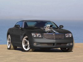
Thought I'd join in this week to brush up on the ol' Photoshop skills, or lack of!
Anyway, here we are. An LM Version...
(Low file size so poor image quality)
EDIT: FINAL ENTRY
EDIT: Just posted one with slightly corrected colour.
O_O FFFFFFFFFFFFFFFF*****. well, there goes the comp. impressive chaser. Im pleased to see that someone shows something like this once in a while. simply astounding, I would have never tought about something like that. I agree, tough, with Jpec. a more "professional" hand would make the chop lotsa good, there are some details that need to be refined. but hell, it is a helluva start. you have my three votes.
Cano
and bring it on, charger, lezzee if I like it. get one of the votes that are gpoing to chaser, man (:
- 6,311

- Hong Kong SAR
Originally posted by Cano
O_O FFFFFFFFFFFFFFFF*****. well, there goes the comp. impressive chaser. Im pleased to see that someone shows something like this once in a while. simply astounding, I would have never tought about something like that. I agree, tough, with Jpec. a more "professional" hand would make the chop lotsa good, there are some details that need to be refined. but hell, it is a helluva start. you have my three votes.
Cano
and bring it on, charger, lezzee if I like it. get one of the votes that are gpoing to chaser, man (:
Nice to see you like it, guys. I appreciate your comments. I could make it much more 'professional', yes. But I really don't have a lot of time on my hands at the moment
 looks like a smudged blob man!! well, it is original, of course, but it BEGS to have more stuff done to it O_o
 so i lost my touch i think hehe
- 6,311
- Hong Kong SAR
Originally posted by Glacius
hey guys this is what i have so far
i made this the day the comp came out ,but i decided to post it now .
dunno y hehe..
well its not finished ,its just a litle preview of what i have in mind
im making a SOLAR carhope u like it ..
and btw NICE ass car u have chaser
sry about the bad quality ,upload is down
Interesting concept, keep going!
- 1,746
- 6,311
- Hong Kong SAR
Originally posted by 360rider
CF that is amazing...at first look i thought you had just taken the lights and the hood from the original and pased them onto an LM car...but at closer examination i discovered i was completely wrong.
Noooo way! That would be taking the easy option. This one is from scratch with the only 'donor' car being the original Chrysler in the photo. The only other parts that are from other cars are the wheels (Jag.) and the rear wing (Cadillac LM).
Super-Supra
(Banned)
- 4,111
I re-did it with nothing in my mind.

- 6,311
- Hong Kong SAR
Originally posted by skip0110
and chaser, that LM is simply amazing. You got my vote.
Cheers, skip! I like yours too, very clean. Though I would be nice if you tidied up the headlights a bit. If you're using PS, you could use the bevel tool in layer properties. Just an idea
Super-Supra
(Banned)
- 4,111
Originally posted by Blaze
So, to enter this comp you just psot the pics here
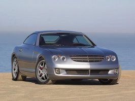
Yes. But, you must use the original picture at the starting of this thread.
Similar threads
- Replies
- 787
- Views
- 90K
- Replies
- 14
- Views
- 1K
- Replies
- 727
- Views
- 148K